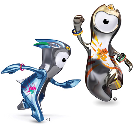
Wenlock and Mandeville by iris
Creative agency iris has unveiled Wenlock (right) and Mandeville, the mascots for the London 2012 Olympic and Paralympic Games.

The two characters are based on blobs of steel used to make the girders for the Olympic stadium, and feature headlights derived from the hire light on London taxis.

Wenlock (above), the mascot of the Olympic Games, is named after the English town of Much Wenlock, which inspired Baron Pierre de Coubertin to found the modern Olympic movement.

Mandeville (above), the mascot of the Paralympics, is named after the town of Stoke Mandeville, the birthplace of the Paralympic Games.

Above: Wenlock. See full-size image here.

Above: Mandeville. See full-size image here.

More Dezeen stories about the London 2012 Olympics:
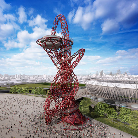
ArcelorMittal Orbit, a giant sculpture by Anish Kapoor
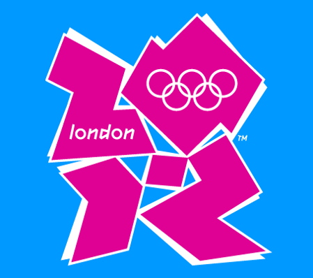
London 2012 Olympics logo by Wolff Olins
London 2012 Olympics stadium by HOK

Here's some text about the two characters from the London 2012 website followed by text from iris' website:

Wenlock
How did I get my name?
My name is inspired by Much Wenlock in Shropshire, a town that is at the heart of Olympic history. In the 19th century, Baron Pierre de Coubertin was invited there to watch the Much Wenlock Games, which were inspired by the Olympic Games of ancient Greece. De Coubertin was inspired by the Much Wenlock Games, too, and went on to found the modern Olympic movement. The Much Wenlock Games are still held to this day!

Mandeville
How did I get my name?
My name is inspired by Stoke Mandeville in Buckinghamshire, the birthplace of the Paralympic Games. On the same day as the Opening Ceremony of the London 1948 Olympic Games, Sir Ludwig Guttmann held his own sport competition in Stoke Mandeville for World War II soldiers with spinal injuries. The Stoke Mandeville Games grew and grew until they became the Paralympic Games.
iris launches the London 2012 Olympic and Paralympic mascots
May 19th, 2010
Eighteen months ago the team here at iris pitched against some world-class competition in the advertising industry, as well as some leaders in character design, to win the brief to create the London 2012 Olympic and Paralympic mascots.
Tonight, Grant Hunter, the creative director of our London office, unveiled the mascots on the BBC’s The One Show in an interview with Claire Balding.
“Our brief was to create mascots that would excite and inspire young people and encourage them to get involved in sport. We wanted everyone, especially young people, to be able to take part, so we asked ourselves, ‘Why have one mascot when you can have millions?’ ” says Grant.
“To capture people’s imagination you have to create something iconic – something unique – something as individual as you and me. We have created a flexible design that allows you to make the mascot your own, while celebrating what is great about Britain – our heritage, our culture and our creativity. They are inclusive, because they invite everyone to take part and get involved. They aren’t ‘the’ mascots – they are your mascots.”
“The result is a world first – a multi dimensional, adaptable design for the digital age, which will allow you to customise the mascots online later in the year. And who knows what else, after all we’re just at the start of the journey and the possibilities are endless.”
The story of the mascots has been brought to life in a beautifully animated film written by Warhorse author Michael Morpurgo. It tells how ‘Wenlock’ and ‘Mandeville’ – their names derived from locations of historic significance for the Olympics and Paralympics – came to be.
Both mascots are made from a highly reflective steel and in the story we discover that this steel was poured for the final girder of the 2012 stadium, before a grandfather retiring from work that day took them home to carve them into the their unique forms for his grandkids. They’re brought to life by the magic of the rainbow and they set off on a journey across the UK, where their skin reflects all the wonderful things around them, from places to people.
The iris team designed the mascots to reflect sport, as well as London’s cultural icons. They are aerodynamic so they can play sport and they have some subtle design features that remain, no matter what form they take.
Some of the design features include:
-The headlight is the hire light of a hackney carriage – a London icon
-The eye is a camera lens, allowing them to record their journeys
-The Olympic mascot wears the 5 Olympic rings as friendship bands, while the Paralympic mascot wears a personal best wristwatch which also displays the year of the games
-The three peaks on the Olympic mascot were inspired by the 2012 stadium roof, while the Paralympic’s head shape has been inspired by the agitos – the symbol of the paralympic movement
-The colour of the Olympic mascot shimmers through golds, silver and bronzes to reflect the colour of the medals.
Design features of the Olympic mascot
Credits
Grant Hunter, Paul Bainsfair, Rob Leeks, Oskah Manchip, Tony Islam, Susie Hale, Nina Zimmermann, Hannah Worthington, Andy Pilkington, Keith Franczak, Carl Addy, Rebecca Cox and Dan Doherty.
See also:
.
 |
 |
 |
| Sculpture for Olympic Park by Anish Kapoor |
London 2012 Olympics logo by Wolff Olins |
The Blue Fence Project by StudioSuperniche |