Pharmacy in La Puebla 15 by Buj+Colón Arquitectos
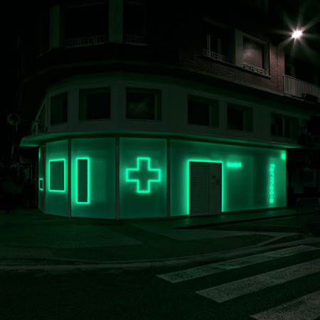
Buj+Colón Arquitectos of Madrid have designed a pharmacy in Palencia, Spain, decorated with large neon symbols illuminating both the interior and exterior.

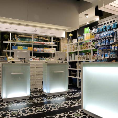
The designers have also removed the traditional pharmacy counter, placing medications alongside the customers.

Photographs are by Luis Díaz Díaz
More details from the architects below:
Pharmacy at La Puebla 15
What is a pharmacy? The signifier leads us to ponder not only on the word pharmacy, but also on the object and relationships that connect the conscious and unconscious dimensions of the term. Illusion becomes the trigger.

Three questions propel us into action:
Where do we draw the line between reality and the space of illusion?

Can one concentrate this boundary along a zero-thickness plane?

Can light be captured in this space of no thickness?

The experiment begins with the search for an intercalary material capable of capturing the illusion of light.

A material made up of a myriad fibres accumulating on a virtual plane.

Light rushes over it as if it were a massless fluid. Limits are dissolved in a liquid plane.

References to the object disappear. The luminous symbols float in the form of ephemeral traces as abstract elements in the dark.

The project embraces the new demands for relationship and proximity of the customer with the product, breaking away from the classic formula of direct sales and creating an ambiance that places the medication on the same plane as the consumer.

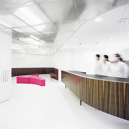
The interior and exterior zones are connected through a first filter that is interrupted to form shop windows, spaces for visual exchange where the façade increases in density and specificity.

These captured voids become magnets to attract the attention of the customer moving in the vicinity of the pharmacy.

Click for larger image
A second filter, designed to showcase the products for sale, will delimit public and private areas, multiplying the relationships between them both.

Click for larger image
Light shines through the programmatic sequence. Space becomes deep once again.

Click for larger image
See also:
.
 |
 |
 |
| Plaza Nueva Pharmacy by MOBIL M |
GKK Dental Ambulatory by Xarchitecten |
More architecture stories |