
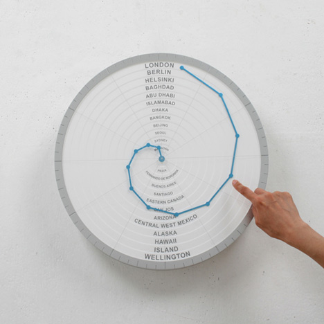
Here's another clock designed by Giha Woo and Shingoeun (see their clock with a battery for hands in our earlier story), this time with a single spiralling arm to indicate the time in different countries around the world.

Called The Bent Hands, the clock face features countries written inside concentric circles, with linked points on a spiralling arm indicating the time.

The product is part of a series of work by the duo entitled The Wrong Objects, which they presented at DMY Berlin last month.

See all our stories about DMY Berlin »
See all our stories about watches and clocks »

More information about The Wrong Objects in yesterday's story.

See also:
.
![]() |
![]() |
![]() |
| The Front & Back by Giha Woo and Shingoeun |
Hand in Hand Clock by Yen-Wen Tseng |
Continue Time by Sander Mulder |


Great clock… but where's Amsterdam?! ;-)
Really a great concept but there is a problem not solved:
For each country daylight saving time start in a different date.
It cause a dilatation/reduction of the time.
Magenta100 you are correct!
I have not checked if they list only countries that follow the same guidelines for daylight saving time.
Will it be possible to buy this?
New York?
it will be better to sign every dot with the same color of the city. it will be more obvious for fast looking. in case if this clock is not near you.
Free advice.
I don't get it. It looks nice, but I don't understand how to read it. I should be able to look at a glance and get the information I'm looking for..
Dave you should get a BIG digital clock if that what you are looking for….
This design is made for people that would sacrifice functionality for design and uniqueness.
Can someone explain how it actually is to be read please?
how does it works?
It's not too difficult to figure out really. The outer rim of the clock is like a regular clock (see lines/ticks representing hours). If you use London as an example, the London dot is about halfway between '12' and '1' – thus being roughly 12:30. The same goes for Wellington, as it's on the same ring, except it would be 12 hours ahead. It's 1:30 in Berlin, 2:30 in Helsinki etc …
I like this idea, especially since it is so simple and easy design. I agree with Egor, it might be easier to understand if it is color coded of some sort or something that makes is a little bit easier to read, but still, nice design :)