
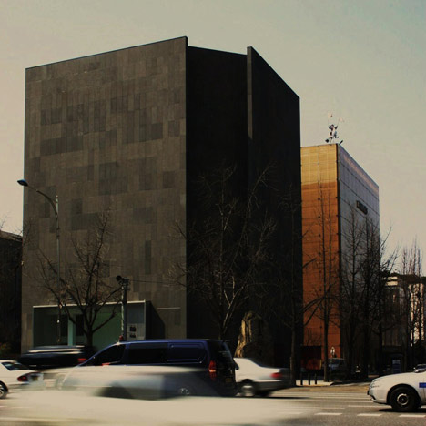
Korean architects VOID planning have completed this stone clad gallery in Seoul, Korea, punctuated by a giant window.

The main gallery space on the ground floor has a six metre ceiling and is framed by the large piece of glazing.

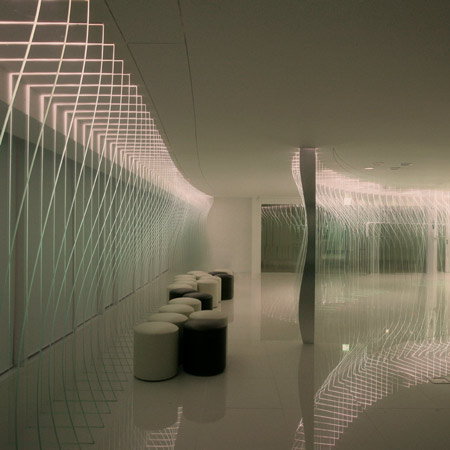
The gallery is split across two floors and connected by a narrow staircase, the walls of which are used as screens for projected art.

The exhibition spaces on the ground and first floor are illuminated by light boxes that trace round the ceiling perimeter.

All photographs are by VOID planning.

Here’s some more from the architects:
313 Art Project
Focus of this entirely white and extremely minimal space is on the artworks.

Nothing is allowed to steal the spotlight from artworks.

Finished with rough dark-gray stones, façade of the building is penetrated by metallic frame containing the two-story high show window with oversized metal plate doors.

To maximize the impact of the main artwork on the 6-meter-high wall, all the windows had to be moved to the backside of the building and also one column, located on the center of the big wall, was removed.

Especially at night, framed with light gray metal plates, artwork on the wall is softly glowing with indirect lighting from the stretched ceiling.

This is not just attractive condition but also very rare opportunity for the artists to give spotlight to their artworks.

On the first floor, behind the big wall containing a staircase, there is an exhibition space where the floating ceiling box is illuminating on its sides.

Indirect light with dimming system and spotlights hung from rails on the ceiling support the space to be flexible in responding to the different tastes and styles of artists.

Long and narrow staircase between two 6-meter high walls, which also provide screen for media arts, leads you to the second floor which is divided into another exhibition space and office space for staffs.

Location, Seoul, Korea

designed by VOID planning

photographed by VOID planning
Click above for larger image
See also:
.
![]() |
![]() |
![]() |
| VOV Building by VOID planning |
Old Town Apartments in Tallinn by Kosmos |
More architecture stories |


Wow, I have never been to Korea but this is striking. Definitely a piece of art in itself. I would love to go visit Korea and see this modern masterpiece.
oh great another blank facade
This building literally fills me with rage.
The interior reminds of Corbu's museum in Tokyo. The lighting is similar it the way that it does not celebrate the work on the walls. The cladding looks kind of cool, reminiscent of Kahn, but what is that the chamfered wall is doing?
Striking indeed. Powerful exterior with intricate glass inserts (what is that dramatic red piece?) and fantastic interiors sophisticated yet clean and readable.
I'd say this single building worth a trip to Korea for an architect. Modern architecture at it's very best…
not a bad project, but im just curious about the "chamfered" corner adjacent to the main entrance. the bldg acts as a group of vertical stone slabs with rooms behind them, rather than a monolithic bloc with voids carved out of it.
Well, There’re no new thing at the space. Just normal building…
the fact that this huge mass is punctuated by a large glass window is really intriguing, but i was rather disappointed that the void created by the window ended abruptly with the high floor to ceiling feature wall, it could even be more interesting if the mass if further puncutated internally. what a damper.
Who dosen't love a monolith?
I know I do
Rather dull and forbidding.
The simplicity of the facade (and interior) is striking, if i could i would squat this building, *deep sighs* I think im in love!
That first image with the chamfered corner in front view is breath-taking! I was really inspired… but then I looked at the project further, and realised that the corner holds nothing but a toilet and mechanical ducts. There is no long vertical strip of light, the entrance is irrelevant in respect, something that had so much potential has been forgotten. Gutted.
I have to say that the chamfered corner is one of my favorite aspects of the design. The recess accentuates the vertical planar quality of the perpendicular walls. If the 45 degree wall were entirely glazed, the impact would be greater, but perhaps a little to on the nose. I like it as it.
Yes, blank walls…I once sat trough an 90 minute long slide show at college that presented nothing but examples of blank walls. I think that the point was driven home to the students. But I'm sympathetic here. First it's a gallery and windows are the nemesis of art. But also, monolithic is the correct response. At least the massing mirrors it's neighbor.