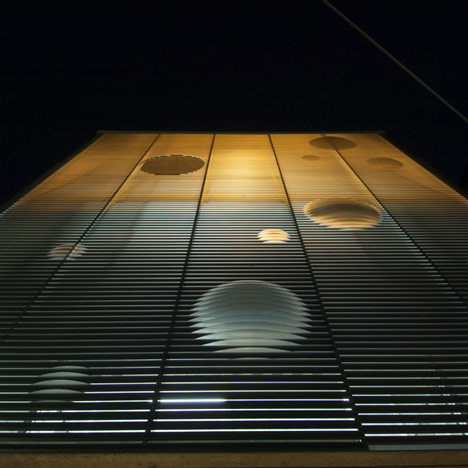
Japanese office Ninkipen have completed this office in Osaka with a facade of aluminum louvres that appear to bubble.

The office was designed for a cosmetic company and inspired by the bubbles found in gelled ointment.

The louvres are made from 2.5 milimetre profiled aluminium.

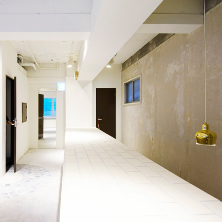
The offices have an exposed concrete interior with a central staircase.

All photographs are by Hiroki Kawata.

Here's some more from the architects:
Mole by Ninkipen!
This is a small office for a cosmetic company Osaka,Japan.

I thought that I was going to express the image of geled cosmetics that is staple merchandise of the company on the facade.

Treating the motif of bobble contained in gel directly, I abstracted it and I tried to merge it in scenery in change it according to the angle.

The louver is made of the 2.5mm aluminum.

First of all, the plate with the different curvature is bent like the L angle, next, the angle is arranged in order of the curvature, then, emboss comes to the surface from among the louver.

I assumed that emboss was a bobble, and I laid it out rhythmically imaging going up in water.

The facade shines like the lantern at night by the light that leaks between louvers, and this architecture begins to become a landmark in the residential area.
Click above for larger image
Project name: mole
Architect: YASUO IMAZU/ninkipen! Architect office
Use: office
Location: Osaka, Japan
Scale: 197.19㎡
See also:
.
![]() |
![]() |
![]() |
| Kiosque Saint-Nazaire by Topos Architecture |
Rroomm by Ninkipen! |
More architecture stories |


Love the way the Japanese don't flinch from exposed concrete. Clever facade treatment but the lantern effect could be too much in a residential neighborhood if it's on all night. Would for me anyway. .
Nice gimmick. Sexy facade. Very relevant given the nature and the scale of the building… Japanese are great. Their minimalism with brutally exposed concrete is always relevant. Brits, with their pretentious attitude and scale could learn from them.
Don't kill me, Brits. I just meant a Carbuncle Cup for the Strata, London. You can read about it on ArchiAlternative.com if you want or on BD Online UK…
I'm a Brit and tend to agree
Nice simple elegant clean design. I would like to see it furnished with workers, perhaps to see how the spaces work together. I love the stairs formally, but they look like a death trap. Is it an optical illusion or are the risers taller than the treads are wide?
This building should schedule a dermatologist appointment.
@james, very clever observation!
Japanese Architecture always makes small big, and big small.
Just one face of the building and says it all.
bubbles because???
The office was designed for a cosmetic company and inspired by the bubbles found in gelled ointment.
When I saw that first photo, I thought to myself, "What a cool office building!" The perspective makes it look like an office tower at least 20 stories high. So I was a bit taken back when it turned out to be rather small. Oh well, it's still interesting.
The lamp is fantastic!!!
I like the idea of the facade, but I feel that it could have been taken further by creating programmatic bubbles within the building as well.
I'm a little uncomfortable with the fact that the slats on the left 3/5 and the right 2/5 don't match up. Am I crazy? Is that a (too) subtle setback or just shifted slats?