
This house on a wedge of land in Shiga, Japan, is by FORM/Kouichi Kimura Architects.

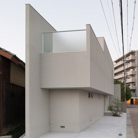
Called House of Reticence, the house is composed of blocks creating triangular courtyards along the boundary.

The central hallway downstairs leads to a master bedroom, children's room and Japanese room, while the combined living, kitchen and dining space on the upper storey opens onto a balcony.

More about FORM/Kouichi Kimura on Dezeen »

Photographs are by Takumi Ota.

The text below is from Kouichi Kimura:
House of reticence
This house is built on the triangle site with a width of 18 m.

The client has requested to make the best use of the characteristic site form to build a house with both privacy protection and a sense of openness in the house.

The building is composed of the echelon volume successive along the site form, and the high wall.

The landscape-oriented façade, which is one of the external features and brought about by making good use of the site width, allows people’s line of sight to be introduced in the horizontal direction.

The interior space design also takes advantage of the site width. On the first floor the entrance hall is located at the center. On its both ends are the spot gardens that are allocated in the spaces separated by the Japanese room on the irregular site form.

As the line of sight is designed to be as long as possible, the internal space is visually expanded so as to realize the space that gives an open feeling.

On the second floor the living room and the balcony are laid out on both ends. In addition, the ceiling of the living room is designed to be higher than that of the other rooms. These designs intensify visual expansion.

The opening at the upper side of the living room, as well as the glass wall on the balcony where a bench is furnished, is one of the elements that produce a sense of openness.

By considering the site form to select the locations for the openings and control the line of sight, this house realizes the spaces that give a sense of openness but are closed off to the periphery.

Architects: FORM/Kouichi Kimura Architects
Location: ShigaJapan
Client: Private
Construction Year: 2010
Site Area: 164,29 m2
Constructed Area: 135,59 m2
Photographs: Takumi Ota

See also:
.
![]() |
![]() |
![]() |
| House of Resonance by FORM/Kouichi Kimura |
House of Spread by FORM/ Kouichi Kimura |
House of Depth by FORM/ Kouichi Kimura |


Just another reason why the architect that designs MY house is going to be Japanese.
why would anyone want to sit in a living room without a window?!
why not ?
there IS a window – it's up high, but surely it's there in pictures 11 and 12
Boring Japanese white house again..but nice…so they are all normally nice.
The narrow site makes this design even more commendable.
great job !
The kitchen counter looks like it's made of a wood veneer, how is this done? Is it durable enough as a worktop? I'm personally looking into using wood as a kitchen surface material, plywood vs. solid, and really wonder how this example was accomplished.
it'll be a standard laminate not wood veneer
simple little tiny house
i hope that every person with some kind of relation with architecture make all these critics with a cientific base, and for the first instance have a well based tought about what their are seeing. what im asking with this is that they have to look for a real function between those withe and clean walls. remember it always after doing comments fulled of idolatry by farest things. just be careful and open your eyes and your minds looking for a rational being of the architecture. Analyze the plans, the context, the plastics but please ANALYZE ALWAYS.
Hails from Mexico
Sometimes a house-design can be tricky to analyze. First of all, one most look at the culture its produced for. For instance, we as occidentals, could find kinda odd that there is just one bedroom at a constructed Area of 135,59 m2 in which a couple with at least one kid is suposed to live.
and also finding that the public space (the so called kid's room) is so long and narrow without a single external windows. however one most know that japanese people use the space as flexible as possible. that's where the japanese room plays an important role. even japanese aren't used to invite friends so often rather than family, this place switch amoung a extra-bedroom (the kiddo's bedroom), or as a dinning room, or a place to gather around (public space). that's the magic of japanese people in terms of flexibility and intelligence to find the function works.
you are right. maybe a have to look at the program and the parameters of this house. and most of all, know a little mor about the japanese society.
Previously published Japanese houses a-la minimalism were more interesting. This one is fine, yet some aestheticism is missing, in my view. Some mystery's gone…
yaaaaaaaaaawn!
why do people want to live in dental clinics??!
It's yet another interesting japanese house, but the materials used reminds of cheap mediterranean holiday houses.
Stunning. There's something about straight lines that are really appealing. Love the stark interiors, and the courtyard shot with the bench and single plant was pretty mouth-watering. I want one (house not plant)!
Just lovely … one day Japanese gona build houses under there Owen feet …
I could never live in a house where the bedroom and the main bathroom area is a floor apart.
Again a nice Japanese house. How many will follow? The materials again aren't shocking either.
A house with great privacy without the need for lotsa curtains yet is bright enough. I like!
Living at the edge (of a street) with style is what came to my mind.
On the outside the house looks narrow but I don't get (see) a narrow feeling inside.
Not sure I like these small windows down to the floor – makes my want to bend down and look outside (with backpain)
A valiant effort for a difficult site, but I can't say I like it. The photographs were almost convincing… and then there were the plans… the labyrinth-like layout just looks tortured and chopped up.
I must say that the first floor, seems to invite to all the family members to have a healthy interaction with each other. the living room semi-integrated with the kitchen / studio and that wonderful issolated balcony with the exterior world, invites to have a nice chat or to a deep reflexion, or to read a good book bathed with sun and the open sky.
for me, this floor plan; it's a Hit, well done!!
I would rather live in a prison…Could someone give that child colourfull paint? And toys?
a house with a soul
please all wannabies who can do better step forward w their own designs
and a dental clinic is not such a bad thing.
Considering japanese culture and the limitations that they have on the space I love this house…
They always come up with great ideas to deal with small and flexible spaces!