web tracker

Lille Métropole Musée extension
by Manuelle Gautrand

Lille Metropole Musee extension by Manuelle Gautrand

French architect Manuelle Gautrand has completed an extension to the Lille Métropole Musée d’art moderne, d’art contemporain et d’art brut at Villeneuve d’Ascq in France.

Lille Metropole Musee extension by Manuelle Gautrand

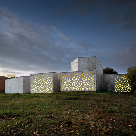
The project comprises five snaking volumes wrapped around the north and east sides of the existing building, which was originally designed in 1983.

Lille Metropole Musee extension by Manuelle Gautrand

Above photo by Vincent Fillon

On the north side these “ribs” house a restaurant opening onto a central patio, before fanning out on the east side to accommodate five galleries showing European art brut.

Lille Metropole Musee extension by Manuelle Gautrand

The new structure is punctured with an irregular pattern to restrict light levels within the galleries while affording views of the surrounding park at the end of each corridor.

Lille Metropole Musee extension by Manuelle Gautrand

This perforated design is repeated on display stands inside.

Lille Metropole Musee extension by Manuelle Gautrand

Photographs are by Max Lerouge except where stated otherwise.

Lille Metropole Musee extension by Manuelle Gautrand

The following information is from Manuelle Gautrand:


The project concerns the refurbishment and the extension of the Lille Modern Art Museum in a magnificent park at Villeneuve d’Ascq. The existing building, designed by Roland Simounet in 1983, is already on the Historic monuments list.

Lille Metropole Musee extension by Manuelle Gautrand

Above photo by Philippe Ruault

The project aims at building up the museum as a continuous and fluid entity, this by adding new galleries dedicated to a collection of Art Brut works, from a travelling movement that extrapolates existing spaces. A complete refurbishment of the existing building was next required, some parts were very worn.

Lille Metropole Musee extension by Manuelle Gautrand

In spite of the heritage monument status of Simounet’s construction, rather than set up at a distance, we immediately opted to seek contact by which the extension would embrace the existing buildings in a supporting movement.

Lille Metropole Musee extension by Manuelle Gautrand

I tried to take my cue from Roland Simounet’s architecture, ‘to learn to understand’, so as to be able to develop a project that does not mark aloofness, an attitude that might have been seen as indifference.

Lille Metropole Musee extension by Manuelle Gautrand

The architecture of the extension wraps around the north and east sides of the existing arrangement in a fan-splay of long, fluid and organic volumes. On one side, the fan ribs stretch in close folds to shelter a café-restaurant that opens to the central patio; on the other, the ribs are more widely spaced to form the five galleries for the Art brut collection.

Lille Metropole Musee extension by Manuelle Gautrand

The Art brut galleries maintain a strong link with the surrounding scenery, but they are also purpose-designed to suit the works that they house: atypical pieces, powerful works that you can’t just glance at in passing. The folds in these galleries make the space less rigid and more organic, so that visitors discover art works in a gradual movement.

Lille Metropole Musee extension by Manuelle Gautrand

The architecture is partly introverted, to protect art works that are often fragile and that demand toned down half-light.

Lille Metropole Musee extension by Manuelle Gautrand

At the extremity of the folds – meaning the galleries – a large bay opens magnificent views onto the surrounding parkland, adding breathing space to the visit itinerary. These views make up for the half-light in the galleries: the openwork screens in front of the bays mediate with strong light and parkland scenery, a feature that recalls Simounet’s generous arrangements in the galleries that he designed.

Lille Metropole Musee extension by Manuelle Gautrand

Envelopes are sober: smooth untreated concrete, with mouldings and openwork screens to protect the bays from too much daylight. The surface concrete has a slight colour tint that varies according to intensity of light.

Lille Metropole Musee extension by Manuelle Gautrand

Lille Metropole Musee extension by Manuelle Gautrand

Lille Metropole Musee extension by Manuelle Gautrand

Lille Metropole Musee extension by Manuelle Gautrand

Click for larger image

Lille Metropole Musee extension by Manuelle Gautrand

Click for larger image

Lille Metropole Musee extension by Manuelle Gautrand

Click for larger image


See also:

.

Conceptual extension
by Axis Mundi
National Glass Museum
Holland by Bureau SLA
More architecture
stories

One Response to Lille Métropole Musée extension
by Manuelle Gautrand

  1. birdy says:

    good example of an architecture that has just been designed from a bird's eye perspective

    • Vince says:

      well said! most of today's architects think inside helicopters! that's no way to think architecture!

  2. sdg says:

    Why do i like the existing building more? Am i that old?

    • Fuxq says:

      The old one is good. I thought it was Kahn's at the first time.
      I am old 2

    • stefan says:

      that's because Roland SImounet's building is way better :)
      on the other hand the interior of the museum is not that bad.

  3. nind says:

    @sdg : well then this new building able to make the old one shine again with its genius way.

  4. Damien says:

    Indeed built from birdview. You absolutely don't get the scheme from the pictures above.

    I don't like much either the permeability suggested by the holes in the concrete slabs, it would probably be better if the graduation would be smoother between blind and glazed parts. The windows are too easily identifiable.

  5. Don says:

    Bad French architecture at its worst.

  6. No. We are just Restrictive. We can just look on humans needs. shame over us. ; )

  7. Fran says:

    What a bad realisation of the prefab pattern !

  8. Fran says:

    Those joins, in the pattern, are just absurd !

  9. Redfern says:

    I agree… and then she didn't even bother posting an aerial photo of the project!

  10. gozzillo says:

    Nice project, but the solution of facades contrast too much with the back part of the building. Not so good taste in choice. The beams should be hidden … not shown behind the facade and walls …

  11. ohtwo says:

    Clearly designed to be viewed from the outside (or a helicopter) and a perfect example of "free in plan, paralyzed in section" thinking. The interior is really let down by the drama implied on the exterior. The designer could've used interior materials in such a way to make all the computer-aided plan manipulations much more apparent. Instead, she stuck with safe, sterile, institutional grey.

    I wouldn't expect visitors to spend too long exploring this addition.

  12. rubadub says:

    how come no helicopter view?

  13. Mark in Melbourne says:

    The concepts were sound enough, however the execution was left unresolved. To make this scheme successful, an emphasis on balance with existing forms was needed – not only in colour, but texture and material as well.. pc concrete was the wrong material for cladding – not only was the weight of the elements apparent, it landed heavily on the ground (and the capping was visible..) The night visuals were its saving grace as forms in landscape, and the interiors were thorough in execution.. maybe longer concept development was needed to make this truly successful…

Leave a Reply

Your email address will not be published. Required fields are marked *

*

You may use these HTML tags and attributes: <a href="" title=""> <abbr title=""> <acronym title=""> <b> <blockquote cite=""> <cite> <code> <del datetime=""> <em> <i> <q cite=""> <strike> <strong>