
Designers Antrepo have created conceptual packaging design for well-known supermarket products by stripping back the existing graphics in stages. Update: this project is included in Dezeen Book of Ideas, which is on sale now for £12.

Called Minimalist Effect in the Maximalist Market, the experiment asks readers to choose which of the stages they prefer.

More information on the designers' blog.

The information that follows is from Antrepo:
Minimalist Effect in the Maximalist Market
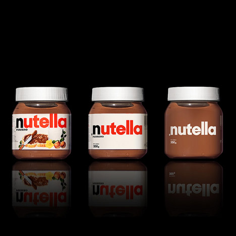
Our last project is about simplicity and we try to find alternate simple version for some package samples of the international brands. We think almost every product needs some review for minimal feeling.

What is your choice in these 3 different variations?
1. Original variation
2. Simple variation
3. More simple variation

P.S. This project is only a design practice for showing minimal feeling of some international samples. It is an article about unnecessary items on the global brands, any of them, second or third variations are not new packaging proposals!

A dose of minimalism and efforts for changing the perception is maybe the simplest definition for Antrepo Design Product.

Antrepo is a multi-disciplinary design consultancy. Also It produces a fresh design object for better tomorrow like posters, industrial object, fonts etc.

At the base of Antrepo are New formulas created by the Antrepo Team.

See also:
.
![]() |
![]() |
![]() |
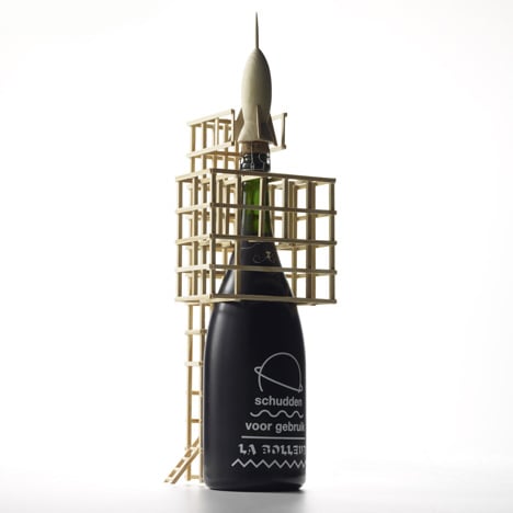
| Champagne packaging for Zarb |
Beer packaging by Brewdog |
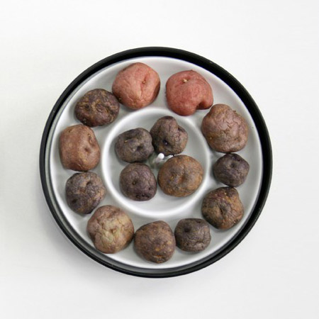
Packaging for potatoes by Héctor Serrano |


It's easy to see where the type holds its own and provides the packaging with a cool improvement, and where the font really isn't strong enough to make the product enticing (corn flakes, toffifee)
maybe just cut some 'windows' in some of the simple packaging and show the real content instead of an unrealistic Photoshop-ed image of if.
in theory I think less is more but when I lived in Switzerland the pictures together with the 3 languages helped me improve my vocabulary.
Since we are bombarded with advertising 24/7 it's nice to see these minimalist designs. As 'they' say: less is more.
Their website depicts their practice as being focused on product design with hardly any example of consumer briefs as in packaging etc. Perhaps they need to learn a bit about that design sector to appreciate why the labelling we have is for a specific reason – ie to attract, persuade and sell. The iconography and visuals in this area of product promotion are actually, as hard to believe Messrs Antrepo, doing a job. And I suggest you stick to your own and not be silly.
I think it goes to show that we often overdesign things, well that seems to be what our client wants anyways.
The third is absolutely the best ,less is more every time!
Looks ok for all BUT the very traditional products, like Nutella or Corn Flakes. In that case the added value is tradition and not the stylishness of the exterior !
Just a caution: Minimizing packaging to the point of not putting on the nutritional information is illegal, and would be dangerous… corporations would feel free to put in whatever they want, and call it a "proprietary secret".
clear packaging really helps the minimalist design…you actually want to see what's inside…..very interesting exercise! as a green thumb i'm for it as well…
although it's sleeker, the character of the brands gets lost.
simple example:
how do you feel when shopping beverages of above design bottles in a medium size supermarket, ? It all look the same., very boring!
let alone this is not efficient since it doesnt include any information about the product. visually.
So chique! Except for the Pringles, but they aren't chique anyway.
Amazing! Simple is powerfull. When you have an important name like this global brands, you just need your name for sell it.
A great example is the White Album of The Beatles.
interesting project! back to basic and see if we really need the extra decorative graphics or not.
:)
I have to say that the fully minimal packages don't work at all, and as somebody pointed out – if they worked they'd be done like this. These designs have come out of dozens of years of market research and experience, they are there because they sell, basically.
For nutella for example, both of the simplified packages completely lose any "desireability" effect – all I see is brown goo with a logo. On the original package, the illustration of a bread with the nutella spread on it goes a long way of telling the consumer what the product is and making it look appealing and tasty.
The simplified nesquicks look like nutritional supplements, instead of chocolate milk.
Mr. Muscle on the other does work in the slightly minimal version (middle one), the fully minimal, not sure what it is but it just doesn't look right.
My overall impression is that, for food products especially, if the product illustration is removed from packaging the whole thing just becomes less appealing. Whether it'd be a chip, or a square of chocolate, or whatever else, the product conveys the idea of "tasty", without that the product becomes neutral and unappealing.
It is a bit easier with non-food products, like Mr. Muscle, but even then, I think the fully minimal version rarely works.
The best thing about stripping down to the basics is that it conveys a sense of confidence in a brand. It's a strong statement to have only the basic information present. Although, in the case of the Nutella I do miss the beautiful rendering of the macadamia nut ;)
I think it only really works when you can see inside the packaging…
While I like the Schweppes bottle, I'm not so sure about this. I'm all for minimalism, but think of these products as a collection on a supermarket shelf. Pretty bland and unappetizing if only the number 3s are present.
somehow it just lose most of the brand identity, and then any design in the future would have less design elements to refer to.
It will work well on something already highly recognized. The 3rd variation gives a more organic look to the packaging, which I think is appealing to the health concious consumers.
Try giving a hint of red to the letter N in Nutella. Makes a lot of difference.
Love it.
The message?
Cut the bulls**t.