La Cite des Affaires by Manuelle Gautrand
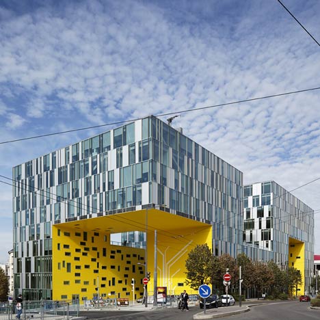
This angular structure looping around a central courtyard is an office building in Saint-Etienne by French studio Manuelle Gautrand Architecture.

The façade of the building is made up of opaque and glass rectangular panels, contrasting with the yellow underbelly where parts of the volume have been cut away.

Three entry points have been created where the building rises and falls, providing a yellow canopy over the pavement.

Above photograph is by Philippe Ruault
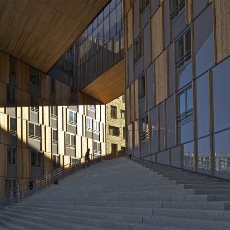
A central courtyard allows easy circulation in and around the building.

Above photograph is by Philippe Ruault
The building houses the offices for several government bodies, as well as a restaurant, tourism bureau and leisure facilities.

Photographs are by Vincent Fillon unless otherwise stated.

Above photograph is by Philippe Ruault
More projects by Manuelle Gautrand on Dezeen »

More office buildings on Dezeen »

The following information is from the architects:
“LA CITE DES AFFAIRES” IN SAINT-ETIENNE - Grüner district – Zac Châteaucreux, Saint-Etienne

This office building (1.500 workstations) groups various public services, including the head office of ‘Saint-Etienne Metropole’, a business canteen and 400 parking places.

Above photograph is by Philippe Ruault
The site is a vital liaison point between the centre of Saint-Etienne and the new Chateaucreux neighbourhood, to which it forms a major entranceway.

Above photograph is by Philippe Ruault
It also constitutes a pole grouping several government bodies that will set up there : Regional Development Authority, Tax Services, Epora, Saint-Etienne Métropole, and so on.

Above photograph is by Philippe Ruault
Service and leisure facilities will also be part of the mix: shared corporate restaurant, café, tourism bureau for the metropiltan area.

Above photograph is by Philippe Ruault
The idea is to develop a long built ‘continuum’ on the site to interact with adjacent streets.

A linear construction that rears up and unfolds but also hugs the ground line to form a low accessible building - one that opens spacious courts and lifts bold overhangs.

Each of its large bays serves an access route: the main portal opens to the concourse on avenue Grüner, which draws pedestrians into the project in a sliding movement.

A high ceiling shelters and magnifies this entranceway, which is the finest and largest of three.

The other two large ‘ports’ open the project to the streets that irrigate the lot, interconnecting pedestrian itineraries in the area.

Our desire for continuity in construction does not simply reflect the idea of building a legible and unitary urban landmark, it also provides the flexibility that the project needs.

Above photograph is by Philippe Ruault
In fact, the principle behind this continuum is to imagine a set of ‘communicating parts’ that enable the user-administrations to merge into a whole, one and all, and to evolve according to their needs in harmony with those of other tenants.

Above photograph is by Philippe Ruault
The absence of breaks in surfaces will ensure that things remain open-ended, with the possibility of extending or reducing space.

Above photograph is by Philippe Ruault
The project is like a large ‘Aztec serpent’ rising on the lot.

Above photograph is by Philippe Ruault
Its body has three identical outer faces, and an underside that is different: a skin of silvery transparent scales and a bright yellow ‘throat’, shiny and opaque.

Above photograph is by Philippe Ruault
This dual treatment of surfaces obeys a simple logic shared throughout, which aims at expressing clarity in folds.

Above photograph is by Philippe Ruault
Depending on these movements, the yellow underside is either a floating canopy or an interior vertical wall, accompanying internal pedestrian movements with its rich luminous presence.

The nearness of so much gorgeous yellow brightens up pavements and glazed elevations, casting golden washes over them like sunlight…

This is a project that is about bringing together yellow and grey, silver and gold.

ARCHITECT
Manuelle Gautrand Architecture: Manuelle Gautrand - representative architect, Thomas Daragon - works project manager, Yves Tougard - studies project manager

CLIENT
Altarea-Cogedim

Click for larger image
Structure: Khephren
Façade: Arcora

Click for larger image
Maîtrise d’œuvre d’exécution : Debray Ingénierie
Roofing / Finishings: Pitance-Lamy

Click for larger image
Metallic framework : Baudin-Châteauneuf
Façade : Allouis

Click for larger image
Surface : 25.000sqm
Length : 108 m, width : 43 m, max height. : 34 m

Click for larger image
Cantilever 25 m X 20 m without any grounding support

Click for larger image
Dates : 2005: design constest, 2006-2007 : studies, 2008-2010 : works, delivery : september 2010

Click for larger image

Click for larger image

Click for larger image

Click for larger image

Click for larger image
See also:
.
 |
 |
 |
| Monolith by Erick van Egeraat |
Le Monolith by MVRDV |
More projects by Manuelle Gautrand Architecture |