web tracker

Reflections at Keppel Bay
by Daniel Libeskind

Reflections at Keppel Bay by Daniel Libeskind

Architect Daniel Libeskind has completed a family of curved towers beside a bay in Singapore.

Reflections at Keppel Bay by Daniel Libeskind

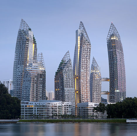
Alternating between 24 and 41 storeys-high, the six glazed residential towers feature rooftop gardens and are connected to one another by elevated bridges.

Reflections at Keppel Bay by Daniel Libeskind

The Reflections at Keppel Bay development also includes a series of aluminium-clad apartment blocks that accompany the high-rise buildings to create over a thousand new residences in total.

Reflections at Keppel Bay by Daniel Libeskind

You can see more projects by Daniel Libeskind here, including a war museum that sparked a fiery debate amongst our readers.

Reflections at Keppel Bay by Daniel Libeskind

Photography is © Courtesy of Keppel Bay Pte Ltd – a Keppel Land Company.

Here’s a longer description from Studio Daniel Libeskind:


Keppel Harbor, Reflections at Keppel Bay

Prominently situated at the entrance to Sin­gapore’s historic Keppel Harbor, Reflections at Keppel Bay is a two-million-square-foot residential development comprised of 6 high-rise towers ranging from 24 and 41 stories and 11 low-rise villa apart­ment blocks of 6–8 floors– a total of 1,129 units.

Reflections at Keppel Bay by Daniel Libeskind

The series of high-rise undulating towers is the focal point of this project. These sleek curving forms of alternating heights create graceful openings and gaps between the structures allowing all to have commanding views of the waterfront, Sentosa, the golf course and Mount Faber.

Reflections at Keppel Bay by Daniel Libeskind

The Libeskind design for Reflections at Keppel Bay skillfully tackles the challenge faced by architects working in contexts such as Singapore: the high-density construction needed to recoup the exorbitant cost of real estate. To address this issue, rather than equally distributing the density across the site with similar building types, the design is composed of two distinct typologies of housing; the lower Villa blocks along the water front and the high-rise towers which over look them set just behind.

Reflections at Keppel Bay by Daniel Libeskind

The artful composition of ever shifting building orientations, along with the differing building typologies, creates an airy, light-filled grouping of short and tall structures. These ever shifting forms create an experience where each level feels unique as it is not in alignment with either the floor above or below.

Reflections at Keppel Bay by Daniel Libeskind

No two alike residences are experienced next to one another or seen from the same perspective; the result of this design is a fundamental shift in living in a high-rise where individuality and difference is not sacrificed.

Reflections at Keppel Bay by Daniel Libeskind

A recipient of the BCA Green Mark Gold Award  from Singapore’s building and construction authority, the form, construction and materials of the buildings are unprecedented for Singapore and particularly for a residential development.

Reflections at Keppel Bay by Daniel Libeskind

The double curvatures of the high-rise towers are unique in the world for structure and construction; they are clad with a fully unitized and insulated curtain wall which is among the first for residential developments in the region.

Reflections at Keppel Bay by Daniel Libeskind

The low-rise villas along the water front are clad in anodized aluminum that creates a luminous surface and provides additional insulation. The six towers are crowned with lush sky gardens on sloping rooflines and linked by sky bridges, providing pockets of open spaces and platforms and unobstructed 360-degree views, the kind of green, open space, rarely found in high-rise buildings.

Reflections at Keppel Bay by Daniel Libeskind

Daniel Libeskind’s first residential project in Asia, and his largest completed residential project to date, Reflections is a creative in­terplay of changing planes and reflections.  It defies the inherent nature of high-density residential developments with its innovative approach to design– creating a new land mark for the greater Singapore.

One Response to Reflections at Keppel Bay
by Daniel Libeskind

  1. sezigue says:

    this is HORRIBLE!!!

    • CodexRios says:

      You are the worst kind of person – simply voicing you're opinion without a valid reason for reaching that conclusion is not helpful – it adds nothing to this thread.

      Personally, I find myself liking this design, despite usually disliking Libeskind's designs, the subtle juxtaposition between the perfectly vertical elevator shaft and the gently bending buildings gives the development an organic feel, despite the construction materials – I think it reflects the tropic climate. As high density living goes, the aesthetics aren't half bad – just have to wait and see how it performs functionally.

  2. Antje says:

    Even it is Daniel Libeskind’s … 'first residential project in Asia, and his largest completed residential project to date' … it is stunning.
    I think it is a creative and elegant design.

  3. ArcAlign says:

    I like Marmite and I like Libeskind's buildings. As ever he is the master of the metaphor. His buildings always have a strong graphic message and photograph well, and having visited a few of his built works, the reality is no less impressive.

  4. Phil Lehar says:

    It's not Frank Gehry. They're not bending and twisting to engender shock. It's a thing of beauty. How I envy the rich, their roof gardens, their mile-high walkways over the sea …

  5. I'm in awe of the originality of this development. It really is like nothing I've ever seen before. These are definitely landmark building worth visiting. My complements to the architectural and engineering team. The critic in me can't help but comment that the exterior forms and finishes do appear to be pre-damaged for upcoming monsoon seasons.

  6. SSSO says:

    How long do you think it took for Daniel Libeskind to emotionally accept that one of his projects would actually have curved lines?

    • Joe Bloggs says:

      This isnt his first building with curves? The imperial war museum in Salford, UK was way back in 2002. Just saying.

  7. Akeel says:

    Speechless! i absolutely love it!!

  8. Bob says:

    Crikey, I wish he'd just relax.

  9. johnny says:

    oh dear its real, i hoped this was just a cgi

  10. shien says:

    I can't feel any intense emotion with this like project.

  11. Dave says:

    Environmental problems are here and now and will get worse , this is unfortunate for our time but a fact. More hubristic greedy nonsense like this won't ease the pain. The spetical is over, please except it gracefully and do the best you can to prepare for difficult times ahead.

  12. Ben Dover says:

    Is it me of do they look rather unfinished?

  13. helen says:

    junk-itecture

  14. hovaard says:

    this is disturbing.

  15. Chacy Graber says:

    Corporate schlockitecture with a few gratuitous and meaningless curves thrown in to fool people into thinking this is a design. It's actually pretty disgusting.

  16. Bob Ross says:

    Another sell-out Libeskind building!…Cue up the bursting building bubble in Singapore!!

  17. jacob says:

    Is it just me, or do these buildings have an especially phallic thing? Something about the overall proportions and curve.

    • Archreviewer says:

      Skyscrapers are tall and narrow. That's why you find cities so arousing.

  18. Edwin Dekker says:

    Libeskind used to be inspirational; making symbolic & narrative architecture. Now, his stories have gone stale and boring… And that’s a shame.

  19. peter says:

    These projects are needed as population density (not growth!) is crucial to all societies globally so having a degree of design diversity within this typology is only a good thing. ipark in Busan South Korea is another similar project by liberskind although it has a commercial and residential mix. I prefer to discuss these projects against the normal unadventurous developer driven monotony that generally prevails and seems to never be questioned by forums such as these. To achieve this level of design is commendable and should be encouraged so that greater possibilities for better and more interesting (and diverse) projects are supported by governments and developers in the future.

  20. Astounded says:

    Remarkable. Nothing but stunted haters on this board.

  21. Pirst says:

    Im living in Singapore, and am going to keep an eye on this…as Singaporean architecture has a tendency too turn out looking rather tacky

  22. Johnny Behrens says:

    Finally, adequate and intelligently broke the mold of the x y z axes, without resorting to the free forms of Frank Gehry or Zaha Haddid. Like anything innovative at the beginning is rejected, then accepted and then copied it!

  23. Redfern says:

    It looks just like a commercial mega-development to me… just because it looks different to 'monotonous developments', that doesn't mean it is automatically a good design. The landscaping looks interesting, but the rest looks like commercial mega-development to me with a couple of 'cool' shapes thrown into the mix.

  24. Astra says:

    The white portion nearest the ground looks particularly bad. It's just a jumble of incoherent shapes trying hard for attention. The lack of cohesion is troubling. It's as though a bunch of different architects just threw something together over the weekend and never bothered to refine the concept.

  25. JoJo says:

    OK. I give up. Where did Libeskind hide the cliched 'Crystal' this time?

  26. Patrick Tofts says:

    Hate those metal frames which complete the shape, reminds me of the slack solutions architects adorn everything here in Melbourne. I am surprised DL didn't turn at least to neon like our 'famed' Recital Room.

  27. Ho Chan Li says:

    Libeskind confuses "dumb shape-making" with serious architectural design. This is his usual deployment of gratuitous forms and angles devoid of any intellectual substance. The resultant effect is an annoying jumble of mismatched towers and a crude base that looks like a corporate office park jizzed up with some leaning walls. Big deal.

  28. Andy m says:

    This project needs Viagra

  29. T.G. Grover says:

    The small pavilion structure is particularly weak and foolish looking. It looks like it belongs in a Disney 'Tunes cartoon video. all those stupid angles don't amount to an ounce of architecture.

  30. kgt says:

    Liebeskind's disneyland! It's a shame…

  31. Opaline says:

    There's 1,129 apartments? Are there enough people in Singapore with really bad taste to take so many units?

  32. Dodi says:

    Fortunately Libeskind is so selfish he takes all the credit for everything. So at least he spares the schmucks who worked on it the embarrassment of having their names forever associated with such a piece of crud.

  33. mark says:

    Weird ideas on paper that has been crumbled and thrown into the dustbin is suppose to stay there … but if to be used again then make sure to iron the paper, please.

  34. Junuzo says:

    Irrational and tasteless. I don't understand people who actually like this.

  35. Shane says:

    'Tasteless' is the right word. Libeskind's core audience are vulgar, uneducated types who mistake 'novelty value' for 'sophisticated design'. Look at the drivel he writes about his work. Clearly it is dumbed down design-speak aimed at a lowest common denominator audience too dumb to figure out they've been suckered.

    • vasi says:

      it's one thing not to like the project and criticize it, and a completely different to blantanlty deny Libeskind's contribution to contemporary architecture. a bit more constructive please.

  36. JDP says:

    It's all fairly juvenile, but the worst bits are the short white buildings that look like a converted car parking block, and that childish recreation structure. Libeskind's approach seems to be: "If in doubt, add some crazy window shapes and leaning walls." Acceding to meaningless whims is not my idea of design.

  37. JHL says:

    The curved towers look good but the white blocks surrounding the towers are obviously built to maximise profit which are totally out of place, i pity the poor people who thinks that they are going to stay in one of the towers nut end up in those ordinary buildings….the function room looks like a rip off of Le Corbusier Notre Dame du Haut, Ronchamp + Frank Ghery though.

  38. Marco says:

    This is going to look great when everybody hangs their clothes from the window and the satellite dishes and all…!!!

  39. HBKZ says:

    curve form but visible vertical core. Just a bit conflicting annoying to look at

  40. hfzhan says:

    as objects, they are quite an interesting sight. but to be critical, its just another condo project with some fancy shapes. the curves does nothing to add value to the spatial experience and it seems solely to be a visual effect. and to create "something different" so real estate agents can sell the apartments for exorbitant prices.

  41. Jandra K says:

    It is interesting that they do not show interior photos of a single apartment. Libeskind had to pay another firm to design his apartment because he knows nothing about residential design. I’d guess he was just paid to do the dumb concept sketch for the exterior skin and then other people who knew what they were doing finished the project.

  42. John D. says:

    Libeskind has become synonymous with bad design.

  43. Paul Rodgers says:

    I’m sorry,(well ok, actually not) but my honest opinion is, that this looks like a collection of slightly crooked penises.

    Wonder when a “landmark” changed from being something wonderful to being anything weird.

  44. Ben says:

    I walked around this project a couple of months back, i didn't mind it. haters gonna hate.

  45. Jason says:

    That is the most awful interior lighting design I've ever seen!

  46. Weng says:

    I have seen the project up close, from its interiors, it recreation facilities, from a distance, from the sky gardens on the 8th, 15th and 22nd floors. Stunning project thru and thru. To experience the project in person is quite stunning, the ever changing shapes, how the towers relate to each other, the fall of light through the day and night. Granted the towers and more successful than the low rise, still a top class architectural project.

  47. Jyanzi says:

    The asparagus .

  48. KyH says:

    Ha, wow…A 'graceful' city skyline imminent…

  49. Piquante says:

    Studio Daniel Libeskind – “Making the world an uglier, dumber place, one project at a time!”

Leave a Reply

Your email address will not be published. Required fields are marked *

*

You may use these HTML tags and attributes: <a href="" title=""> <abbr title=""> <acronym title=""> <b> <blockquote cite=""> <cite> <code> <del datetime=""> <em> <i> <q cite=""> <strike> <strong>