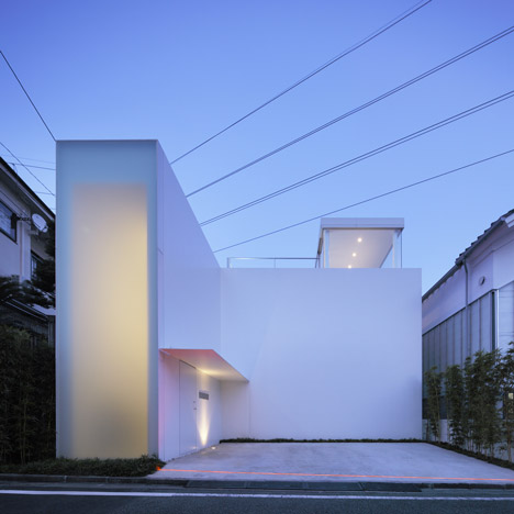
The protruding entrance lobby of this Tokyo house has a seamless frosted facade that glows with diffused light.

Top and above: photograph is by Satoshi Shigeta
Named Cube Court House, the three-storey residence by Japanese architects Shinichi Ogawa & Associates encloses a central courtyard and tree.

Above: photograph is by Satoshi Shigeta
A large double-height room occupies the majority of the ground floor, accommodating a kitchen, lounge and dining area.

Two-storey-high glass walls on both sides of the courtyard permit views across from this living room towards bedrooms on the ground and first floors.

A glazed sunroof is the only room on the top floor and opens out onto a terrace overlooking the courtyard below.

You can also see more projects by the same architects here, including a long narrow house divided lengthways.

Photography is by SOA, apart from where otherwise stated.

Above: photograph is by Satoshi Shigeta
Here's some more text from Shinichi Ogawa & Associates:
Cube Court House (S Residence)
Within a calm residential area in Tokyo, this house has the two contrasting faces: an intimate, introverted, closed house with courtyard and an outward looking, open glasshouse above.

A tall wall of frosted glass on the principal façade brings sunlight into the entrance hall, through which the LDK room is accessed.

The large courtyard is bounded on the North by the LDK and on the opposite side the children’s room and master bedroom.

The small courtyard is placed for the bathroom and the toilets, interrupting the eyes. Totally closed toward the neighborhood, the cubic courtyard connects these modestly sized rooms indirectly, creating a sense of togetherness, while providing a comfortable, spacious living environment; well ventilated, filled with sunlight and connected to the changing seasons.

In contrast, the 3rd floor glazed penthouse and a roof top terrace are perfectly opened towards the city.

Project name: CUBE COURT HOUSE
Completion: 2010
Location: Tokyo, Japan

Program: residence
Structural system: reinforced concrete, steel frame

Site area: 177.72 sqm
Building area: 88.75 sqm
Total floor space: 154.60 sqm


Slightly bored of seeing these white, characterless buildings. Personally, I think it's just a lazy solution.
Most impressive. That's an amazing sheet of glass in the living area. This is really one of the best I've seen here.
seriously, if you are making architecture in japan, can you do anything less than awesome and white with random japanese architects getting all meta on it?
As everyone of their project I really feel like something is missing, it seems like they hide behind the definition minimalism.
The idea of an introverted cube is super old, the spaces inside are not just minimal, but poorly designed, the entire house is full of proportion issues, not to mention that the frosted facade, it's not just ugly, it's also useless, I'm repeating myself..but i don't see any point in building such a thing..
Probably I'm wrong, but I really don't understand this house.
Did the client had any influence in this project? This Kitchen-dining-living area is rediculous.
Livingroom is smaller then the childroom. Court and void between bathroom and toilet?? What a waste of space. `hit and run architecture`
Incredible that one can order a glass that big in Japan. Would have loved to see pics of how they installed it.
Nice project. Although the photographs focused too much on the living room/dining area. What about the rest of the house?
Don´t understand the criticism, i think this is a fantastic achievement on limited space, with the height giving a great sense of freedom and contrast to the denser functional zones. The intimate yard is great too, amazing how only a few plants can set a calming tone. I would love to live there.
There are actually children living here? All I see is a red futon in the "childroom", and even then, it's apparent in some photos and not in others. What does the master bedroom look like? the kitchen? the bathroom? I'd love to see the glazing in the bathroom. I love, love, love modern architecture, but I wish that the photos would showcase not only all the rooms/spaces, but also "real-life" interiors.
Did anyone else notice the stronge orange strip light near the curb? what is that?
Parabolic antenne neighbours on the left side must be very happy with that absurd frosted facade volume obstructing their sun and views. Less (pointless minimalism) is more (people) = better architecture.
It looks like a model house that developers showcase to grab the market but they too have a proper functioning layout!!
I hate seeing vast expanses of walls being wasted. Minimalism is meant to be about refinement and functionality, not sparsity and waste.
if you want to see a big piece of glass in japan look up tezuka architect’s matsunoyama natural science museum
http://www.architecturenewsplus.com/cdn/images/o/…
pvp, the tezuka project is an acrylic panel to deal with snow weight issues. I would like to see glass details for this project haha. never going to happen though…
cool for fuzziness light, but maybe for front space like so empty
IMHO