Schlump One Hamburg by J Mayer H
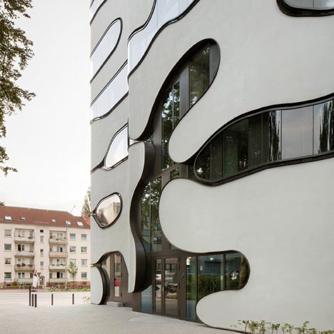
German practice J Mayer H has replaced the gridded facade of a 1950s office building with organically curved glass and white render.

"We tried to design a facade that would be a bit more free, something less strict and linear" explained Wilko Hoffmann of J Mayer H.

Located above the Schlump underground station in west Hamburg, Schlump One is a seven storey building and the architects have extended it to accommodate more offices and the facilities for a private university.

The curved forms continue inside the building, where partitions have rounded openings that form surfaces beside the corridors.

Combined with the extension, the building has a U-shaped plan that wraps around a courtyard at the rear.

We've published a few stories about J Mayer H over the last year, including a round-up of projects in Georgia and proposals for a building made from scaffolding.

See more stories about J Mayer H »

Exterior photography is by Jan Bitter and interior photography is by Ludger Paffrath.

Here's some more information from the architects:
Schlump ONE – Hamburg, Germany
Office Complex and University Building
The project "Schlump ONE" is located directly at the underground station Schlump in Eimsbüttel district in Hamburg.

The original administration building from the 1950s and 90s was gutted, renovated and expanded, and has now been converted into an office building with four possible rental units per floor.

The existing data processing center in the courtyard has been transformed into a private university and expanded to include a new building.

The building’s facade has been completely renovated and redesigned to form a single unit that freely interprets the original building’s 1950s linear design.

The organic formal language of the facade is continued in the design of interiors.

Above: original office building
The project is embedded in a sophisticated, open space planning design with oversized tree sculptures.

Site plan - click above for larger image
Project Team: Juergen Mayer H, Christoph Emenlauer, Mehrdad Mashaie, Ana Alonso de la Varga
Project Architect: Hans Schneider

Ground floor plan - click above for larger image
Project: 2010 - 2012
Completion: Summer 2012
Client: Cogiton, Projekt Eimsbuettel GmbH, Hamburg

Typical floor plan - click above for larger image
Architect on Site: Architekturbuero Franke, Hamburg
Structural Engineers: WTM Engineers
Building Services: Energiehaus Ingenieure, Sineplan, Hamburg
Landscape Architects: Breimann Bruun Simons, Hamburg