Calvert Brody typeface by Margaret Calvert, Neville Brody and Henrik Kubel
Graphic designer Neville Brody has reworked the Royal College of Art's house font by Margaret Calvert as part of the London institution's rebrand.

The RCA asked Neville Brody, who made his name as art director of fashion magazines The Face and Arena and is now dean of communication at the college, to come up with a new identity for its buildings and press material.
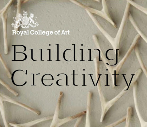
Brody and his design office Research Studios worked with Henrik Kubel, a graphic designer who graduated from the RCA in 2000, to produce the Calvert Brody typeface as a "remixed" version of the college's house font Calvert.
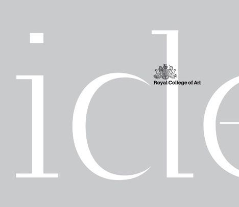
The Calvert font is by Margaret Calvert, the graphic designer best known for creating the UK's road signage system in the 1960s and a former graphic design course director at the college.
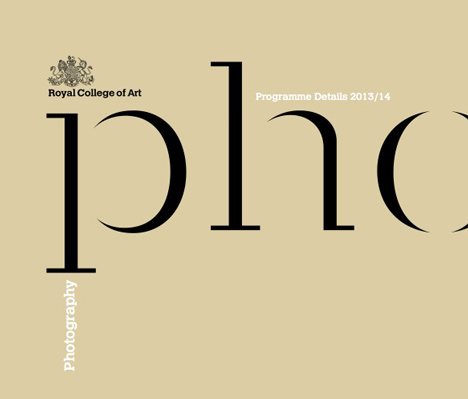
"The idea is like bringing in a producer and doing a remix of music, so I remixed Margaret's font," Brody told Dezeen. "I've tried to make it both more classical by making it more exaggerated and thick and thin, and at the same time make it more industrial and contemporary, by bringing in the - hopefully interestingly - redrawn pieces plus the stencil."
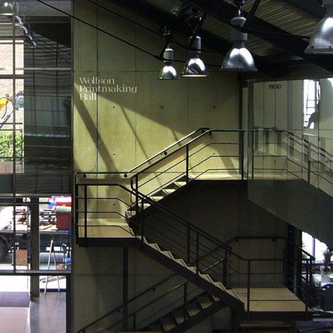
Calvert Brody will be used throughout the college's buildings, either sprayed directly onto walls or laser-cut into metal, and will also appear in print and on screen.
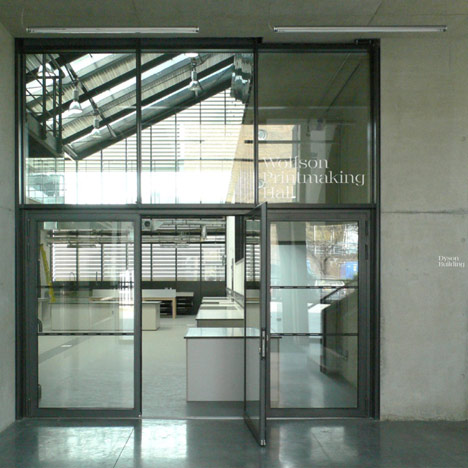
"Hopefully we've come up with an interesting typeface that encapsulates a lot of different ideas about the Royal College, which is sort of robust but innovative; it's slightly non-traditional but at the same time giving a nod to a very traditional source," Brody added.
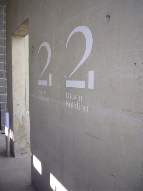
The designers were asked to reflect the college's history as well its current reputation for innovative design and fine art practice, said Octavia Reeve, the RCA's senior publishing manager, who led the rebrand with the designers.
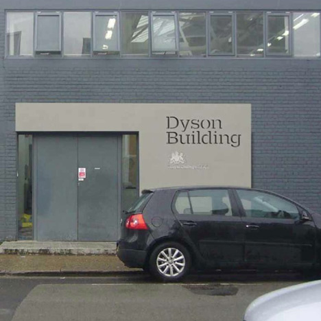
Above: image shows how the font might be used on exterior metal signage
"The typography is key to this," she told Dezeen. "It’s a great message that three generations of RCA graphic designers have collaborated on this essential new element of the RCA’s identity," she added.

The font is currently on show as part of an exhibition at the college celebrating its 175th anniversary. The Perfect Place To Grow: 175 Years of the Royal College of Art runs until 3rd January at the RCA, Kensington Gore, London SW7 2EU.
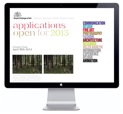
The rest of the RCA's rebrand, also designed by Research Studios, launches on 1st January 2013.
Dezeen previously published a movie with Neville Brody for the Design Museum’s Super Contemporary exhibition, in which he talks about the people, places and cultures that have defined his life in London.
Writer and broadcaster Andrew Marr recently warned that the Royal College of Art will end up as a "Chinese finishing school" unless the UK government does more to encourage young people to study art and design.
See all our stories about typography »
See all our stories about Neville Brody »
See all our stories about the Royal College of Art »