4D typography by Lo Siento
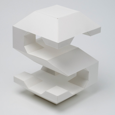
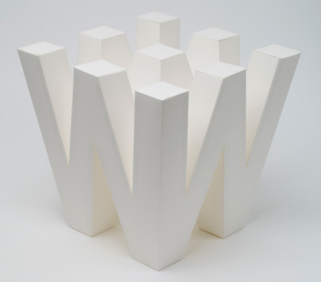
Barcelona graphic design company Lo Siento has created a set of sculptural letters that can be read from all sides (+ movie).
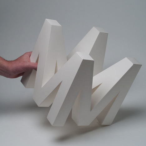
The studio had been working on several projects relating to architecture when they decided to try out "four-dimensional" typography.
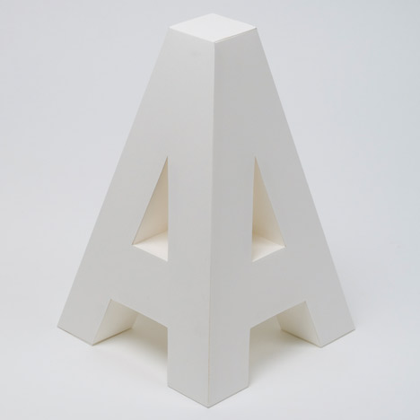
The designers constructed the letters from pieces of white card.
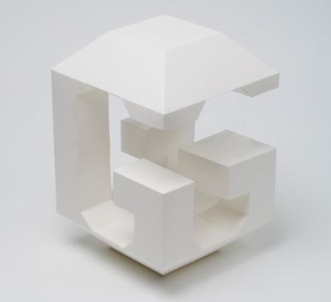
When the letters are strung up, the reader can walk around and through words and read them from any direction.
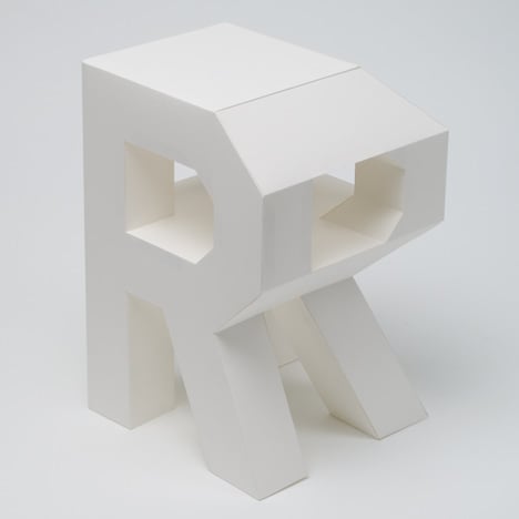
The movie is by Marcel Batlle and Lander Larrañaga.
Photographs are by Lo Siento.
See all our stories about fonts »
Here's more text from the designers:
4D Typography is the result of the intersection in an orthogonal way in space of two extrusions of the same character, which allows the spectator to read it from two different positions in space at least.
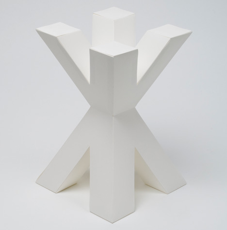
An observer searching to enjoy a particular architecture is forced to move around and through it. The change in perspective generates new spaces in which light acts in different ways. In this case, it is the typography that makes the effort of abandoning its two dimensions to approach the architectural sense. It does not resign with a third dimension; a fourth one is necessary to complete the reading possibilities. By hanging the typography, the reader is allowed to surround the characters in order to understand all their shapes.
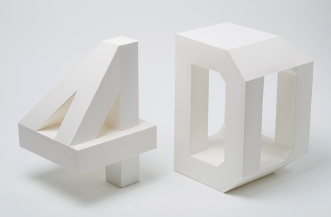
This idea started after Lo Siento carried out several identity projects regarding architecture. This was when the study decided to investigate and develop several volumetric languages starting from basic graphical concepts. One of these languages was 4D typography. It became a personal project from the studio and we decided to develop the whole alphabet. The creation of this alphabet and mistakes that were made during the creation process lead to new ideas for future projects.
Project name/title: 4D paper lettering
Year of work produced: 2011
Work type: Typography / Alphabet
Client: Losiento / self-initiated project
Art direction/Design: Gerard Miró / Lo Siento
Photography: Lo Siento
Work description: Four dimensional alphabet lettering made with paper. Each piece can be read from all 4 sides.