Colour of the moment "millennial pink" dominates at Milan design week
So-called millennial pink is hugely popular in fashion right now, but has also become the most sought-after colour in furniture design, this year's Milan design week revealed.
The name millennial pink was coined to describe a muted shade of the colour – somewhere between beige and blush.
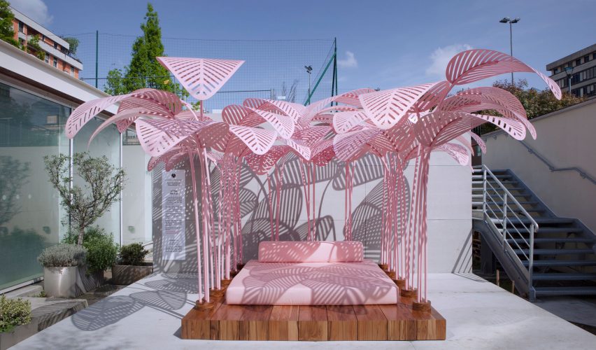
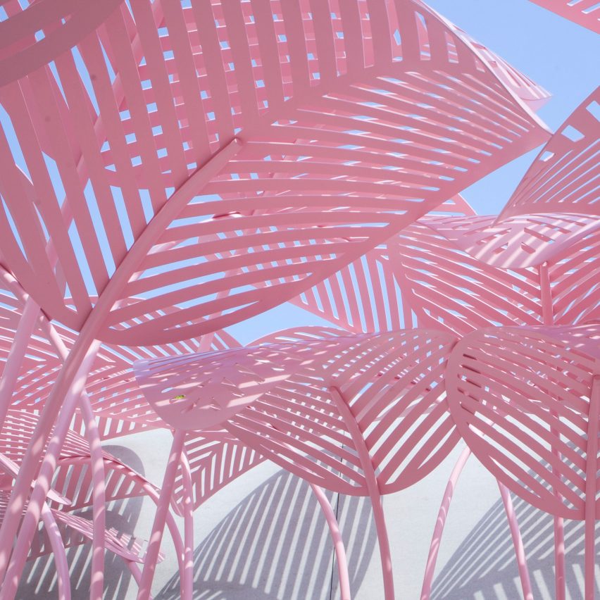
With other design trends thin on the ground during Milan design week last month, the colour somehow managed to become one of the most noticeable crazes. Not only was it showcased by popular brands including Moroso, Muuto and Normann Copenhagen, it featured on the event's most Instagrammed installation, Marc Ange's Le Refuge.
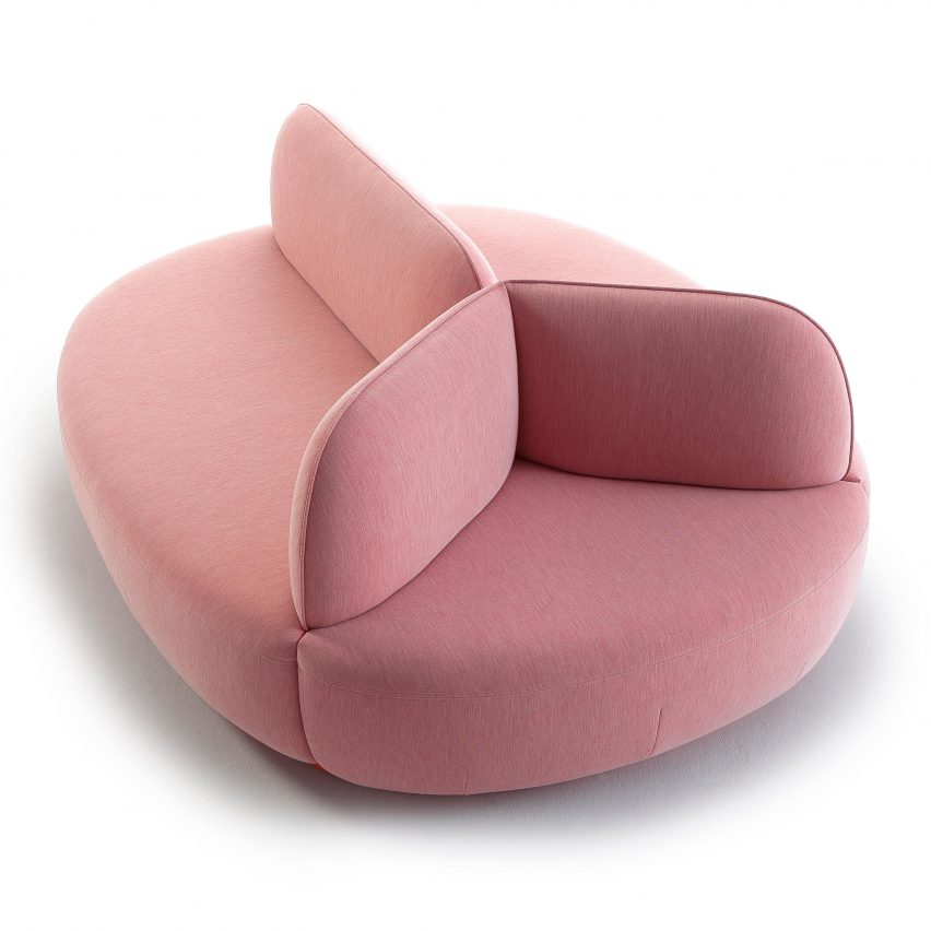
"Pink is a quite soft and friendly colour – it tends to work well with a lot of other colours and adds a certain glow," explained Sanna Wåhlin, one of the designers at Swedish office Note Design Studio.
Her team selected the colour for its biggest Milan launch, an island sofa for Spanish brand Sancal, but also recently used it to create a pop-up restaurant at Stockholm Design Week and a collection of workplace partitions.
One of the main reasons for the colour's popularity, according to Wåhlin, is that – unlike more vibrant shades of pink – it is free from girly-girl associations, so appeals to men as well as women.
"We use pink a lot and we are more men than women working in the studio," she told Dezeen.
"When suggesting pink to our clients, they seem to feel quite brave when they say yes, and being brave in design is a good thing – it means you’re moving forward, pushing boundaries."
The growing interest in pink has been widely documented in the media, and not only by fashion publications – the Guardian, New York Magazine and the Times have all written about it extensively.
The trend can be easily traced back to 2016, when the more warm-hued Rose Quartz was one of Pantone's two colours of the year. The colour company later listed Pale Dogwood, an even closer match, on its trend forecast for spring 2017.
For Italian designer Matteo Cibic, the inspiration for the colour goes back even further – to Wes Anderson's movie The Grand Budapest Hotel, where it features frequently. He is one of many creatives to list the movie as a design stimulus.
"Wes Anderson used it in Mendl's pastry in The Grand Budapest Hotel, and it reminds me of marshmallows," he told Dezeen.
"I often find pink in the work of my design heroes," he added, listing fashion designer Paul Smith and interior designer India Mahdavi as role models. "It definitely makes your day and makes the people around you more happy."
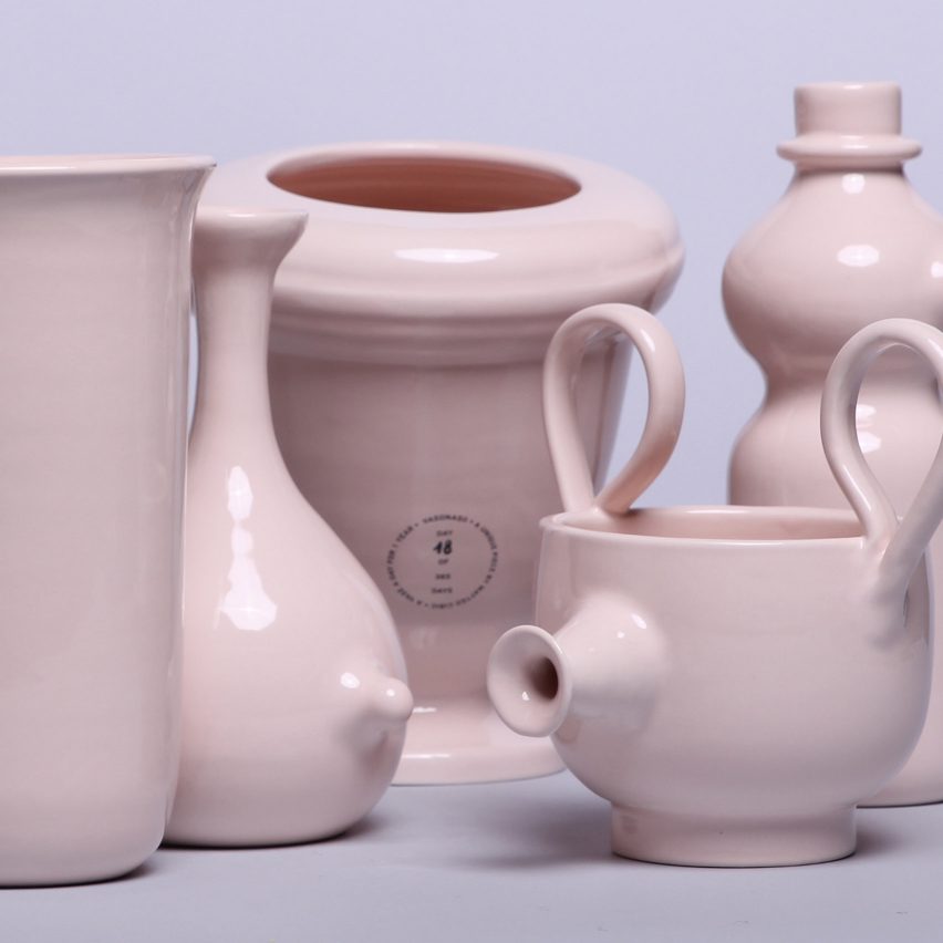
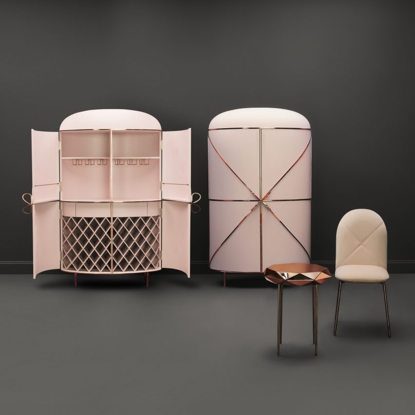
Cibic used the colour for two separate projects he showed in Milan: a series of 365 anthropomorphic vases and a decorative cabinet he created for Indian furniture brand Scarlet Splendour.
Slovenian designer Nika Zupanc also chose the shade for two designs she showed in Milan: a range of cabinets, also for Scarlet Splendour, and an angular daybed for British brand Sé.
Zupanc said she has worked with various shades of pink over the last decade, in an "almost rebellion manner", as the colour was so unpopular until recently.
"I first used a dusty pink shade for my Maid chair, which was introduced at Salone Satellite in 2007. I remember there were absolutely no objects in this colour under the spotlight of contemporary design," she said.
"We all felt that we are courageous for introducing this colour, as it had a sort of bad reputation at that time, symbolising frivolity and un-seriousness, far away from the expectations of the design establishment."
"We all hoped that by using it in this new, contemporary way, we would bring it out of the ghetto and give it a new meaning," she continued. "I guess we succeeded."