Snask rebrands North Korea as Love Korea with heart-focused identity
Stockholm studio Snask's North Korea rebrand features a heart motif designed to create a "common feeling of belonging".
The rebrand was created for Icon Magazine's ongoing Rethink feature, which invites design studios to reinterpret anything they choose – from cigarette packaging to the pope.
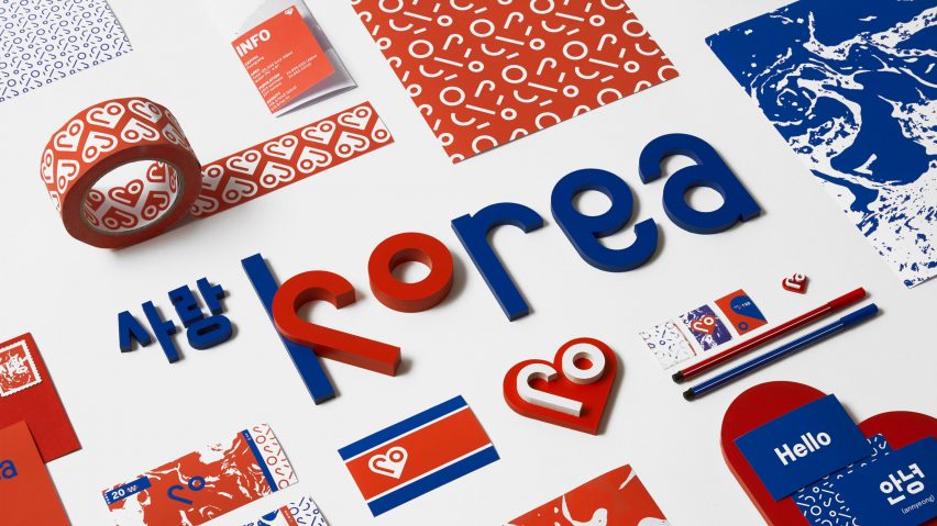
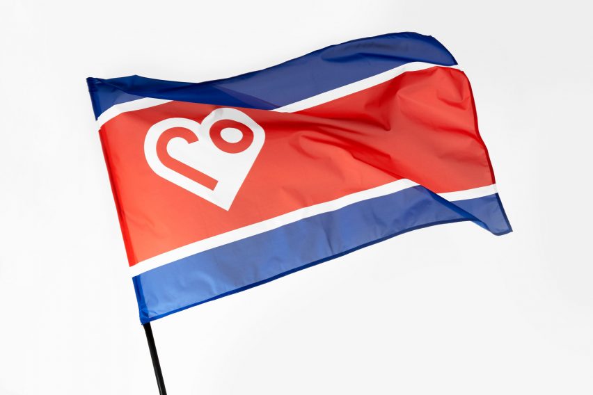
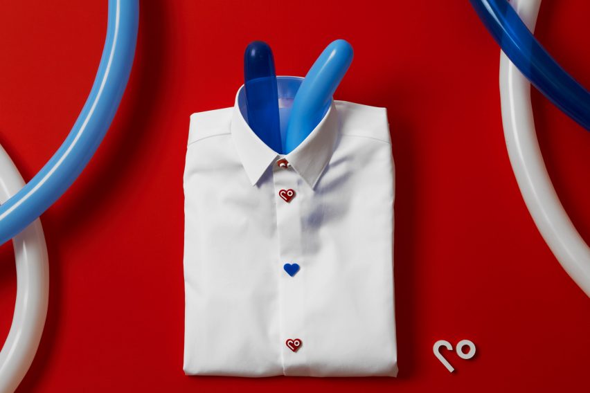
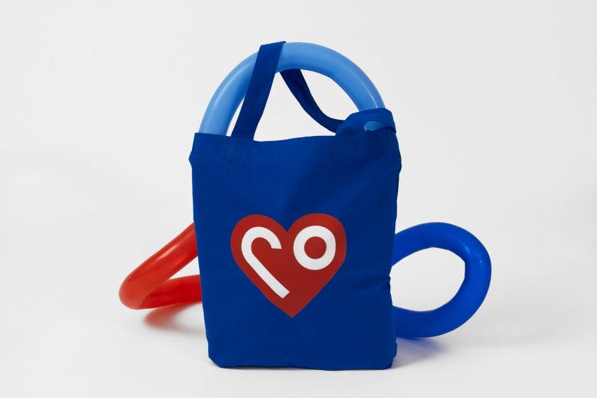
Snask designed a new flag for the totalitarian country, formally called the Democratic People's Republic of Korea, based on its original colours of red and blue and featuring a heart shape. Its logo combines elements from the Korean word for love.
The identity is offered free for the state to use, should it decide to embrace true democracy. The rebrand would incorporate a name change, as well as an ideological one.
"To us dividing the world into north and south, particularly countries, creates boundaries, conflicts and hatred instead of love or a common feeling of belonging to each other," the studio told Dezeen. "So we we chose to change the name from North Korea to Love Korea and what better symbol than a heart for that."
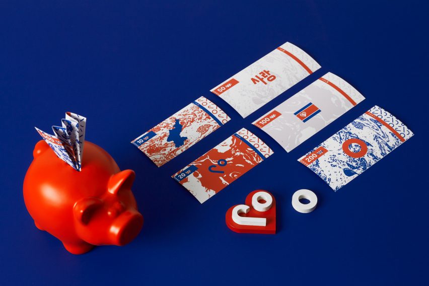
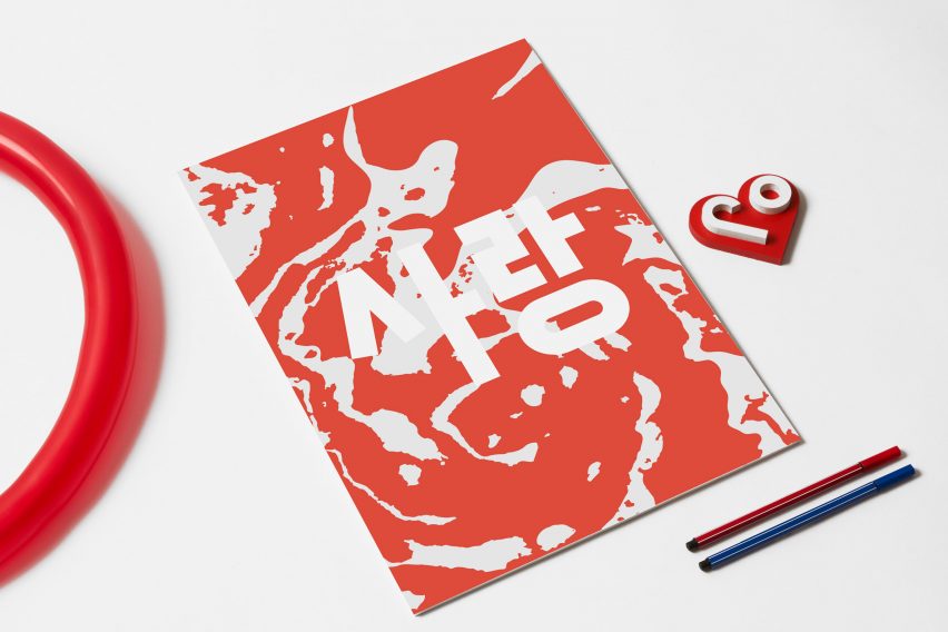
Snask's graphic identity also includes business cards that show the recipient how to say hello in both Korean and English, prototype currency featuring simple graphic patterns made using elements from the logo, and a set of postcards that can be used to announce the rebrand.
For those wearing official uniforms, there's a set of heart-shaped buttons available to "spice things up a bit". Suggested livery for the country's state-owned airline Air Koryo features bright red polka dots and a heart symbol on the tail.
Snask's pleas to North Korea are likely to go unanswered, given the state has come into increasing conflict with the United States and its allies this year after it pledged to continue nuclear weapon testing. The United Nations imposed sanctions on the country following its most recent nuclear weapon tests in September 2016.
However, the studio said the rebranding exercise served a purpose by exploring how graphic design could communicate and inspire change.
"We always get the question about what our dream project is, and to us this truly is a dream project," said Snask's Frederik Öst, who set the studio up in 2007 with partner Magnus Berg. Snask works across branding and graphic design, as well as film and animation – often using decorative type in its work.
"They face such huge challenges the day they become a democracy that they will certainly need help," he added. "Their internal view of their own brand and their leader is extremely far away from the rest of the world's."
"Some people think we actually made this rebrand in the belief it would change North Korea, but we wanted to see if we could show change through design and branding."
French photographer Raphael Olivier sought to contradict the country's reputation as a tourism black spot, with a series of images that capture the unique architectural style of its buildings and monuments.