David Lynch's Twin Peaks sketches inform minimal craft beer packaging
Director David Lynch has collaborated with illustrators Ben Kopp and Keith Shore to design beer can packaging inspired by sketches he created for his cult television show Twin Peaks.
Lynch tasked the Philadelphia-based illustrators with creating "simple" packaging for the beer that was to be sold at this year's Festival of Disruption – a two-day event in Los Angeles curated by the director.
Using drawings that Lynch had originally created for merchandise, the pair came up with three designs based on specific themes from the Twin Peaks series.
Twin Peaks premiered in 1990, and – although it was cancelled – went on to gain a cult following, and even made a comeback earlier this year.
The series is set in the fictional town of Twin Peaks, Washington and follows an investigation headed by FBI agent Dale Cooper, played by Kyle MacLachlan, into the murder of homecoming queen Laura Palmer, played by Sheryl Lee.
"As a fan of the series, it was exciting to use these iconic references, but was very important to make each concept clear and impactful," the designers told Dezeen.
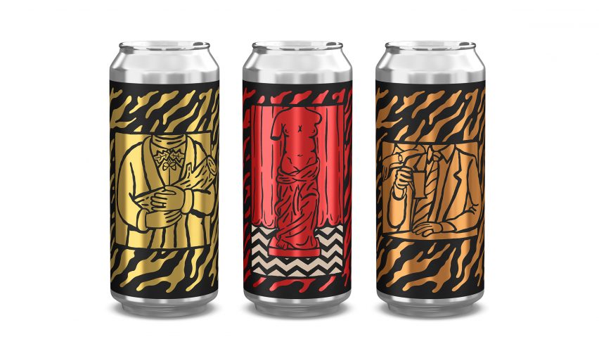
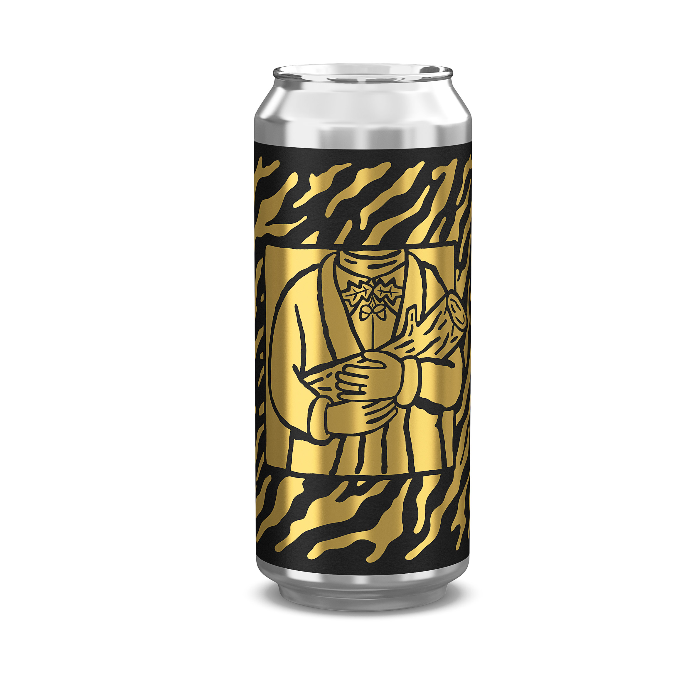
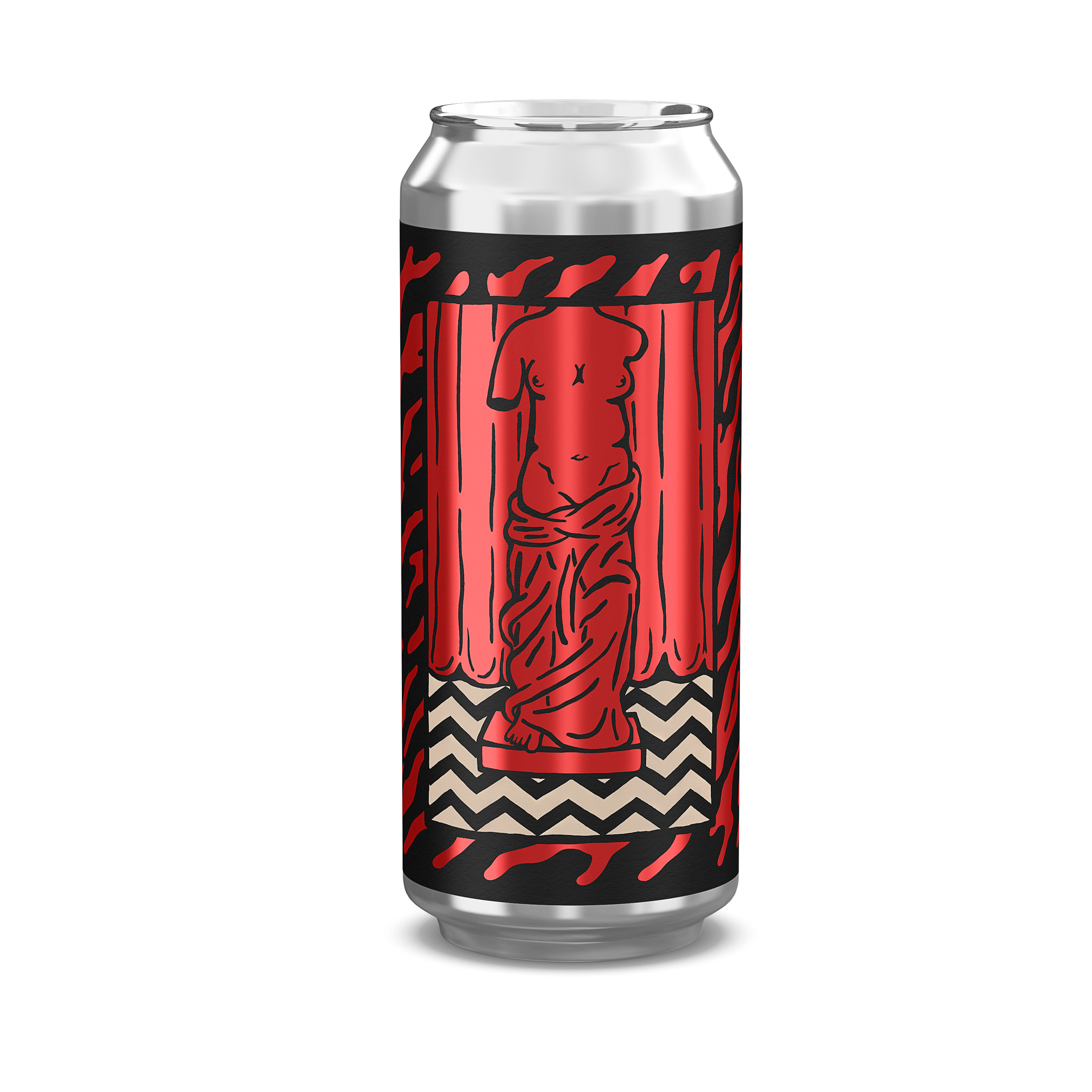
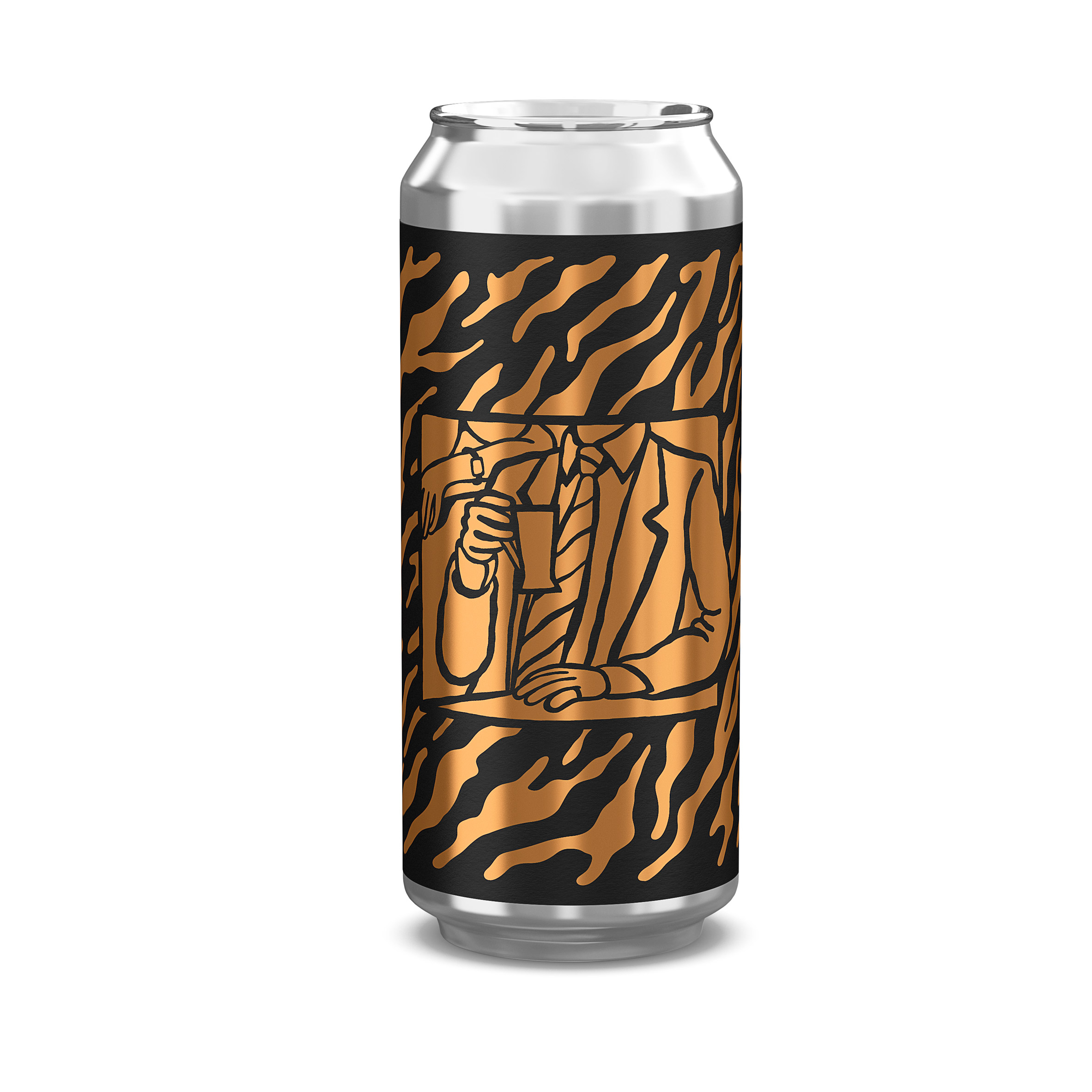
The designers chose not to include character's faces, but opted for more abstract references instead.
Each of the three brews of beer is represented by a different metallic colour: gold for Log Lady Lager, a reference to Margaret Lanterman's "Log Lady" character and her clairvoyant piece of wood; red for Red Room Ale and bronze for Damn Good Coffee Stout.
The hand-drawn illustrations were placed in the centre of each beer can and outlined with matte-black frames. The background features a "drippy" design inspired by patterns found in Lynch's other personal projects.
"Knowing these beers would be limited and collectable, we felt it was important to let the illustrations be front and centre without the interruption of any typography," they said.
For the small amount of lettering on the information label, the designers used a green-outlined type used in the title sequence of the show.
The ongoing trend for craft beer in the US and Europe has resulted in a number of interesting drinking venues, including a concrete shell transformed with slatted timber screens in east London and a waterfront spot in Stockholm.