Lyle's Golden Syrup changes dead lion logo after 150 years
British company Tate & Lyle Sugars has unveiled a rebrand of its Lyle's Golden Syrup for the first time since the inception of the sugar syrup brand in the late 19th century.
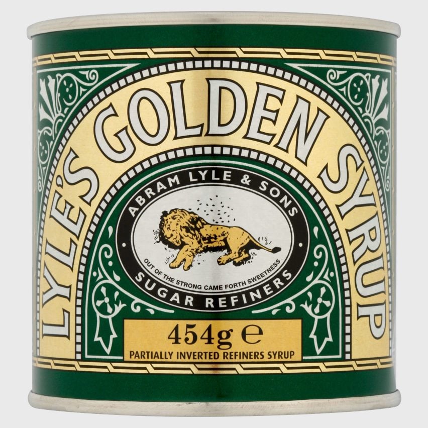
The branding – confirmed by Guinness World Records as the oldest unchanged brand packaging – was updated to remove the illustration of a dead lion surrounded by bees and the accompanying religious tagline.

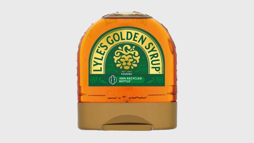
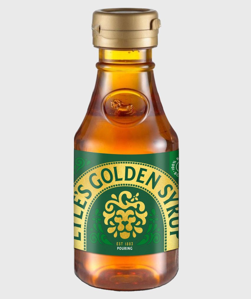
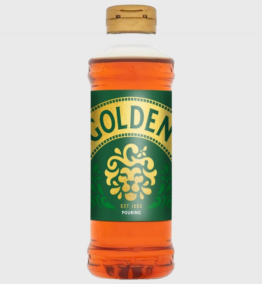
In an effort to bring the product to a 21st-century audience, the new logo will be used across Lyle's Golden Syrup squeeze bottles. But the brand's classic green-tin packaging will retain the original 150-year-old lion illustration.
"While we'll continue to honour our original branding with the heritage tin, consumers need to see brands moving with the times and meeting their current needs," Lyle's Golden Syrup brand director James Whiteley said.
"Our fresh, contemporary design brings Lyle's into the modern day, appealing to the everyday British household while still feeling nostalgic and authentically Lyle's."

Lyle's Golden Syrup was founded in 1881 by Scottish businessman Abram Lyle and, according to the company, it was Lyle's religious beliefs that led to the brand's original logo, drawing from the biblical tale of Samson from the Old Testament.
In the original story, strongman Samson kills a lion with his bare hands and later discovers a beehive nestled within its carcass, exclaiming: "Out of the strong came something sweet".
An interpretation of this quote – "Out of the strong came forth sweetness" – has accompanied the lion carcass logo until now, with the company opting to remove the quote as part of the rebrand.
The lion iconography was abstracted and simplified, removing the full-body lion carcass and swarm of bees. Taking their place is a decorative golden lion's head and a single hovering bee to retain the connection to the original product story.
"We're confident that the fresh new design will make it easier for consumers to discover Lyle's as an affordable, everyday treat while reestablishing the brand as the go-to syrup brand for the modern UK family," Whiteley explained.
The new packaging design will be rolled out across the brand's range of squeeze bottles, dessert toppings and portion packs starting this month.

The rebrand has already proven controversial, particularly among traditional Christian groups who have lamented the dilution of the religious imagery.
Tate & Lyle Sugars was quick to respond that religion played "no part" in the rebrand.
Lyle's Golden Syrup is owned by Tate & Lyle Sugar, which was acquired by American Sugar Holdings Group (ASR) in 2010. Tate & Lyle's was initially established in 1921 following a merger between Abram Lyle & Sons and rival sugar merchants Henry Tate & Sons.
Elsewhere in the food and beverage industry, dessert brand Jell-O recently received its first makeover in ten years and Pepsi updated its logo to hearken back to the 1990s.
The images are courtesy of Tate & Lyle.