"Don't let architectural ego detract from a building's evolution"
This week's comments update is led by the debate surrounding Snøhetta's plan to overhaul Philip Johnson's postmodern AT&T Building, and the backlash that ensued as a result.
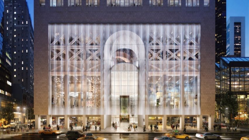
Throwing stones: Snøhetta unveiled plans to add a glass base to the iconic New York tower, now known as 550 Madison, but were met with online petitions and a protest organised by filmmaker Nathan Eddy. The debate split readers down the middle.
"Just what we need, culture arbiters telling us that NYC has too much glass. A filmmaker no less. Hilarious," sneered HeywoodFloyd, who perhaps felt only architects should have an opinion on such issues.
Ponchoes had the completely opposite response: "Just what we need yet another pretentious architect whose answer to every design problem is glass."
Michael Ramirez suggested that the views of some architects were, in fact, the real issue: "Makes no sense being conservative for the sake of it if the building cannot attract any tenants who need to satisfy the needs of today. Don't let architectural ego detract from its evolution."
"Makes no sense to intervene just for the sake of intervention," countered Arc*. "The glass curtain wall skirt has nothing to do with the rest of the building. Don’t let architectural ego detract from an already fine structure."
"This is glass-washing to appeal to real-estate clients and not the people who work in or walk by this building," pointed out Lloyd Bergenson.
One reader felt this was the potential start of a domino effect for the city:
Should Snøhetta's overhaul of the former AT&T building go ahead? Have your say in our comments section ›
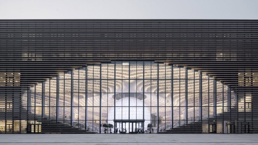
An eyeful: this week, MVRDV's eye-shaped public library was completed in China, but it was the decision to cover some shelves with a wallpaper printed to look like books that got readers talking.
"So a library full of books that you cannot reach. What does this say about the public purpose of libraries and sharing knowledge?" opened Ben, referencing the varying shelf height in the library.
"I was thinking the same, then you realise half of the books are fake and just flat prints. Very tacky!" replied an incredulous Gabriel Tam.
"It's insulting to use fake books in a place where books were burned and people killed for owning banned literature," mused Crusty the Clown.
Ivana Curcic tried to find positives: "It's a very impressive building and attractive looking space! However, when I look at its usability, which as a librarian I do, I find some non-sensical solutions: books difficult to reach, or even see, because the shelves are too low and too deep."
"It looks like a perfect metaphor of the Chinese dictatorship. All flashy and fashion in its appearance to keep people happy and ignorant," concluded Jack Mclathass.
This reader indicated the library was ideal for 2017:
Read the comments on this story ›

Money man: Pether Zumthor's latest renderings of his LACMA expansion, released following a $150 million donation American business magnate David Geffen, came under scrutiny in the comments section.
"Actually look pretty similar to the original ones, bar sharper textures. Still not very excited by the project from these visualisations, yet given Zumthor's built portfolio the project might turn out better than in the images," wrote a nonplussed Jacob.
"Heading in the right direction I suppose, looks less like an airport than in the last set of renderings," concurred HeywoodFloyd lukewarmly.
"Stop hating LACMA because it is not a white cube gallery space. Zumthor's built portfolio has been consistent in their out of this world detailing," fumed Lim Song Jie.
"The name behind the work isn't so important, aside from the fact that it demands an excellent level of craftsmanship," countered John Delaney.
But Kevin Adkisson was not convinced in the slightest: "I just don't understand how the curatorial or exhibits team has agreed to any of this. Where is the lighting? How do you close one gallery to install a new show? This project needs a marketing team to sell it because Zumthor's team certainly is not doing a bang-up job."
This reader was more fussed about fair pay than the content of the drawings:
Read the comments on this story ›
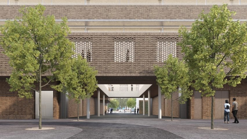
A ton of bricks: images of Herzog & de Meuron design for a new £108 million RCA campus failed to impress many readers, who made their feelings clear about the Swiss firm's decision to use textured brickwork.
David Cloux was finding it hard to get excited about the project: "Wow, I'm getting bored of bricks in London. I propose a motion that anyone designing a flat bricked soffit from here on in gets barred from architecture."
Kay felt cautious about the project: "I like it despite my extreme apprehension of this nostalgic return to red bricks and the fact that this definitely needs lots more refining"
Geofbob thought he had the answer "Is the sawtooth and bricks supposed to match south London's macho image? If so, with knife crime soaring in London at present, we can do without it; how about some exotic, Hadidian, curves instead?"
"No curves, no thanks. This is beautiful. Herzog & de Meuron are great!" replied Thomas, one of the few staunch supporters.
This reader couldn't hide their disappointment:
Read the comments on this story ›