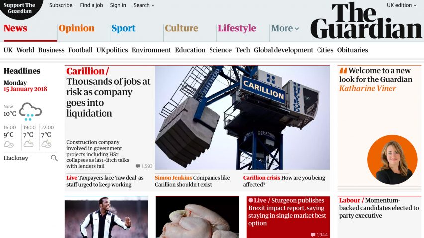
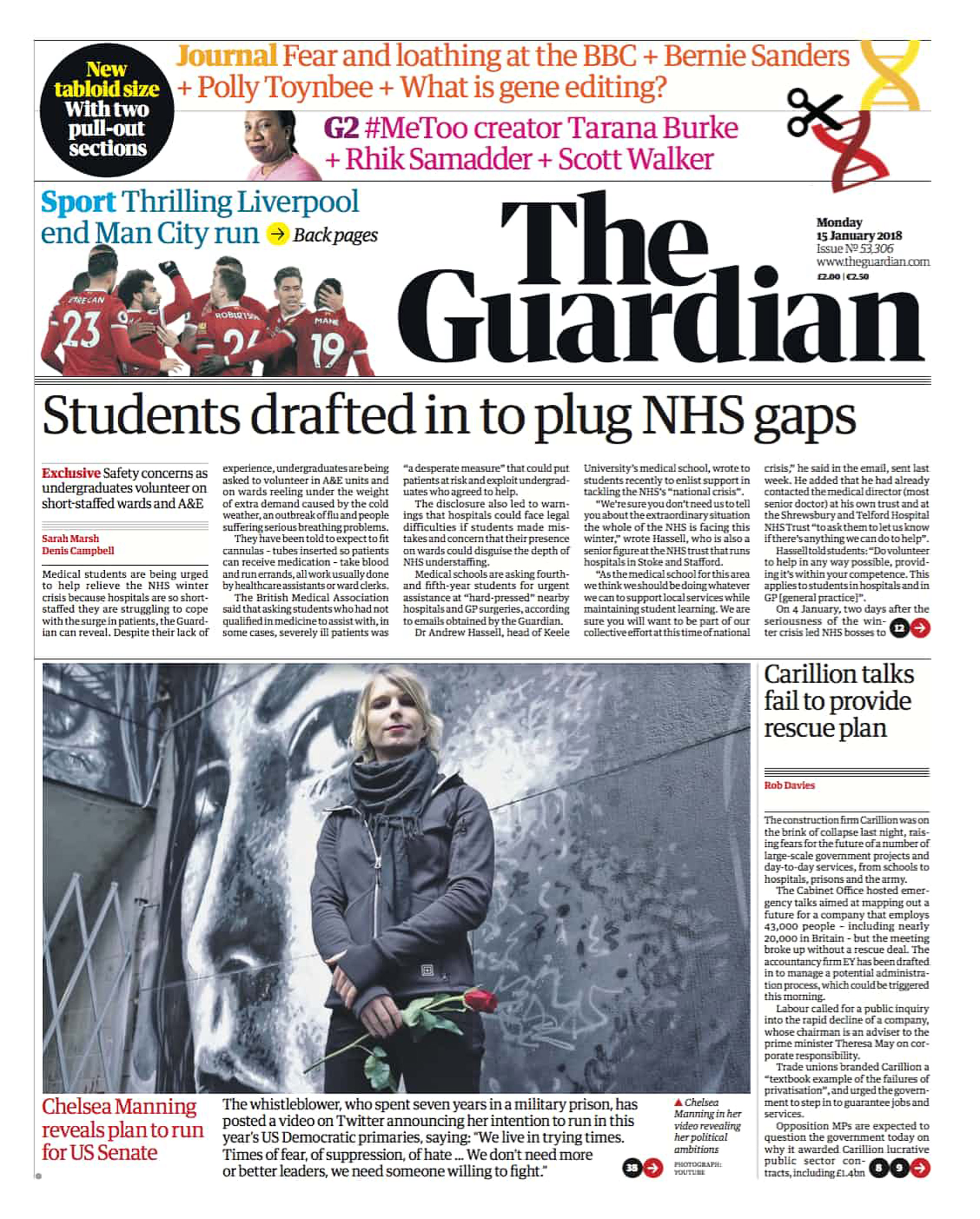
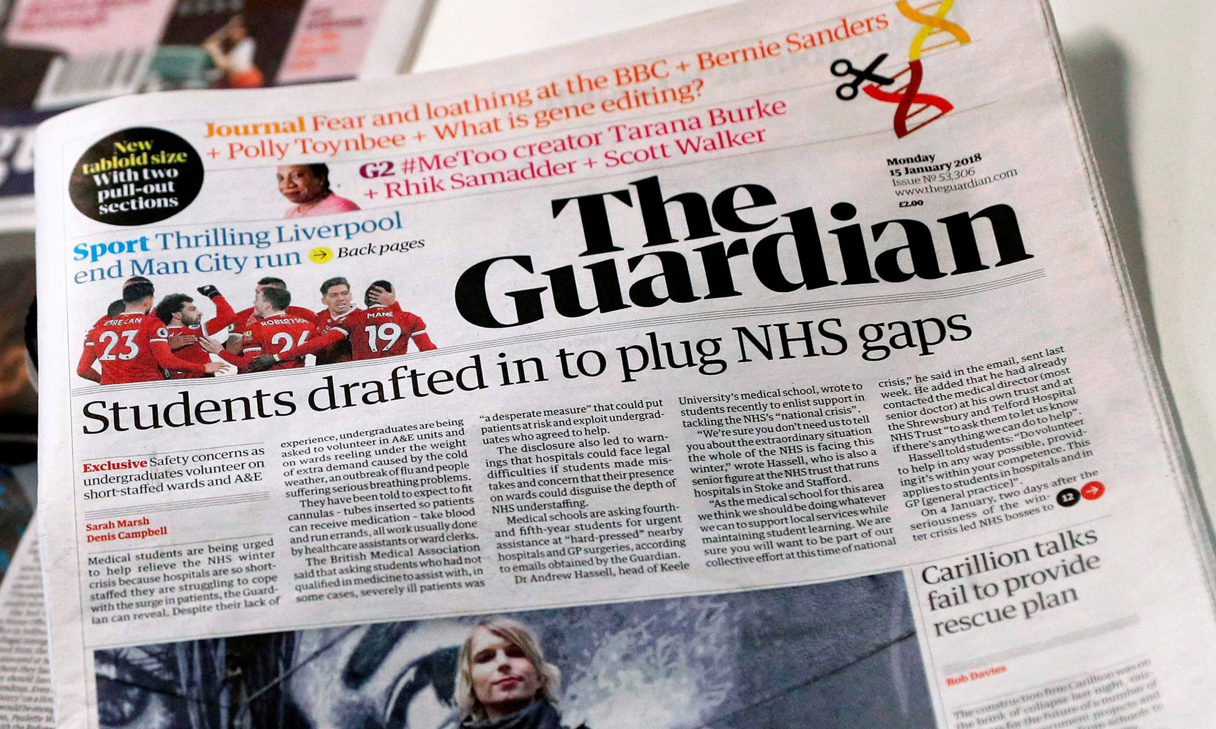
The Guardian newspaper unveils new font and logo in major redesign
The Guardian newspaper has unveiled a simplified and smaller tabloid format, as well as a website redesign that includes the launch of a new logo and font.
Unveiled this morning, the newspaper's smaller tabloid format has been rolled out across all sections and supplements of The Guardian and The Observer.
As well as the introduction of the tabloid format to the printed newspaper, The Guardian's website has also been given a makeover for readers across mobile, apps and desktop.
"It's been an exhilarating period of creativity, imagination and focus, and we’re thrilled with the result," said Guardian editor-in-chief Katharine Viner, in a piece featured in this morning's edition.
"For several months, a team including our exceptional creative director Alex Breuer and senior editors and designers have been discussing and refining The Guardian's new look, as well as gathering invaluable feedback from readers," she continued.
New font designed to be easier to read
Most strikingly, the redesign features a new font and logo designed by New York- and London-based studio Commercial Type, which also created the original Guardian Egyptian font.
Called Guardian Headline, the new font is designed to be easier to read and is described by Viner as "simple, confident and impactful".

The distinctive blue banner that was previously emblazoned across the newspaper's masthead has been removed and the logo, now printed in Guardian Headline on a plain white background, takes up two lines – a change that Viner says communicates "a renewed strength and confidence".
Despite the smaller format, the main text font remains the same with marginal changes to size, line spacing and overall typesetting in a bid to improve readability.
Paper will still use different coloured type
Meanwhile, Viner reports that the newspaper's trademark use of different coloured type for specific supplements and subcategories remains "at the heart of the look" although the palette has been updated with some new "bold and striking" colours.
Every weekday The Guardian will appear in three sections: a main section including news, politics, international affairs and financial news with sport starting on the back page; Journal is a new daily pullout section of opinion and ideas; while G2 includes features and an arts and culture pullout.
On Saturdays, as well as the news section, Journal and a standalone Sport supplement, The Guardian will come with five magazines including a redesigned Weekend magazine, Review, Guide, Travel and Feast – a brand-new 24-page food magazine.
The Observer, published on Sundays, will include a new look Observer Magazine and The New Review.
Switch to tabloid format will save millions
The decision to move the newspaper to a tabloid format was taken seven months ago as part of a three-year plan to generate significant savings and break even at an operating level by April 2019.
The newspaper claims that the move to tabloid printing will save several million pounds.
"The media sector remains challenging," said David Pemsel, CEO of Guardian Media Group. "However, our reader revenues are growing well, and more people are reading us than ever before – we now reach over 150 million unique browsers each month and we have over 800,000 supporters."
"Our strategy to secure The Guardian's future is on track. By April 2018 we will have halved our operating losses in just two years, reducing them from £57 million to £25 million per year, with the goal of breaking even in 2018/19," he continued.
The newspaper confirmed that printing and distribution of the newly formatted Guardian and Observer newspapers will be carried out by Trinity Mirror and that it will also be printed in Scotland for the first time, leading to improved distribution for Scottish readers.