New York Times redesigns website to catch up with mobile offering
The New York Times has subtly reimagined its webpage to better reflect the way its digital subscribers consume news online.
The newspaper has updated both the user experience and the speed of the site to create a uniform branding for readers accessing news across all different digital platforms.
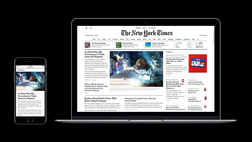
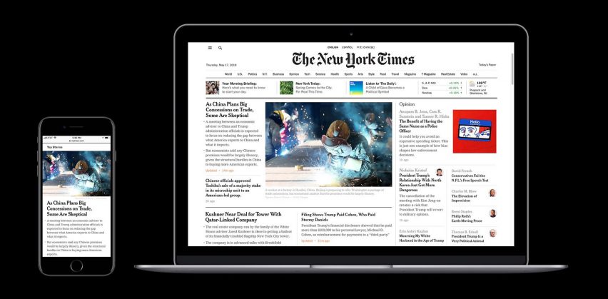
The comments section now runs parallel to the article. The site also supports right to left page-turning for moving between stories, which mimics the way you read a physical paper.
Articles can now be read with a single scroll, rather than clicking through pages to continue. A scrolling horizontal bar at the top of the page leads readers to more stories in the section that they're reading.
A "section" button in the top left-hand corner of the page, allows readers to switch between areas of the paper that the user is interested in. Each page also now has a "share" button.
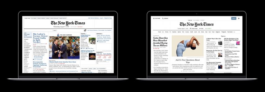
Although the format of stories, the platforms that the website supports and the way readers navigate have all changed rapidly over the last decade, the overall design of the website had remained largely the same.
Until now the paper had focused on making the mobile apps easy to use and visually pleasing, with a full overhaul in October 2017. But the website had taken a backseat.
"We've invested heavily in making our mobile apps expressive and visually dynamic, but our desktop design has lagged behind, powered by a siloed and ageing set of tools," wrote six journalists including Kirsten Dudish, creative director of news experience at the paper, on Times Open – a site on which New Yorks Times employees discuss building digital products and workplace culture.
Not wanting to alienate subscribers who were used to the old homepage, the team first interviewed 40 readers at home in New York, Los Angeles and Houston. They then trialled early prototypes of the redesign with 60 readers chosen from 15,300 survey responders.
"We felt we needed to go through a comprehensive research phase that would get at that fundamental question: where was it in our readers' best interest to make real improvements versus what inherent value should we continue to support and amplify?" Libby Gery, vice president, product design at the New York Times told Dezeen.
The team acknowledged that the desire for trusted editorial judgement on a story's importance and readers' choice are fundamentally at odds.
"The way we've attempted to address this [problem] through the redesign was by being much more intentional in the hierarchy and presentation of what we call Top Stories, while also guiding [readers] toward additional groups of stories – categorised as Features, Smarter Living, In Other News and more – that utilise less hierarchical layouts and feature a variety of story options for readers to choose from as they scroll down," said Gery.
All the web designers sat in with the newspaper's editorial staff for a day to test the design during a breaking news cycle. The hope is that the new, flexible system will shore them up against the need for future redesigns.
"Our intention was not just to create a more satisfying home page but to develop a flexible "product system" that would support continuous improvements to the experience over time," continued Gery.
The Telegraph in the UK was the first newspaper to launch a website, in 1994. NYTimes.com was created two years later, in 1996.
Recent years have seen a number of news websites unveil redesigns, aiming to unite their printed and online versions. Earlier this year, British newspaper The Guardian went down to tabloid size and launched a new font and logo.
Dezeen underwent a redesign in October 2016, introducing a Highlights panel at the top of the homepage and bigger images, while keeping the overall feel of the site.