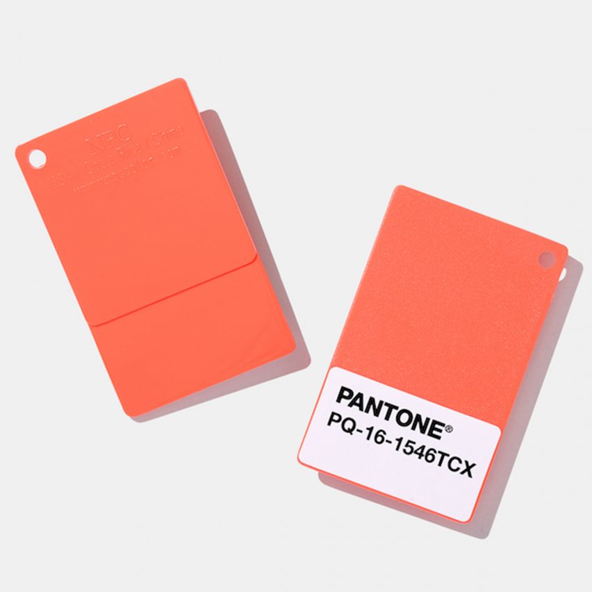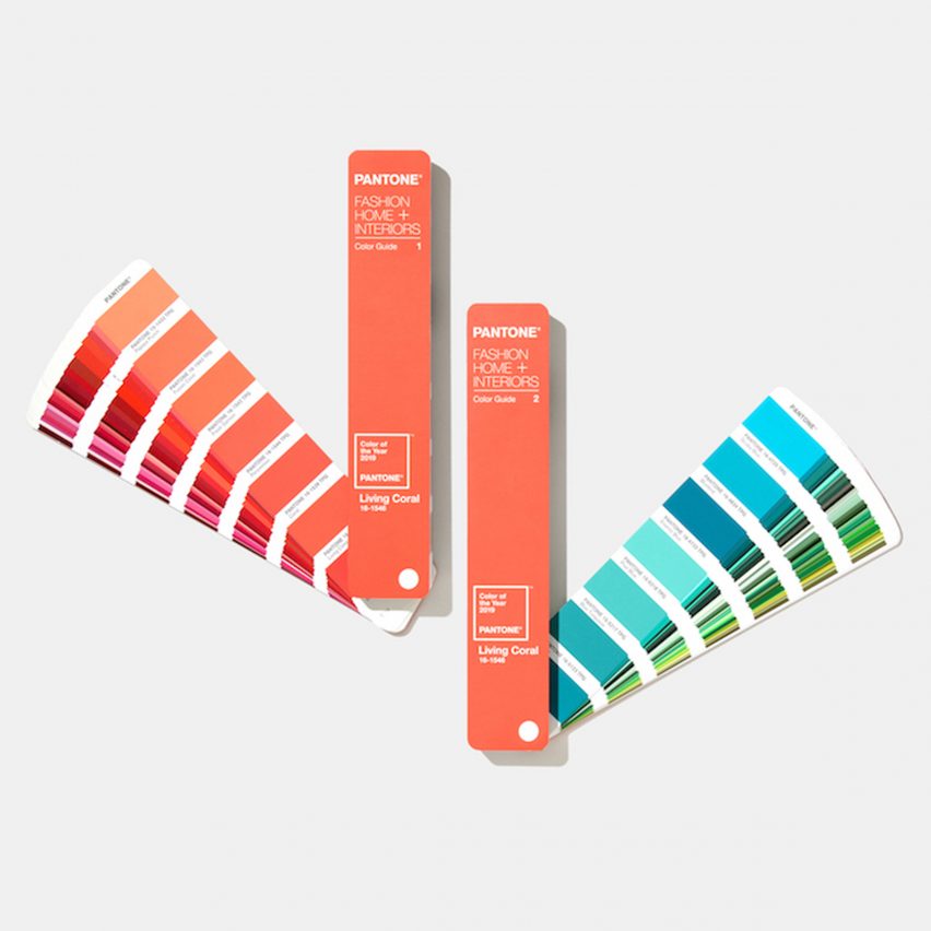
Living Coral is Pantone's colour of the year for 2019
Colour expert Pantone has chosen a peachy orange shade named Living Coral, or Pantone 16-1546, as its colour of the year for 2019.
Announced today, 6 December, the Living Coral colour is described by Pantone as an "animating and life-affirming coral hue with a golden undertone that energises and enlivens with a softer edge".
"Sociable and spirited, the engaging nature of Pantone 16-1546 Living Coral welcomes and encourages lighthearted activity," said the company.

Following on from 2018's colour of Ultra Violet, dubbed by the company as a "dramatically provocative and thoughtful purple shade", this year's vibrant shade of golden orange is meant to reflect the "innate need for optimism and joyful pursuits" as a response to social media and digital technology.
"In reaction to the onslaught of digital technology and social media increasingly embedding into daily life, we are seeking authentic and immersive experiences that enable connection and intimacy," explained Pantone.
The colour is also said to reference the nourishing impact of coral on sea life, as well as the "devastating" effect of today's society on the environment.
Pantone announces a colour of the year every December, based on trend-forecasting research from the Pantone Color Institute.
The colour is chosen based on "what is taking place in our global culture at a moment in time". According to the brand, Living Coral is already being spotted on catwalks in fashion shows, as well as on social media.

"Colour is an equalising lens through which we experience our natural and digital realities and this is particularly true for Living Coral," said Leatrice Eiseman, executive director of the Pantone Color Institute.
"With consumers craving human interaction and social connection, the humanising and heartening qualities displayed by the convivial Pantone Living Coral hit a responsive chord," she continued.
The Pantone Color Institute has been choosing a colour of the year since 2000. Last year, a vibrant purple shade was chosen, and in 2017, a zesty shade of green called Greenery. In 2016, Pantone picked two soft colours – a baby blue and dusty pink.
The colours are often bold in tone. Other recent examples include the purply pink Radiant Orchid announced for 2014, and the bright orange Tangerine Tango in 2012.