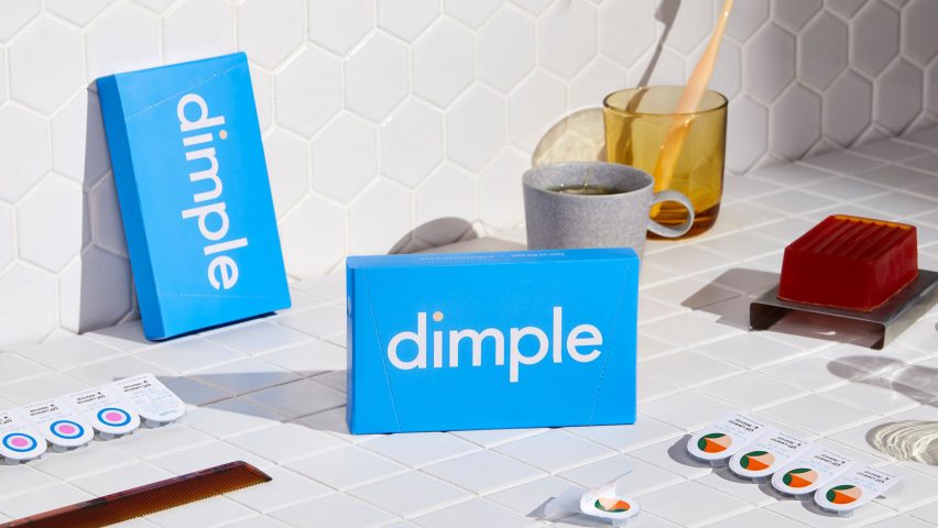
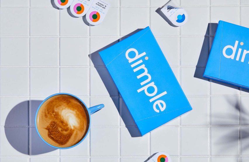
Colourful circles denote contact-lens prescriptions in Dimple design by Universal Favourite
Australian studio Universal Favourite has designed the packaging for contact lens subscription service Dimple, which makes use of boldly patterned circles that correspond with prescriptions.
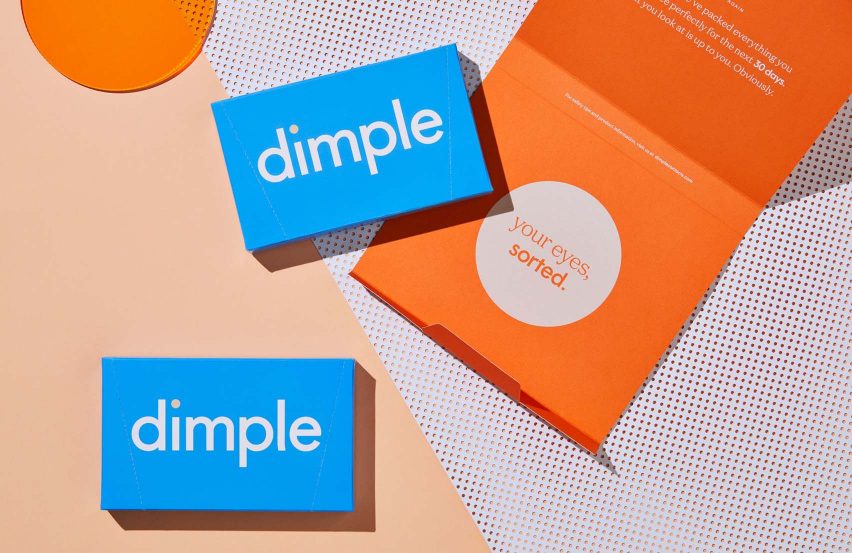
Dimple is a direct-to-consumer service that targets the millennial market. As such, the company needed branding that would stand out on social media and attract new customers — without losing the serious appearance of a medical service.
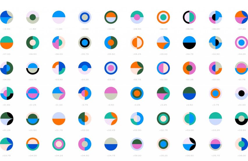
For this reason, Universal Favourite based their design on a series of complementary circle graphics, each one denoting a particular contact-lens prescription.
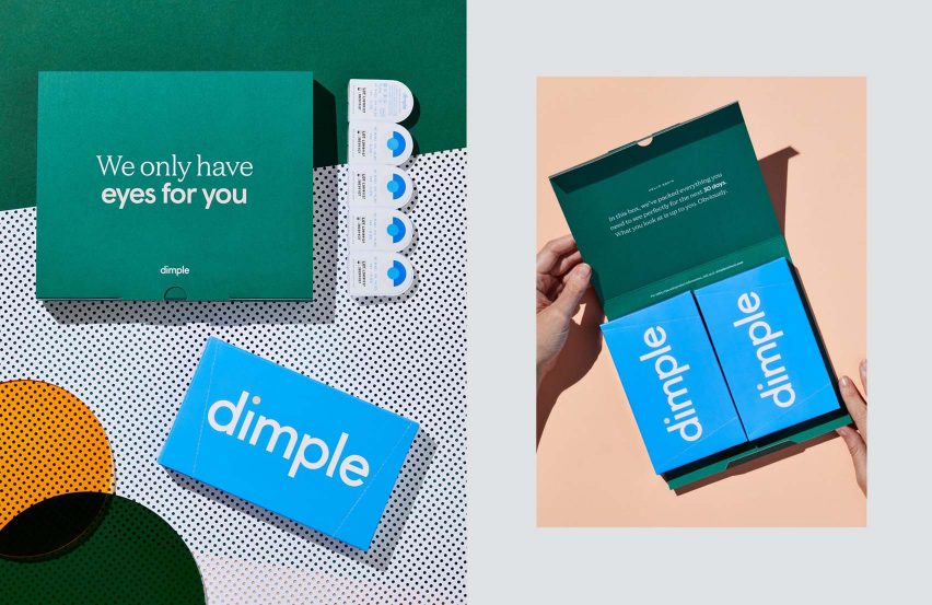
Since most people need different levels of correction in each eye, their Dimple lenses will usually have different packaging for the left and right eye — and the difference is bold enough that the user can see it without their lenses in.
With power numbers ranging from -12.00 to +6.00 for Dimple prescriptions, Universal Favourite created 60 different circle graphics in a palette of blues, pinks, oranges, olive greens, teals and black.
The studio said that the advent of direct-to-consumer contact lenses had created the opportunity to completely rethink the product's packaging design.
"In Australia, four manufacturers control 97 per cent of the contact-lens market," said the studio.
"With this monopoly, there has been little to no effort required to brand their products. Packaging has always been designed with the optometrist in mind — storable, stackable — leaving a sea of white, clinical branding that lacks any connection with its consumers."
Instead, Dimple's mix of usefulness and visual appeal is meant to put the consumer first.
"We wanted to create a youth-focused brand selling a lifestyle as much as a product," said Universal Favourite. "But being a medical product, it was crucial to also convey a sense of trust."
To complement the packaging design, the studio co-ordinated fun campaign imagery, shot by photographer Jonathan May, that was about celebrating Dimple wearers' "individual quirks".
The studio also designed the digital experience for customers, incorporating an "innovative and interactive" purchasing method that again puts the focus on users choosing their individual lens prescriptions.
Universal Favourite's work for Dimple has been longlisted for a Dezeen Award in the graphic design category.
Dimple launched in February 2019, and Universal Favourite reports the brand has already seen a higher than average conversion from trial to monthly subscriptions, with customer numbers growing daily.
Universal Favourite work at the intersection of design, brand strategy and digital products.
Dimple contains echoes of a previous colourful project of theirs, the Complements chocolates, which could also be mix-and-matched into pairs and were given as Christmas gifts for their clients.