Playful Jell-O rebrand captures jelly's "jiggly goodness"
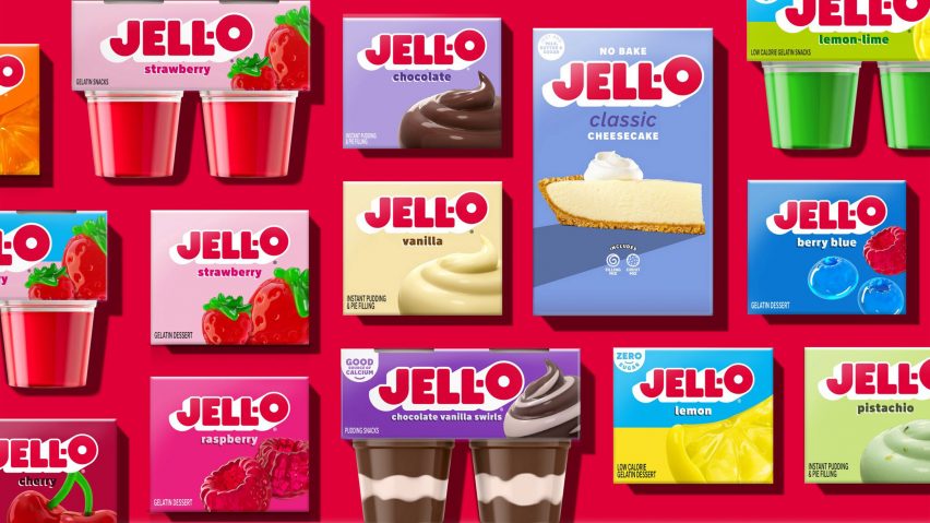
Dessert brand Jell-O has received its first makeover in ten years courtesy of branding agency BrandOpus, featuring a bolder, blockier logo and hyperreal renders of pudding swirls and jelly fruits.
The aim of the rebrand was to attract both parents and kids through "imaginative and playful" imagery, BrandOpus creative director Rebecca Williams explained.
"With the Jell-O renovation, we're bringing back the jiggly fun and harnessing the wonder that the brand brings to adults and kids alike," she said.
"We've loved taking on the task of reimagining and reinvigorating the brand for the next generation of parents by creating an imaginative and playful brand world that invites them to see their every day in inspiringly wonderful ways."
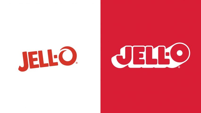
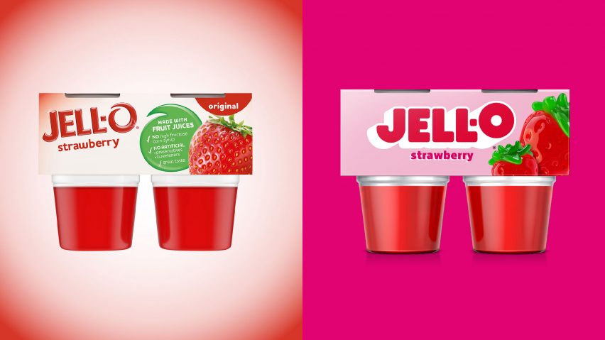
The agency revamped the Jell-O logo by using a simpler, blocky sans serif font that's placed on a white background for a 3D effect.
Previously stylised as an elaborate swirl, the O now sits slightly above the preceding characters as a further identifier of the brand's new identity.
The emphasised ending "spotlights the endless possibilities when it comes to flavourful fun", the design team said.
A signature red was used for the logo, which contrasts the cooler pinks, blues and greens used throughout the packaging.
The updated logo also lies straight and centred across the packaging, where previously it sat slanted and located towards the corner.
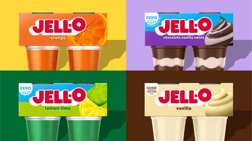
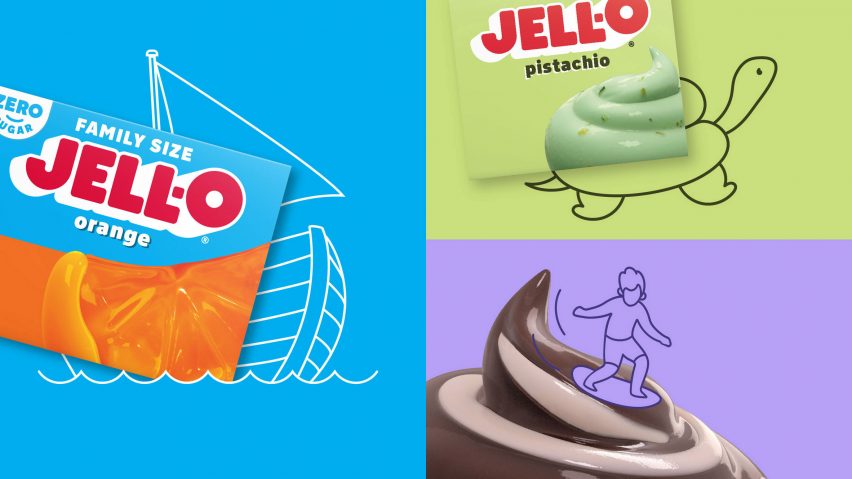
In contrast to the realistic photos on previous packaging, gelatin and pudding flavours are now marked by cartoonish 3D-rendered graphics of jelly fruits and pudding swirls, leaning into the artificiality of Jell-O desserts.
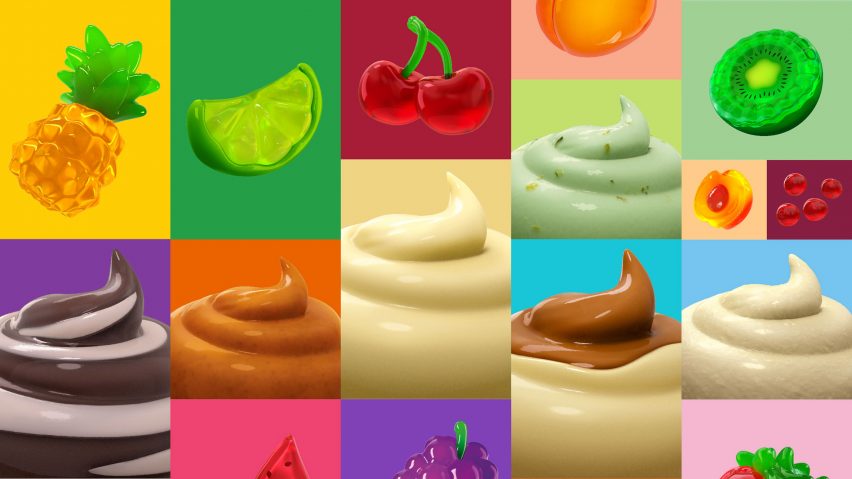
"The new fruit and pudding imagery unleashes imaginations by shifting away from literal depictions of the product to re-imagining how the flavours can come to life in a playful, sensorial way, transporting customers into the Jell-O world of jiggly goodness," said the team.
The playful graphics stand out on backgrounds of simple, solid colours in bright shades.
Similar to Pepsi's rebrand earlier this year, the simplified design also spotlights Jell-O products that have zero sugar content.
Jell-O's new logo and packaging are being rolled out across the brand's entire product range, including ready-to-eat dessert cups and boxes of powders for recreating them at home.
The brand was originally founded in 1845 and underwent its last rebrand in 2013.
Other recent rebrands include Pepsi's new "unapologetic" logo and an uplifting, bolder look for soft drink company 7UP.
The imagery is courtesy of BrandOpus.