FT coronavirus updates "allow people to make an informed decision" says data visualisation journalist
Daily data visualisations created by John Burn-Murdoch for the Financial Times have provided one of the most reliable pictures of the global coronavirus pandemic. He spoke to Dezeen about how his charts allow people to be independently informed.
First started "as a fairly scrappy rough chart" tracking coronavirus cases and deaths, the project has expanded to provide updates on responses by different countries, the effect of measures to mitigate the virus spread, like lockdowns, and economic impact.
"Without data it would be very easy for governments to tell their own story"
Burn-Murdoch told Dezeen that the Financial Times' popular data visuals, which are updated online daily, have enabled readers to remain well-informed in the pandemic.
"If it weren't for the data, a politician could just stand up and say, 'oh it's not true, our deaths are lower than this other country'," he said.
"By visualising the data and the nuance of these different measures and methodologies, we allow people to make an informed decision on whether they're going to believe what they're hearing or whether they're going to, interpret the information for themselves," Burn-Murdoch added.
"Without data it's very hard to answer those questions and it would be very easy for governments or the media or other people with vested interests to just tell their own story about how things were going, and there'd be very little anyone could do to push back on that."
Burn-Murdoch expected to update charts daily
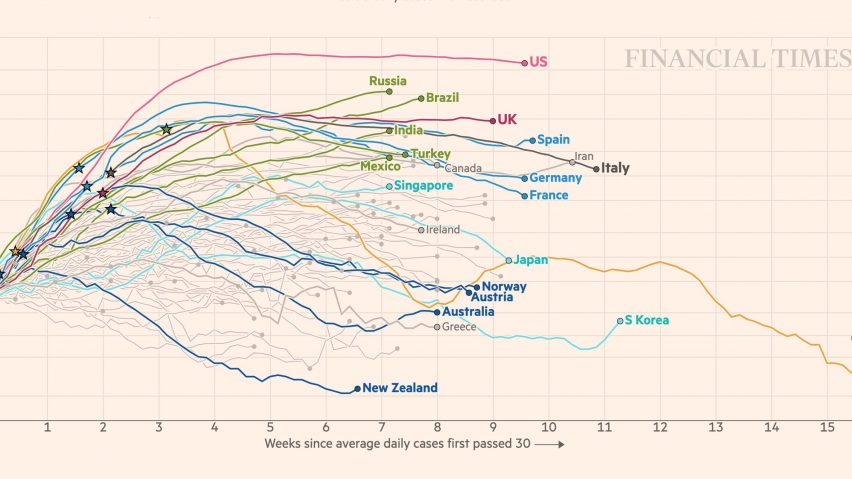
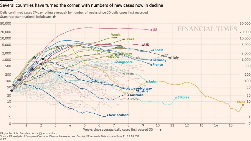
Burn-Murdoch initially created the Covid Tracking Project as a graph using logarithmic scales to depict the exponential growth of the virus, and forecast for the next few days.
Initially, it allowed readers to make comparisons between countries that were yet to experience outbreaks and lockdowns with those that were heavily affected, such as Italy, which became the epicentre of the pandemic in late March.
While originally intended as a one-off, it became so popular as outbreaks continued that Burn-Murdoch was expected to update them every night.
"We accidentally created a product," Burn-Murdoch told Dezeen. "I went from putting out what I thought was just one chart for one day to finding that people really wanted to see updates of this chart every night."
"Data numbers are a chance for people to get some kind of anchor"
Burn-Murdoch also attributes the popularity of the data visuals to them providing reassurance amid the pandemic.
"Not reassurance in a sense of 'everything is fine' but of this just being such a fast-moving and sprawling story," he said. "Data numbers are a chance for people to get some kind of anchor."
"It just became this familiar reference point," Burn-Murdoch added. "Partly transparency and information and partly just the routine and comfort of being able to come back and check progress over time."
His remarks echo those of The Washington Post reporter Harry Stevens, whose infographic explaining how coronavirus spreads became the newspaper's most-viewed online story ever. Stevens attributed the popularity to showing people the impact they could make through changing their behaviour.
Visualisations redesigned to meet demand
Burn-Murdoch said as demand for his visuals increased, he redesigned the way the charts to make the process quicker. He initially used R, a data analytics software, and then refined them in Adobe Illustrator but said that this became too time-consuming.
The charts are now produced in d3 JavaScript library, which allows Burn-Murdoch to visualise and amend the data in a web browser. The chart automatically changes as new data is inputted and can then be downloaded for publication.
Burn-Murdoch and the FT Visual & Data Journalism team also wanted to expand their output to meet with the changing stories around the pandemic.
"The unique factor has been having this evergreen product in terms of data visualisation about coronavirus but knowing that, as well as just updating the data, we need to be just slightly shifting the form as time has goes by, because what the key part of the story is on one day isn't necessarily going to be the key in two weeks or a month," he continued.
"That's been the really interesting sort of design, refresh journey that we've had throughout this."
Recent adaptations include an interactive version of the tracker called Coronavirus tracked: has your country’s epidemic peaked?. This is a live-updating chart allows readers to customise according to their country and the way they want the graphic presented.
Coronavirus economic tracker: latest global fallout provides live updates on the effect of shutdowns on the global economy and changes as countries start to reopen.
Read on for an edited transcript of our interview with Burn-Murdoch:
Eleanor Gibson: Could you just start by introducing yourself and explaining how you got into data visualisation?
John Burn-Murdoch: I've been at the FT now for coming up to seven years, it was late 2013 when I joined. Since I joined the FT I've been getting more into the visualisation side of things.
When I started out as a data journalist, I was always working with data and charts but I was often just making charts using sort of straight off the shelf software. But since I've been at the FT, I've been getting more into the coding side of things as well. So although I've remained a reporter – like writing stories and that kind of thing throughout – I've got more into the custom visualisation and design side of things over the last few years.
The very first time I made one of those charts, it was made just as a fairly scrappy rough chart
In terms of a little bit of background, before that I did my undergraduate degree in geography at Durham University in the UK. Although I didn't know at the time, that's where I got introduced to a lot of the things I do in my job at the moment; making graphics and working a lot with data.
I specialised in climate change and then I did a master's in journalism. So it's the combination of quantitative and the storytelling of reporting stuff that's started me down this road. I've just been getting more into the technical side of the visualisation work over the last few years.
Eleanor Gibson: How do you create these visuals?
John Burn-Murdoch: We use a lot of different tools depending on the time available and what exactly we're trying to do. Even the coronavirus trajectory charts that I've been making went through a sort of evolution in terms of how they were made.
The very first time I made one of those charts, it was made just as a fairly scrappy rough chart using the programming language R. I just made that to share with a colleague to show her something she asked me for her story. And then the first more polished version of the graphic that I put out on social media, and in her story, was also made using R with a bit of post-production in Adobe Illustrator.
The problem is all of the fine tuning that I was doing in Illustrator because we then got into this situation where I was updating these charts every night. It was taking about between half an hour and an hour every night, just to make all those little routine changes in Illustrator – like moving around annotations and that kind of thing.
I've certainly created hundreds of versions of this chart since early March
So after a couple of weeks of doing that, I switched the workflow entirely and redesigned the charts using the d3 JavaScript library. The nice thing with d3 is you get complete, sort of pixel-level control of everything that you're making. And you can do everything in a web browser, so that means that the workflow then became something where I would just open up a web page in Chrome and I'd be able to see the chart there. When the data changed, the chart changed.
I can do a lot of the stuff I was doing in Illustrator like with the fonts and labels and positioning and that kind of stuff, I could just write in my code so that would automatically be done in all of the versions of these charts that I was making.
Then the final step is simply to press a button that downloads the chart in all of its different sizes and aspect ratios for different devices. It downloads all of those as PNG files that I can put straight into our CMS or out to social media. So at the moment, all of the charts that I'm making are done in JavaScript, and then outputted, either as SVG or or PNG. But, yeah, it's been a long road to get to, to get to that stage.
Eleanor Gibson: How have the visualisations changed as the pandemic has progressed? Have you shifted what you're showing?
John Burn-Murdoch: So I think that's another really interesting point about this whole thing. We accidentally created a product essentially. I went from putting out what I thought was just one chart for one day to finding that people really wanted to see updates of this chart every night.
So if I think about the different versions of these charts and the sort of sister charts that came up along the way. I've certainly created hundreds of versions of this chart since early March.
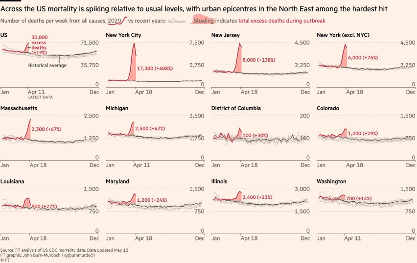
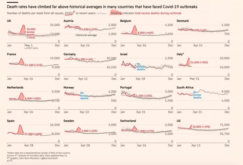
But as you alluded to in your question, that's the actual subject matter, the content and the format has changed a lot throughout. The very first version of the chart we made was showing the cumulative numbers of deaths in different countries. Because at that point in early March, the story was really about the question of where are all the other countries relative to each other, or relative to Italy, and how many days behind? So it was all about the cumulative journey that countries were on.
It's been a constant tension of knowing that we've got some really popular data visualisation products here that people are very familiar with, but not wanting to be slaves to that
But within a couple of weeks, the pitch started shifting away from those cumulative totals, and on to the question of what was happening right now. Were countries able to flatten the curve? Were they seeing more deaths or more cases on one day than the previous day?
As it became clear that the focus was shifting to that, we didn't want to just throw away the cumulative charts we'd be making that people had got very familiar with, but we knew it wasn't really going to cut it to just keep churning out the same thing. While the area of focus was shifting, we added the charts showing daily new cases and daily new deaths, because we felt like we needed to shift attention to that, and we kept the old ones going as well.
We ended up with a situation like, I think anyone who's been involved in designing, maintaining and iterating on products would recognise. In our mind, and for a lot of our readers, the new charts we were bringing out were better suited to the purpose they had. But we still got inundated with people who got very used to the old charts, saying: "what's happened? Bring back the cumulative trajectories", and that kind of thing.
It's been a constant tension of knowing that we've got some really popular data visualisation products here that people are very familiar with, but not wanting to be slaves to that familiarity when the changing story demands that we change how we present things.
We've added charts, we've changed charts and more recently – just this week – we've added interactive versions of the charts that allow people to pick countries that they want to look at, or even to change the way the data is presented in terms of flipping between absolute numbers and per capita rates and that kind of thing.
Without numbers, it would be incredibly hard to communicate how things are changing and how things are different between countries
So yeah, it's been a really interesting journey in that sense, because you know, within my role and our team, generally the visualisation work comes in one of two sort of forms. We are either making a static chart, which is a throwaway kind of thing for one news story, or we're making an evergreen piece either static or interactive, which we're going to maintain with new data, but we're not going to change in terms of its form.
The unique factor this time has been having this evergreen product in terms of data visualisation about coronavirus, but knowing that, as well as just updating the data, we need to be just slightly shifting the form as time has goes by. What the key part of the story is on one day, isn't necessarily going to be the key in two weeks or a month. That's been the really interesting, refreshing journey that we've had throughout this.
Eleanor Gibson: You talked a lot about how the public got a thirst for these visualisations. Could speak a bit about the importance of data visualisation in helping people understand complex information? Has it become more popular during the pandemic?
John Burn-Murdoch: There's all sorts of things going on here. I mean one is just that this is such a huge story. I don't mean that just in terms of its importance, but its breath, you know, there's cases and deaths and testing and lockdowns and all of this stuff. Without numbers, it would be incredibly hard to communicate the scale of what we're talking about and certainly to communicate how things are changing and how things are different between countries.
This has obviously become quite politicised and everyone's aware of, first of all, the countries who seem to be doing much better than others, and secondly, just the concept of flattening the curve, and how we are doing.
Without data it's very hard to answer those questions and it would be very easy for governments or the media or other people with vested interests to just tell their own story about how things were going, and there'd be very little anyone could do to push back on that.
The closer one spends with following this story in the data, the more you realise that nothing is straightforward
A lot of this is just is about transparency and contextualising what politicians and other figures are saying. We obviously see this a lot in the UK at the moment where in early May, there's the whole discussion about should lockdown be relaxed, and another discussion about whether or not the UK is now seeing the highest death tolls in Europe.
If it weren't for the data, a politician could just stand up and say, "oh it's not true, our deaths are lower than this other country", but by visualising the data and the nuance of these different measures and methodologies, we allow people to make an informed decision on whether they're going to believe what they're hearing or whether they're going to interpret the information for themselves.
So I think part of it is that need for people to know what's going on, and the other is reassurance. Not reassurance in a sense of like, everything is fine, but of this just being such a fast-moving and sprawling story. Data numbers are a chance for people to get some kind of anchor. So I think that was certainly the case when people who got into this habit of coming back to check the graphics that I was putting out every night. It was about this anchor point and they knew where their country was in relation to other countries and where it was in relation to where it was a week ago.
It just became this familiar reference point. Partly transparency and information and partly just the routine, and the comfort of being able to come back and check progress over time.
Eleanor Gibson: Do you have any opinions on how the pandemic has been handled by the governments in the UK in the US, and any thoughts on what can make a difference in bringing it to an end sooner?
John Burn-Murdoch: The closer one spends with following this story in the data, the more you realise that nothing is straightforward. There have been statements that I've made quite confidently in the past about the data or about trends and patterns, which, you know, a few weeks later, it's much less clear that that's the case. For example, the importance of lockdown.
Whichever way conclusions end up going on this, the data and the visualisations will have played a part
Of course, it's common sense that the earlier country locks down, the more chance it has of containing an outbreak. But we also increasingly see in the data that you have countries like Sweden, where there hasn't been any sort of top-down lockdown, but that hasn't stopped people from taking the initiative and changing how they behave and socialising less or in larger groups. It's increasingly hard to say if this one thing had been different everything could have changed.
We'll go on for months and years about how different governments and healthcare systems performed and what could have been different. But with all of this data, we're helping people make those conversations easier and more informed. If these arguments were taking place without any of this information, it would be a case of she said, he said, but with the data, we can at least point to evidence.
The other thing is the data is useful, even if we don't know what the conclusions are yet, the fact that we can look at this and compare countries and look at how things are today versus last week versus last month, it really does help inform the debate that we're having. I get questions from people who work in governments around the world about the graphics that we're making and the data we're pulling together. So it's clear that whichever way conclusions end up going on this, the data and the visualisations will have played a part in helping people get to those conclusions.