Hem launches new brand identity by Made Thought
Dezeen promotion: Swedish furniture company Hem has launched a new visual identity featuring shapes based on popular products from its archive.
The rebrand reflects "a new chapter" for Hem after a year of growth for the company, during which it relocated to a larger headquarters in Stockholm and opened its first permanent studio in New York.
Designed by London-based branding agency Made Thought, the visual identity includes new graphics, a fresh colour palette and a redesigned typeface.
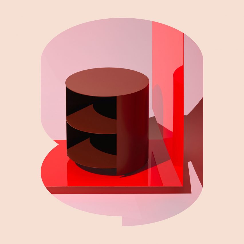
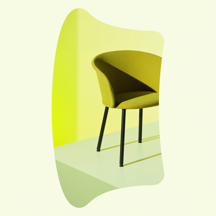
For the brand graphics, Made Thought selected a series of digital visuals taken of popular Hem products and stripped them down to their basic forms, leaving just flat silhouettes of the items.
Chosen designs include the Alphabeta Pendant Light by Luca Nichetto, the Last Stools by Max Lamb and the Kendo Chair by LucidiPevere.
These shapes will be used to represent key product categories across Hem's packaging and promotional materials, as well as on its website. They will be used as colour-block graphics on their own or as frames for other content, such as product photographs.
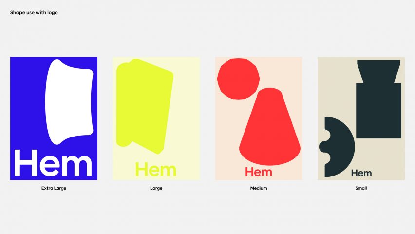
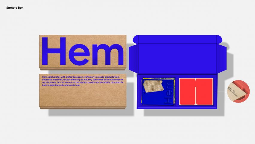
The graphics and branding have been animated with a vibrant colour palette featuring cobalt blue, lemon yellow, bright red and deep green.
These hues are paired with a lighter version of their own colour, apart from the blue tone, which is paired with white.
"The expressive colour palette reflects the unique style and playful tone of the brand, its designs, and collaborations, while also marking Hem's significant growth and the vibrant position it has earned across the world of contemporary design," said the company.
"Hem came to us with an interesting challenge: their products are exceptional and their people progressive leaders in the design world, but they felt their current brand wasn't a true reflection of their ethos or offer," said Garrett Duncan, strategy director at Made Thought.
"Hem offers imagination and creativity in abundance alongside their obsession with quality and detail," he continued.
"We wanted to create an identity that stood apart from the more expected visual codes of control and precision and instead focus on expressing Hem's personality and character, to create a visual language that was engaging, personable and unexpected."
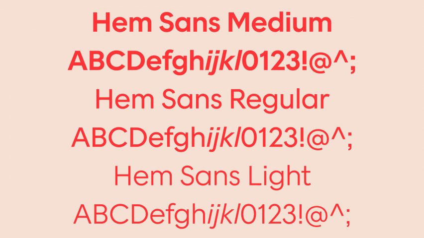
A new, bespoke typeface was also created for the furniture brand by leading Swedish typographer Göran Söderström.
Dubbed Hem Sans, the font reimagines the Geometric Sans Serif font, with "unexpected shapes" such as sharp corners, squared punctuation and long, curved tails on the lowercase y and t letters.
While Söderström designed the typeface as a homage to the use of geometry in architecture and interior design throughout history, Hem wanted it to also strengthen their digital presence.
"Text is still the single most important part of any digital interface, and in order for Hem to own every detail of that experience we decided to create something new, and bespoke," said Söderström.
To see Hem's new visual identity in action, which launched today, visit its website.