Samsung launches range of paints to complement its TVs
Samsung has released LivingColour, a collection of six paints designed to provide harmonious backdrops to three of the company's television models – The Serif, The Sero and The Frame.
The LivingColour paint range was created by Samsung in collaboration with British colour expert Karen Haller.
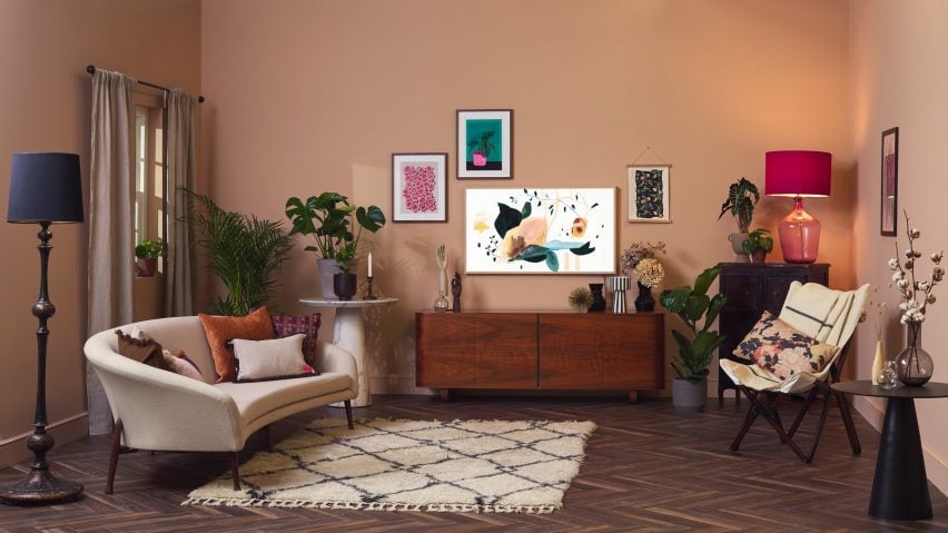
Together they have developed six colours to accompany Samsung televisions The Sero, The Serif – which was designed by the Bouroullec brothers – and The Frame, which displays digital art and photography when not in use.
Each TV model has been given two shades. One shade is meant to perfectly match the TV's casing, while the other is a complementary hue that can be applied to walls surrounding the TV.
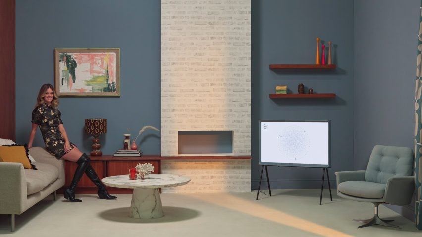
Colours accompanying The Frame are Frame Beige and Restful Pine, a "restorative" shade of green. Serif Cotton Blue and Champagne Bliss, a soothing pale-pink hue, have been made for The Serif.
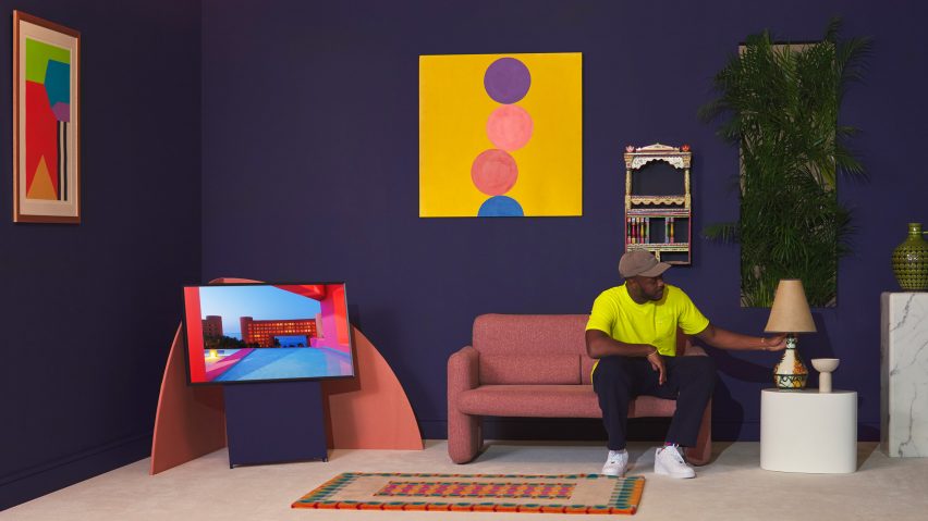
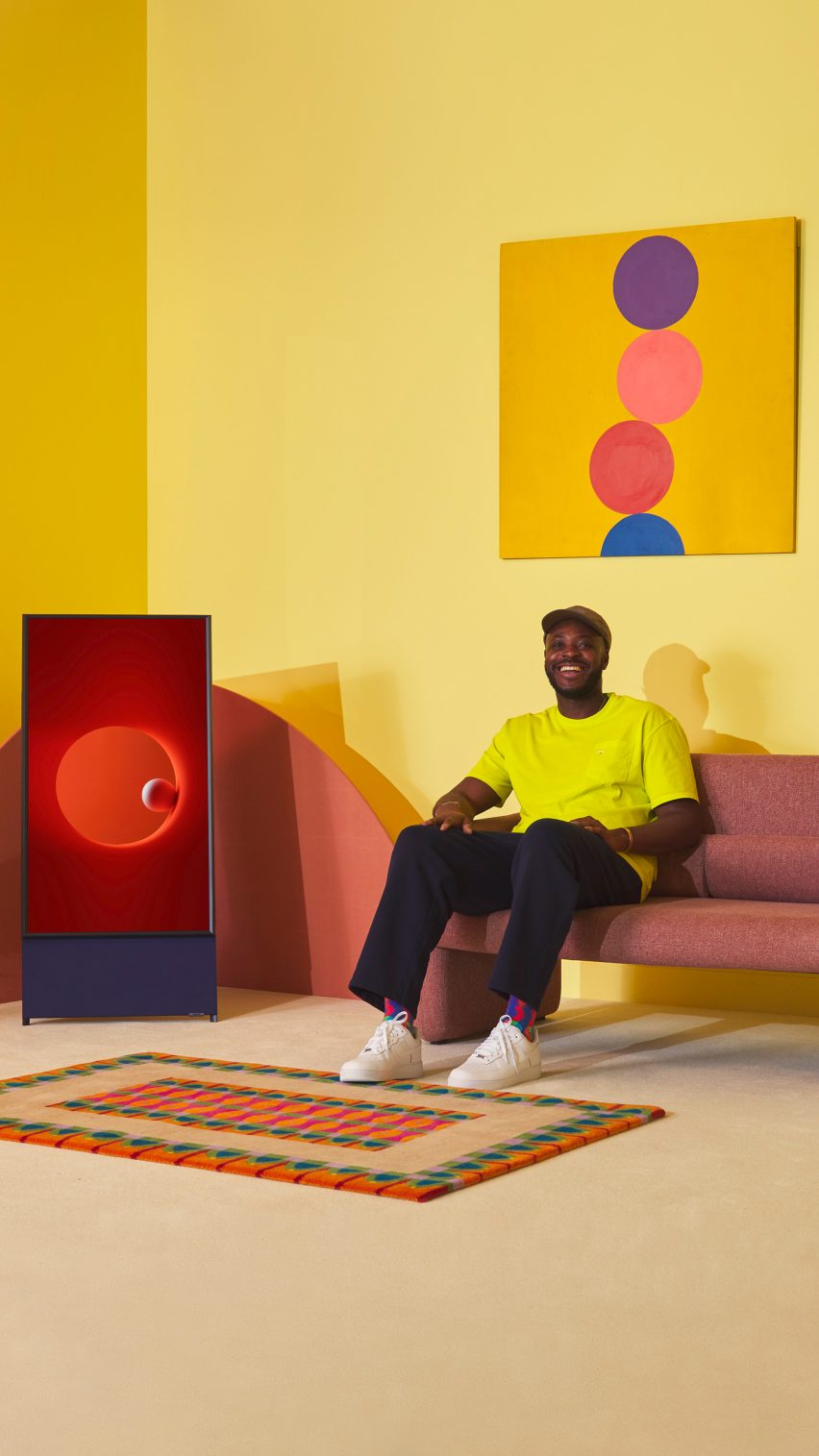
Finally, The Sero television has been paired with Sero Navy Blue and Bright Spark, a vivid yellow colour.
Samsung says the overall palette of the paint collection is meant to "elicit an uplifting emotional response", particularly as the pandemic is forcing us to spend an increasing amount of time indoors.
"Colour is an amazing phenomenon that can change how we feel, think, and behave in an instant...it's a universal language that we all speak," added Haller.
"The colour pairings for Samsung's range of Lifestyle TVs were selected to match the personality and style of each TV, whilst also creating an environment that would be uplifting and ultimately complement your personality and lifestyle."
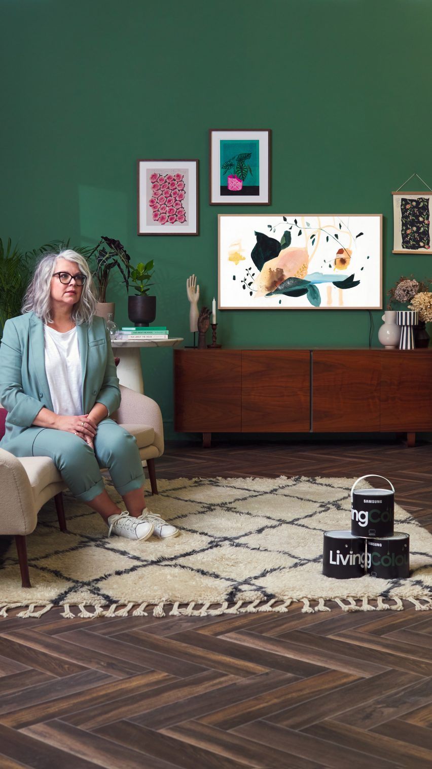
To mark the launch of the LivingColour collection, Samsung invited three figures from the creative industries to create living room set-ups using the paints. This included interior designer Kate Watson-Smyth, musician and stylist Whinnie Williams and designer Yinka Illori.
Watson-Smyth and Williams' rooms lent towards a more vintage aesthetic, while Illori's space – which featured The Sero colour palette – boasts graphic art prints, patterned rugs and brightly-hued furnishings.
Earlier this year Samsung teamed up with Dezeen to kick off the Out of the Box competition, which asked entrants to design household objects using repurposed cardboard packaging.
Among the submissions were a rocking horse, basket and modular storage system. First prize went to a collection of cardboard children's toys shaped to resemble endangered animals.