
Six seminal projects from Bauhaus designers Josef and Anni Albers
Nicholas Fox Weber, a longtime friend of Josef and Anni Albers and executive director of their foundation, has authored a visual biography of the renowned Bauhaus couple and their work. Here he discusses six of the most interesting projects from the book.
Called Anni & Josef Albers: Equal and Unequal, the book traces their artistic evolution from meeting at the Bauhaus, the German art school that gave birth to the Bauhaus design movement, in 1922 to fleeing Nazi Germany in the 1930s and teaching at the experimental Black Mountain College in North Carolina.
Although they never formally collaborated and often worked in very different mediums – Anni Albers in weaving and printmaking and her husband primarily in painting and glasswork – the two are united by the same driving principles.
"It's easier to find similarities between the Albers' than differences, especially the deeper we go," Weber told Dezeen.
"They were both very interested in form following function. Everything was about process and understanding the materials and technology of putting them together. So that was part of the Bauhaus mentality but then other aspects of their work are sheer poetry – though they would never use the word poetry."
What sets their work apart is its enduring universality, which Weber says can be traced back to their obsession with basic visual elements and how these can be manipulated to influence our perception.
"Some of us have been bowled over by their work for 50 years and other people are just discovering it but I think it's successful because it has a very lasting beauty," he said.
"Unlike the very personal art of Tracy Emin or Francis Bacon, the Albers' work is about more universal, timeless forces – lines, colours and forms. They appeal to children, they appeal to everybody. So the Albers' work will have as much virtue across time and cultures as it does here today."
Below, Weber discusses three projects from each of the Albers' that illustrate their distinctive approach across different mediums.
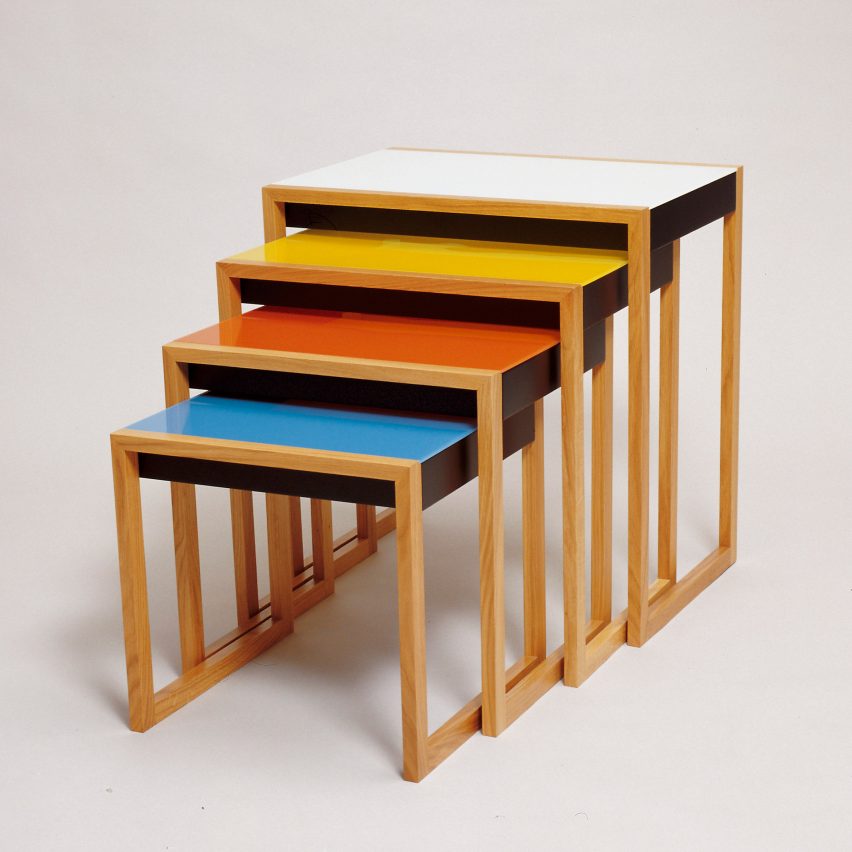
Stacking tables by Josef Albers, around 1927
Fashioned by Josef Albers during his time at the Bauhaus, these nesting tables apply his early work in coloured glass to a functional piece of furniture, which is still in production today.
"Many designers made these kinds of tables and what interests me is to compare Josef's with Marcel Breuer's or Erich Dieckmann's," Weber said.
"Josef had a very precise sense of measure, so if you were to take a tape measure to one of those pieces of wood, you would discover that one measurement was exactly half or double another. Everything is incremental with the same core measurements.
"There isn't one added element to those tables, one added ridge or scrollwork that isn't needed."
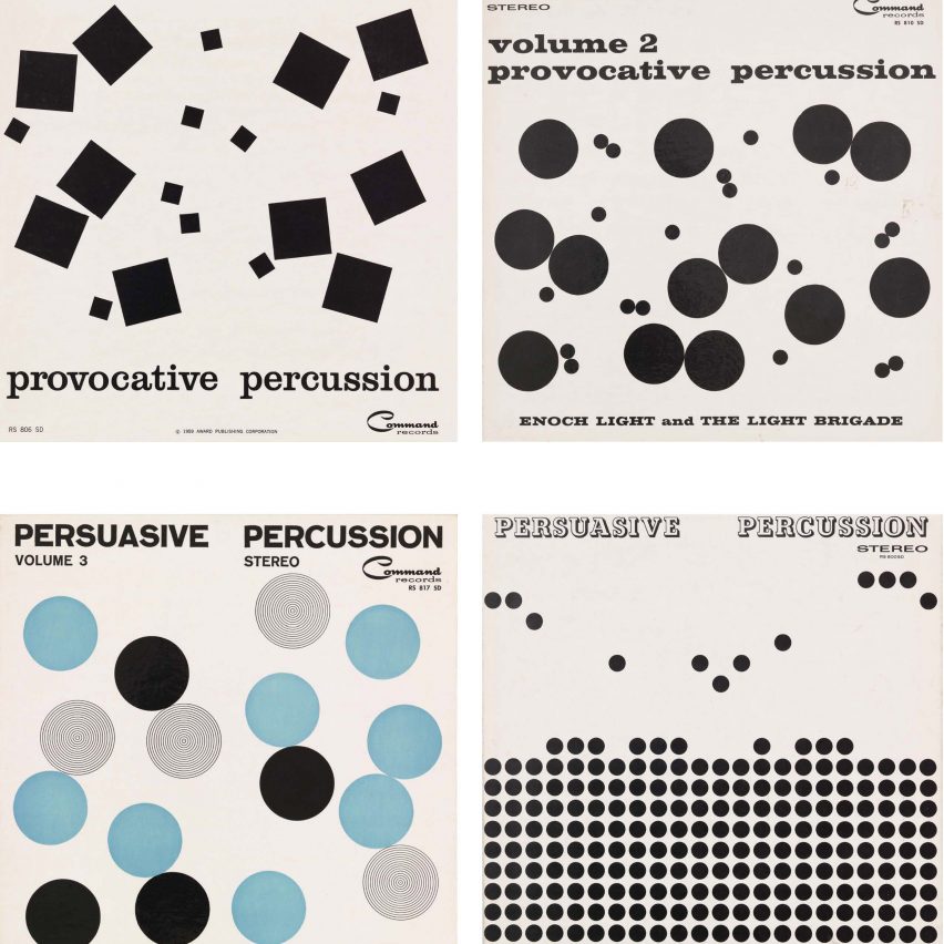
Provocative and Persuasive Percussion by Josef Albers, 1959/60
Josef Albers was approached by Enoch Light, the founder of Command Records, to design the covers for a series of jazz records in what turned out to be one of the artist's rare graphic design projects.
"Josef was deeply influenced by Bach and was fascinated with rhythm. Think about the way that percussion sounds and you realise that the large squares on these covers are almost like kettle drums and the little squares more like hi-hats," said Weber.
"How things were placed was always of great importance to him. Josef thought placement could either be jarring or pleasing, boring or entertaining. Form, for him, always had to conform to purpose even in graphics. He was full of theories about graphic design but he had very few projects of this sort, so these record covers are very unusual."
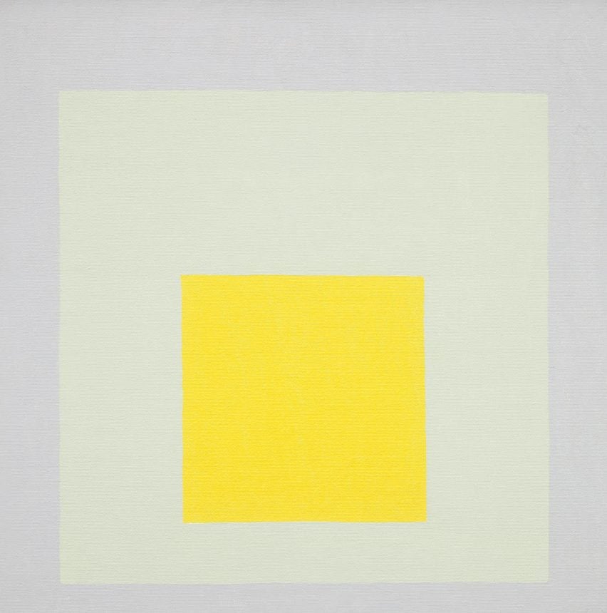
Study for Homage to the Square: Impact by Josef Albers, 1965
In 1950, Josef Albers began what would become his most recognised series, called Study for Homage to the Square. It explored his enduring fascination with colours, which later culminated in his book Interaction of Color.
"Josef made more than 2,000 paintings of squares. He used the format because it allowed him to let colour have its voice. If you see yellow on its own for example, it has a quality of uplift. But if you see it as part of something, it becomes altogether different," Weber explained.
"Colour appeals to most people but they don't take it out of its context the way that Josef did. His theories in Interaction of Colour are ultimately about the relativity of colour. Colour isn't an absolute, it depends on its setting and its 'neighbours'."
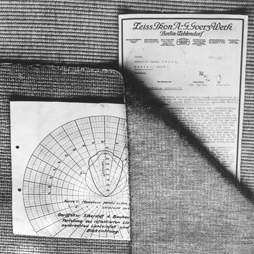
Sound-absorbing, light-reflecting wallcovering by Anni Albers, 1929
At the Bauhaus, Anni Albers specialised in weaving and for her diploma project created a textile to improve the acoustics of an auditorium in Bernau, Germany which had been designed by the school's director Hannes Meyer.
"The task was to make something that was sound-absorbing and light-reflecting. So she put noise insulation on the side that you don't see and the light-reflecting quality is achieved through metallic thread on the other side," said Weber.
"It's just a very simple warp and weft of different types of thread. For Anni, what made a textile work was also what gave it its beauty. So a textile didn't have to reproduce squirrels with acorns or other ornaments. Just the mere fact of threads being interwoven was a source of beauty."
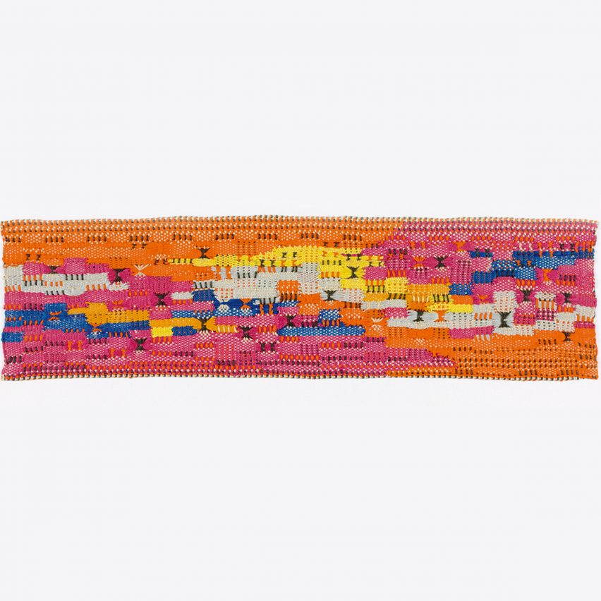
South of the Border by Anni Albers, 1958
This piece is what Anni Albers described as a pictorial weaving – a one-off wallhanging, framed under glass that is closer to a painting than a functional textile.
"In the early 70s, I started writing a book about Anni and drove to the Baltimore Museum just to see this piece. On the way, I stopped at the National Gallery of Art in Washington and saw a lot of very large, abstract expressionist paintings," Weber remembered
"When I got back to the Albers' house after my trip, I said: 'Anni, South of the Border is bigger in feeling than any of those enormous paintings by the abstract expressionists', even though it's hardly more than four inches by 15 inches.
"I can never get over how much is achieved in this small work. It's just a thread put together through abstract warp and weft, and some inventive ways of knotting thread and yet it has that ability to make you feel that you're heading on a holiday to Mexico."
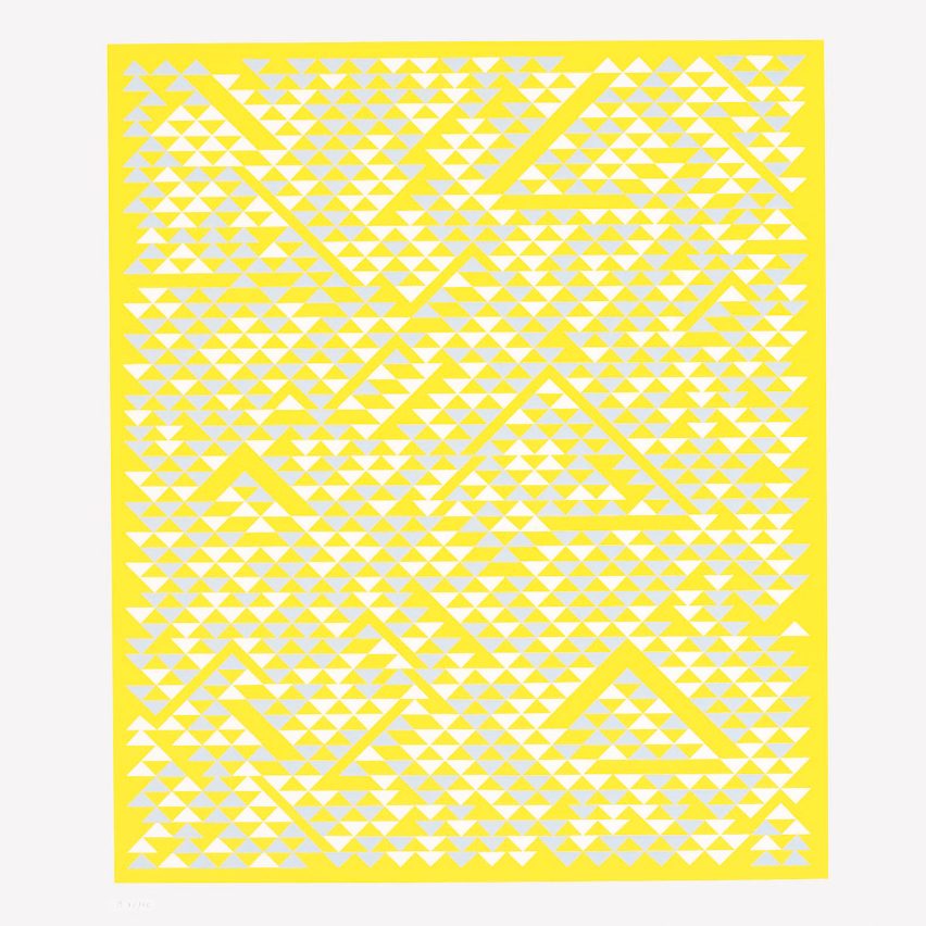
B by Anni Albers, 1968
After being introduced to printmaking at LA's Tamarind Lithography Workshop in the 1960s, Anni Albers often used the medium to explore one of her favourite shapes – the triangle.
"She exalted in the idea of surprising you. If you look at her screenprints and the textiles, there's no predictability. So you engage and stay engaged because you cannot find a pattern," said Weber.
"We recently worked on an exhibition of the Albers' art for the visually impaired and I watched a blind person take his finger and go through every line of an embossing very similar to this yellow print. And as he went through it, he was engaging with every angle, with every experience.
"And that's how Anni Albers treated her art – not as something psychological but rather a whole different world that we enter through the eye."
Anni & Josef Albers: Equal and Unequal is being published by Phaidon.
All images are courtesy of the Josef and Anni Albers Foundation save for the Stacking Tables, which are courtesy of Daimler.
The top photo was taken by John T. Hill.