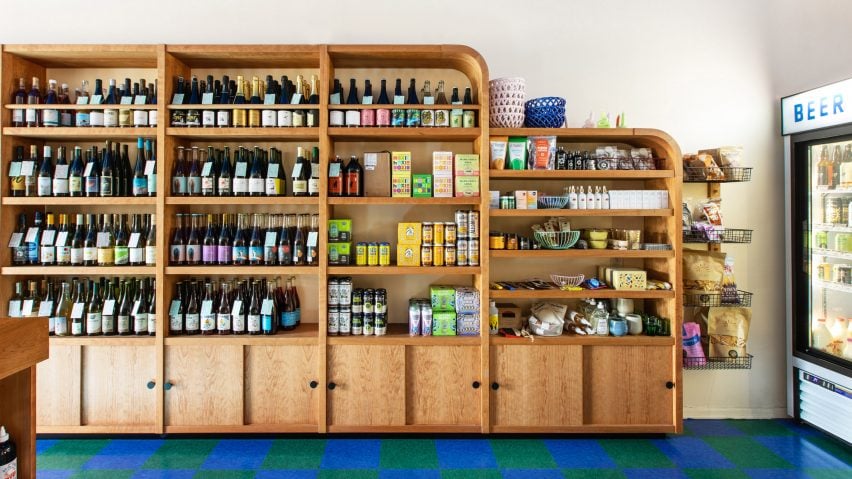
Wine and Eggs is a colourful Los Angeles grocery with a European feel
Designer Adi Goodrich has created the interiors for Wine and Eggs, a neighbourhood grocery in Los Angeles' Atwater Village, with custom-made furniture and details that nod to Parisian cafes and Italian tobacconists.
Goodrich, who is one of the co-founders of LA-based creative studio Sing Sing, designed the store for owner Monica Navarro as a "monument to colour," working with a palette of saturated colours and natural materials.
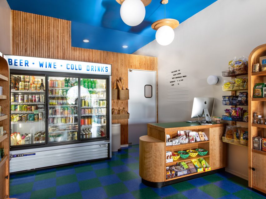
Wine and Eggs' interior was informed by the design of European groceries, including Italian tabacchis – tobacco shops – Parisian cafes and colourful Portuguese storefronts.
"I spent a year living in Paris and I was struck by the details of some of the tabac and bars," Goodrich told Dezeen. "Extra bits of design details that seemingly were overlooked by locals – because everything in Paris is beautiful!"
"The older I got and more interested in design, the more I started to realise that each country had its overlooked details. Including my own," she added.
"A local ignores these bits of beauty, but someone traveling, like me, obsessively photographing – I used these details to inspire the design of Wine and Eggs."
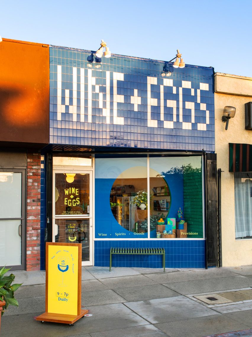
The tiled storefront of the grocery, which sells fine foods and natural wine, was also informed by the designer's travels.
"A sign made out of tiles in Mississippi inspired the storefront tile work – creating words spelt from un-cut tiles," she explained.
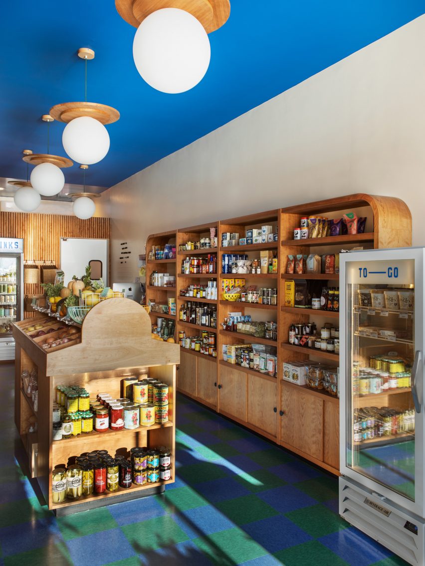
Inside the store, the floor is laid with a blue-and-green checkerboard pattern made from commercial-grade vinyl composition tile (VCT).
"These tiles are often found in schools, hospitals and other public places where dirt and wear are prevalent," Goodrich said.
"I love VCT because it actually feels both playful and reminiscent of our childhood in public schools."
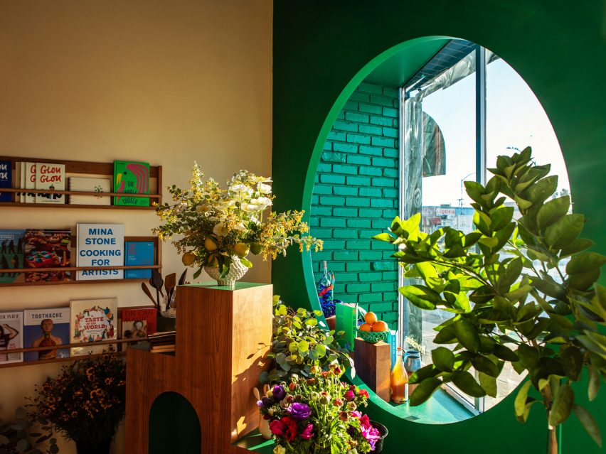
The designer chose the blue and green colour palette carefully to create a space that would be inviting to everyone, while also referencing what it would be used for.
"I wanted the space to be a source of fresh, local food and wine, thus beginning with green," the designer said.
"A bright Klein-esque blue followed as a nice companion for a non-gendered colour combo."
"I think a retail space that sells natural wine and cute food could easily sway into a feminine feeling and I wanted even old men to love the space and feel invited," she added.
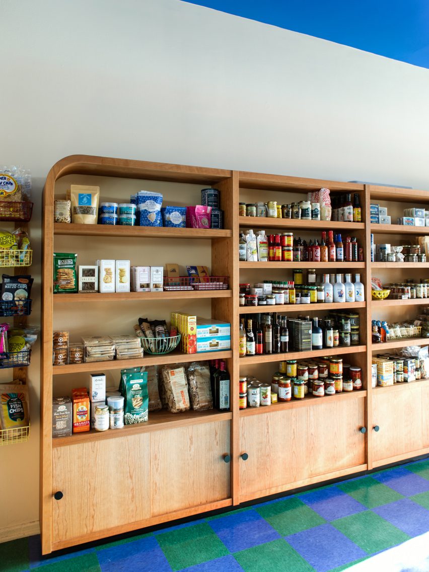
Cabinets made from FSC-certified cherry wood give the space an organic, inviting feel.
"Inspired by the warmth of the wood in Le Corbusier's Cabanon seaside cabin, we chose cherry because it has the warmth that the aged birch of that French mid-century era now has after many years of use," Goodrich said.
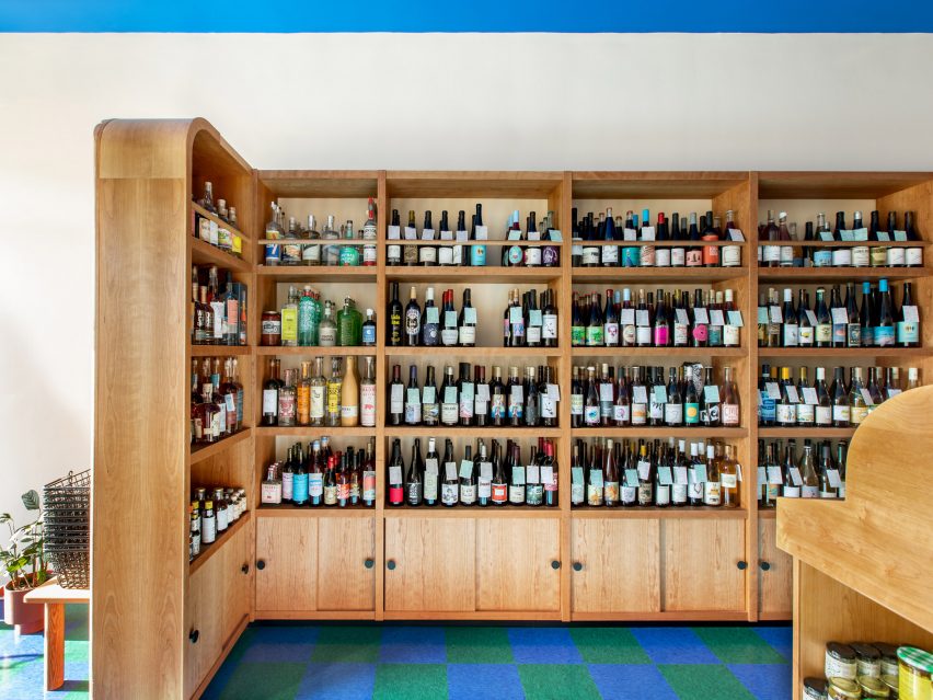
The shelving and fixtures were designed by Goodrich and custom-built by Dusk Studio, and have an oil finish to let the wood breathe.
"Each material used in the build is green, from the tiles, wood, flooring and laminate used on the tabletops," Goodrich added.
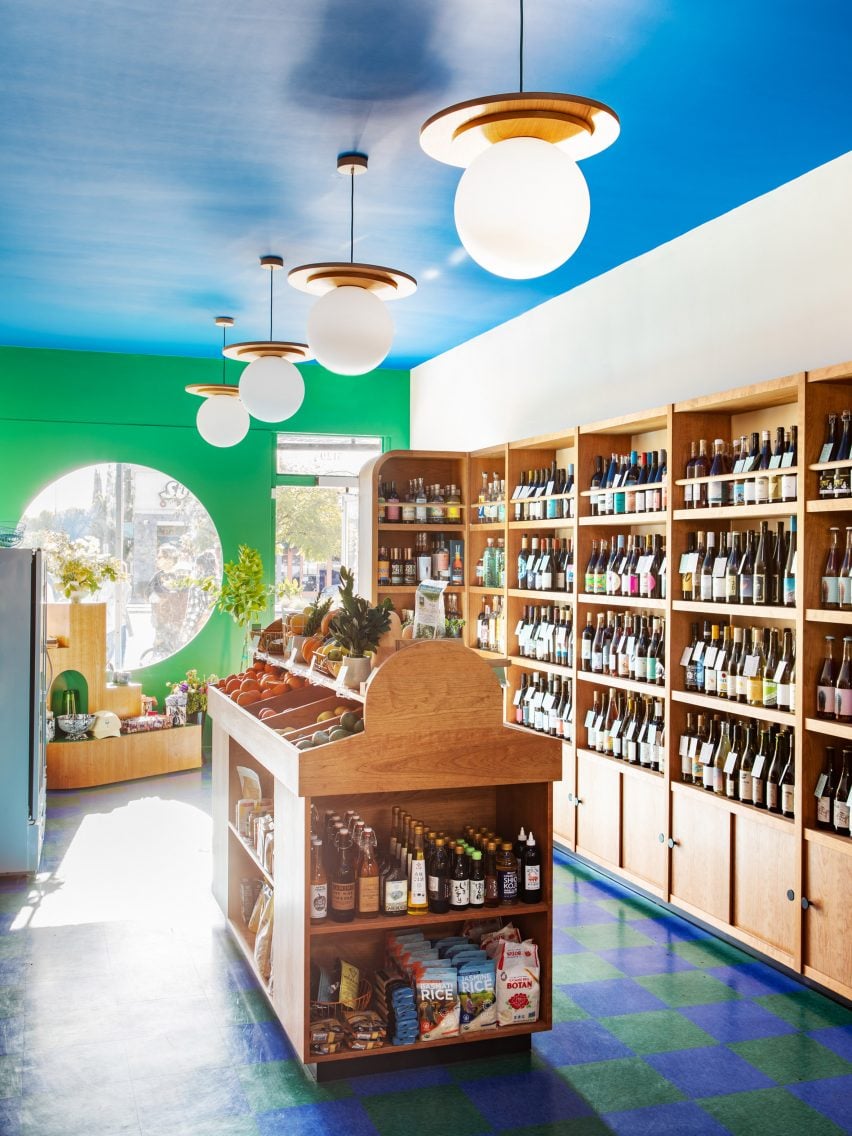
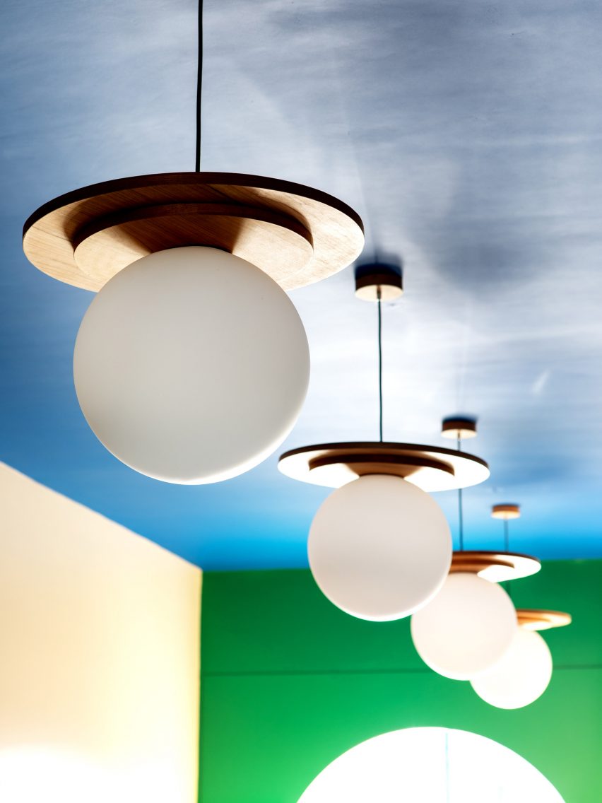
The designer also designed and built the lamps for the grocery, which were created to look like fried eggs – in reference to the shop's name.
"At the beginning of the project I knew I wanted the lights to look like a sunny-side up egg," Goodrich said. "After designing some wiggly shapes I landed at the stacked circle."
"From below, a visitor sees a glowing light surrounded by layered wood, my take on an abstract, sunny-side-up egg, but hung on the ceiling!" she added.
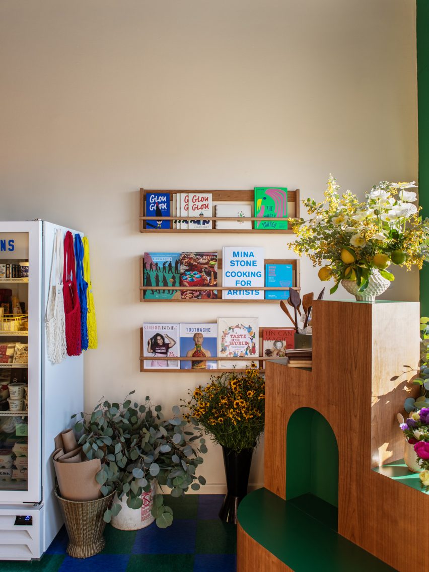
As well as the lamps and shelving, Goodrich also designed a flower stand for the store that she describes as a "sculptural fixture" that houses flowers and homewares.
Its shape was informed by the "awkward geometry" of the climbable cat trees that people buy for their feline companions.
The whole layout of the store was designed to attract customers to come in.
"Much like a painting, I wanted the guests' eyes to be pulled into the space," Goodrich explained.
"From the sidewalk outside, the guest looks through a circular window into the space, pendant lights hang in a row, guiding the eye to the back of the store."
The designer also tapped illustrators Clay Hickson and Liana Jegers to create the store's logo and graphic identity, which are based on a logotype found at a garage sale in the city.
Other recent Los Angeles projects on Dezeen include a prefabricated backyard home by studio SO-IL and a garden-themed pop-up shop.
Photography is by Laure Joliet.