Five African football logos that "tell a tale of identity"
Afrosport is a new book by Peet Pienaar that explores the visual culture of African sports. Here, the designer selects five football logos from the book and explains their role in celebrating unity and independence.
Unveiled alongside the 34th edition of the African Cup of Nations (AFCON) football tournament, which is currently underway in Ivory Coast, Afrosport was created by Piennar and his surf brand Mami Wata Surf.
The book explores the history of African sport and its influence on the world through the lens of design.
It features a mix of graphics and photography alongside in-depth analysis, including a foreword by former NBA professional basketball player Joakim Noah and an exclusive interview with Ivorian footballer Didier Drogba.
Interspersing the book are entire pages dedicated to the logos of different football clubs from across the continent, which according to Pienaar serve as narratives of cultural heritage and collective identity.
"Most African national football logos were created after colonial independence when football played a key role in nation-building," he said.
"Although football was a colonial influence, changing logos and colours were important to show change and rally people behind a newly independent nation."
These historical influences still persist in logos to this day, according to Piennar.
"Even with neoliberalism, the rise of the individual football star and nation-building taking a back seat, the design history of football in Africa is still heavily connected to celebrating independence and unity between nations," he said.
"African football logos tell a tale of identity," he explained. "They group you as a team and allow you to paint the logo on your house, car and face without worrying about copyright or concepts like 'It's not them and us. You are part of the team.'"
Read on for five influential football logos from the African continent:
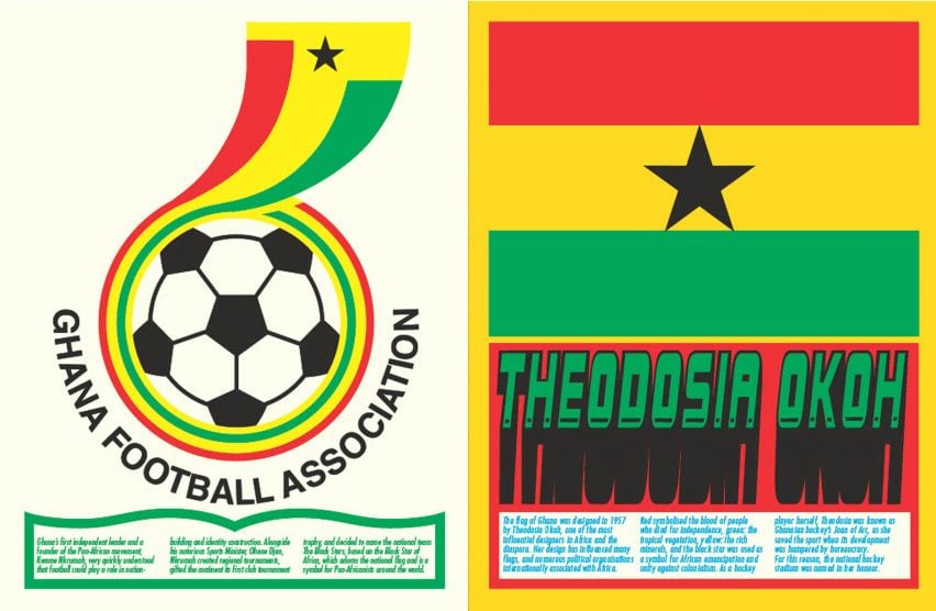
Ghana Football Association
In 1957, Ghanaian hockey player and designer Theodosia Okoh designed the Ghanaian flag, which later influenced not just the logo of the Ghana Football Association but the flags of many nations across Africa.
"Theodosia Okoh's flag design for one of the first African nations to become independent from colonial rule, Ghana, set the tone for other nations to follow," Pienaar said.
"As a hockey player, Theodosia Okoh is an example of the integration of design into sports culture and nation-building."
Okoh chose the colours featured in the flag to convey various themes associated with Africa and its diaspora. Red serves as a symbol of the blood shed by those who fought for independence and green for the abundant tropical vegetation that can be found across Africa.
Yellow signifies the continent's rich mineral resources, and the prominent black star embodies African emancipation and unity in the face of colonialism.
"Her design choice of colours, red, green, yellow and a black star, became the most known design set for many African countries and liberation organisations linked to Africa internationally," Pienaar said.
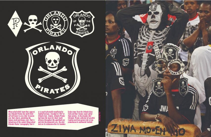
Orlando Pirates
The Orlando Pirates football club was founded in 1937 in Orlando East – a community on the outskirts of Johannesburg in South Africa – by defectors from the local football team Orlando Boys Club.
The club's name was born after their former coach decried them as pirates, while the distinctive skull-and-bones crest was popularised by a fan, who produced and distributed stickers that gained widespread popularity among supporters throughout South Africa.
The club's iconography is also embodied by fans, who cross their forearms over their chest to mimic the logo.
According to Pienaar, the Orlando Pirates logo highlights the spirit and playfulness of African design and sport.
"Orland Pirates took a name that was supposed to be an insult as their pride," he explained. We see this attitude of making fun to have a long history in football, especially in South Africa."
"Diski is an example of a South African style of football that is not so much about scoring goals but more about making yourself famous as you humiliate your opponent with showboating, flair and skill," he added, referencing a distinctive style of football developed by South African players.
"It all reflects this playfulness and outperforming your opponent with a humorous reflection of skill."
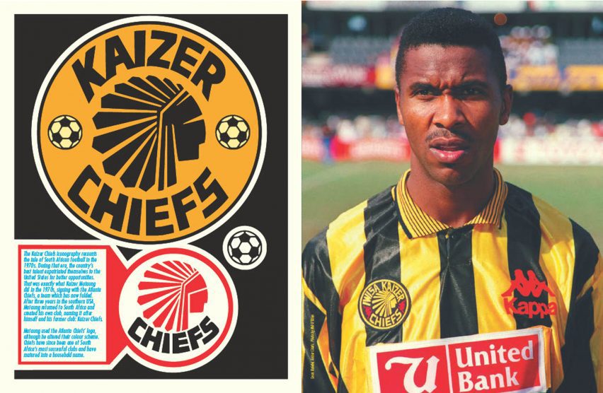
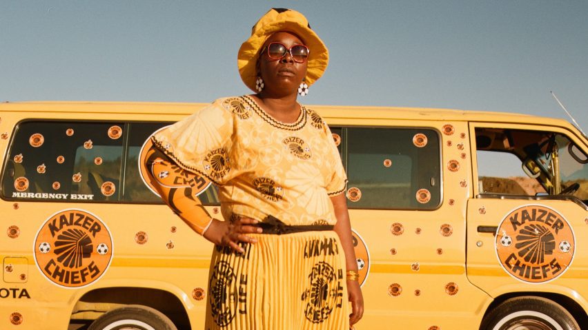
Kaizer Chiefs
The Kaizer Chiefs logo was born in the 1970s, the peak of apartheid in South Africa. During that period, several of the country's prominent sports figures relocated to the United States in search of opportunities.
Among them was football player Kaizer Motaung, who moved to the USA for three years before returning to play for the Atlanta Chiefs.
After returning to South Africa, he founded Kaizer Chiefs FC – named after himself and his former club, with a logo that took inspiration from the Atlanta Chiefs logo but features distinct colours.
"In what would be considered copyright infringement by the West, Motaung is indicating his path and showing recognition," Pienaar explained.
"Chiefs have since become one the most successful clubs in Africa."
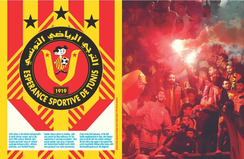
Esperance Sportive de Tunis
The logo of football team Espérance Sportive de Tunis can be traced back to the club's origins within the Bab Souika neighbourhood of Tunisia's capital Tunis.
The club derives its name from Café Esperance, a prominent cafe in the local neighbourhood, where football enthusiasts gather to watch games and drink coffee.
The football club represents a broader tradition within North Africa, where in addition to serving as social hubs, cafes have a tradition of renting out their premises for the registration of sporting associations.
"With a strong Muslim influence in North Africa, people unfamiliar with Muslim culture and football might not realise the link between cafes and football," Pienaar continued
"Many football logos in Africa do not purely come from a marketing perspective but reflect an honest, integrated interaction between culture and design."
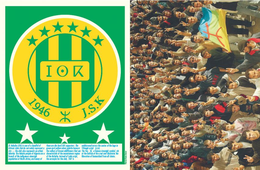
JS Kabylie
"Kabylie is one of a handful of African clubs that do not solely represent a city," Pienaar said. "The club also represents an ethnic identity."
Although based in the city of Tizi Ouzou, the club also represents the Kabyle people of Algeria, a branch of the indigenous Amazigh population of North Africa.
The Tifinagh alphabet, which is used to write several Amazigh languages, was chosen over the more common Latin script typically featured in football logos. It was used to write the club's acronym, JSK, prominently positioned at the centre of the logo.
Also featured in the logo is the Amazigh symbol yaz, which embodies the "free man" and signifies the emancipation of humanity from all constraints.
The photography is by Kgomotso Neto Tleane and Rogan Ward.