Dezeen's top 10 rebrands and logo redesigns of 2023
In this roundup, we continue our review of 2023 with a collection of notable rebrands and logo redesigns, including Twitter's switch to "X" and a revamped look for the "I ♥ NY" logo.
Other rebrands in this roundup include refreshed looks for drink brand Pepsi and fashion house Burberry, as well as a simplified brand identity for the US Army that "builds upon the equity of the legacy Army star".
Here are Dezeen's top 10 rebrands and logo redesigns of 2023:
Pepsi unveiled its first rebrand in 14 years to commemorate its 125th anniversary and to mark a further "commitment to Pepsi Zero Sugar".
The redesign retains the Pepsi globe, with the brand name at its centre in black.
"We want to instigate moments of unapologetic enjoyment," PepsiCo chief design officer Mauro Porcini told Dezeen. "We've always been a bold and energetic brand – now our visual identity better matches our attitude."
Find out more about the Pepsi rebrand ›
After purchasing social media platform Twitter, US entrepreneur Elon Musk suddenly changed its name and logo earlier this year to "embody the imperfections in us all".
The logo was crowd-sourced, with user Sawyer Merritt posting the winning design – a white X with a hollow bar.
"If X is closest in style to anything, it should, of course, be Art Deco," tweeted Musk.
Find out more about Twitter's rebrand ›
City of New York by Graham Clifford
The City of New York released an updated version of the city's unofficial "I ♥ NY" logo as part of a campaign to raise optimism after the 2020 pandemic.
Designed by Graham Clifford, the new logo replaced the typewriter-esque font of the 1977 design with a blocky sans-serif and added a three-dimensional heart.
It was met with a mixed response by New Yorkers.
Find out more about City of New York's rebrand ›
Fanta by the Coca-Cola Company and Jones Knowles Ritchie
Coca-Cola's design team and Jones Knowles Ritchie simplified drink brand Fanta's logo to create a unified identity focused on fun.
"The identity was too contained and didn't portray playfulness," said global vice president of design at The Coca-Cola Company Rapha Abreu.
"At the same time, it felt geared towards a younger audience – our audience is anyone that is playful at heart, and it was important that we brought the idea of fun and play to an older audience."
Find out more about Fanta's rebrand ›
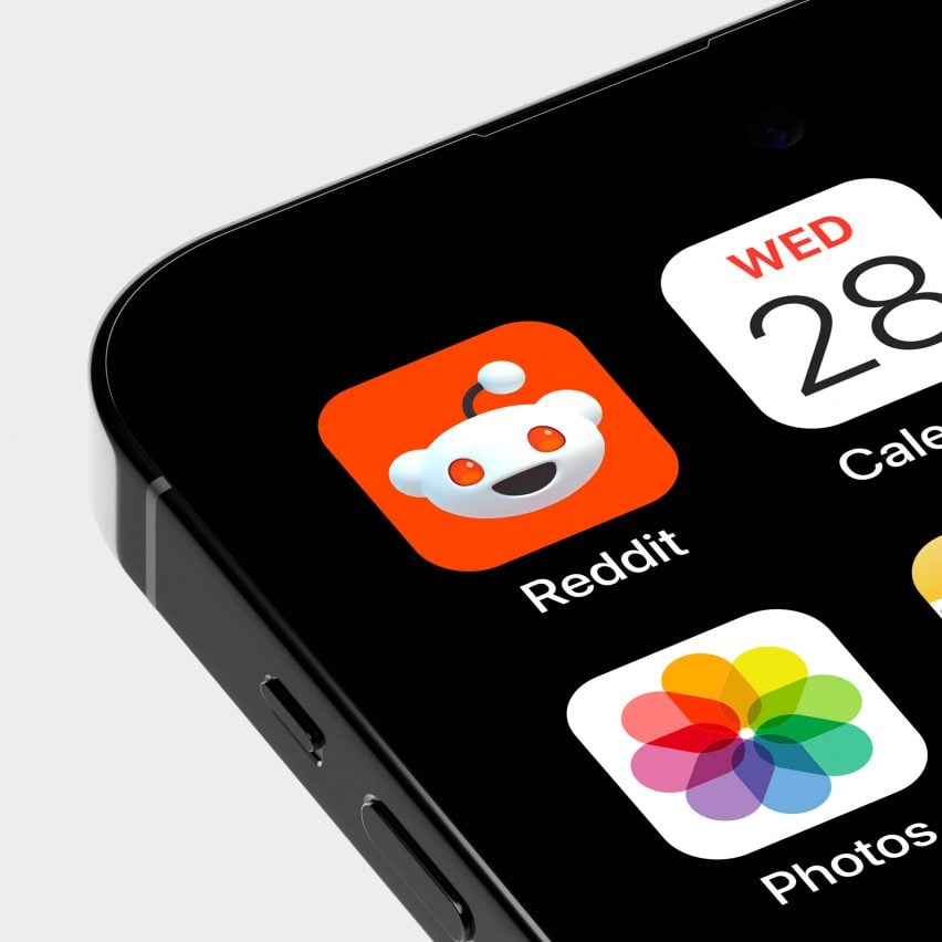
Design agency Pentagram created a new visual identity for social media platform Reddit, creating a custom font, rendering its alien mascot, Snoo, in 3D and creating colourful chat bubbles to help organise the site.
The studio focused the rebrand around four traits it felt define the platform–"inherently eclectic, positively different, delightfully absurd and genuinely candid".
Find out more about Reddit's rebrand ›
Announced as "the first creative expression" under new chief creative officer Daniel Lee, British heritage brand Burberry rolled out a new logo that uses an equestrian knight from the brand's archive.
Paired with a serif typeface, both elements reference the brand's storied history.
"The new Burberry logo is archive-inspired," said the brand in a press release. "The original Equestrian Knight Design was the winning entry of a public competition to design a new logo, circa 1901. The design features the Latin word 'Prorsum' meaning 'Forwards'."
Find out more about Burberry's logo redesign ›
Lippincott created a new graphic identity for technology company Nokia focused on representing the company as more than just a producer of mobile devices.
The original logo created in 1979 was thinned out, broken up and paired with a brighter blue.
"[The logo] has been designed as a symbol of collaboration, which Nokia believes to be critical for realising the exponential potential of networks, unlocking gains in sustainability, productivity, and accessibility," said the brand.
Find out more about Nokia's rebrand ›
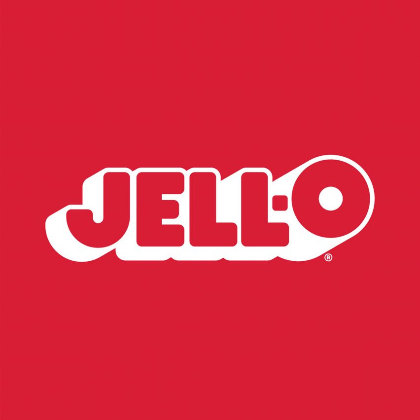
BrandOpus revamped the Jell-O brand for the first time in 10 years with blocky, playful lettering meant to attract both kids and parents.
Cartoonish 3D-rendered graphics of jelly fruits and pudding swirls were also created for the new identity, intended to capture the brand's "jiggly goodness".
Find out more about the Jell-O rebrand ›
National Portrait Gallery by Peter Horridge
Peter Horridge created a new logo for the National Portrait Gallery in London based on an 1893 sketch by the gallery's first director.
The new logo features the gallery's initials entwined in a circle, an emblem which can be found across metalwork, furniture and mosaics from when it first opened.
Find out more about the National Portrait Gallery logo›

The US Army received a logo revamp by American agency Siegel+Gale for the first time in 20 years.
The redesign simplifies the centralised star, removing it from a box that previously enclosed it and placing US Army next to it.
"The objectives of the project were to build on the equity of the legacy Army star, optimizing it for performance and relevance in a digital-first world and imbue it with meaning connected to the Army's culture and purpose," Siegel+Gale told Dezeen.
Find out more about the US Army rebrand ›
This article is part of Dezeen's roundup of the biggest and best news and projects in architecture, design, interior design and technology from 2023.