Copenhagen Culture House + Library by COBE and Transform
Danish architects COBE and Transform have won a competition to design a new Culture House and Library in Copenhagen.
Renders are by Luxigon.
Here's some info from COBE:
--
CULTURE HOUSE + LIBRARY IN COPENHAGEN BY COBE AND TRANSFORM
Location: Copenhagen, Denmark
Type: Competition 1st prize
Client: Copenhagen Municipality
Program: Culture house + library
Total floor area: 1800 m2
Status: Ongoing – To be realized in 2010
Architects: COBE + Transform
Web: www.cobe.dk, www.transform.dk
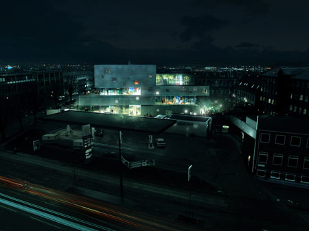
The Northwest area of Copenhagen is located in the diverse and lively transition zone between the dense urban Nørrebro area and the villa neighbourhoods at the edge of the city. Even though many people live and work in the multi-ethnic Northwest Copenhagen, the area is by many Copenhageners mainly passed through going in and out of the city by car. The reason for this is the area's vicinity to numerous entry roads as well as the lack of cultural facilities and recreational areas.
Programme
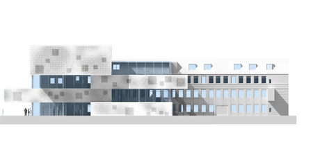
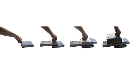
The new Culture House + Library is composed of several elements: Rethinking and modernisation of an existing culture house, a merger of two newer libraries, and the addition of a new culture hall, together forming an enormous potential as a new Culture House for the whole area.
This can make up the significant and attractive cultural institution which the neighbourhood lacks today, creating a strong sense of community. The new Culture House + Library can be the missing link for the Northwest area, and will be placed centrally in the neighbourhood's and the people’s awareness. The house must prove itself functionally and be emphasised visually as a house growing out of the rough urbanity of the area - possibly starting up a necessary dialogue between the new and old in the neighbourhood.
Urban passage
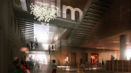
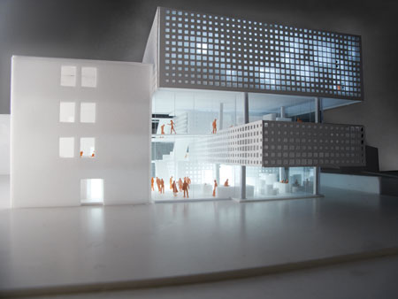
The building has two entrances. One from the north and one from the south, making the foyer act as an urban passage for the neighbourhood. For everyone it is possible and legitimate to walk through the building without any errands, and more people will feel inspired to spending time in the building. The passage is a simple gesture of how open the Culture house will be towards the city and its citizens. The building is fundamentally based on democratic principles: open, accessible and transparent. The building is designed to include and welcome all, and act as a platform for dialogue.
Diversity
The complex has an intricate program. It is a dynamic figure of open and closed areas, which is occupied by the library and at the same time used for both fixed functions and flexible areas. This gives a varied coherence between open and closed spaces. Open spaces marked by the immediate context and the closed areas as completely choreographed library spaces for, amongst others, children and youths.
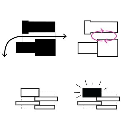
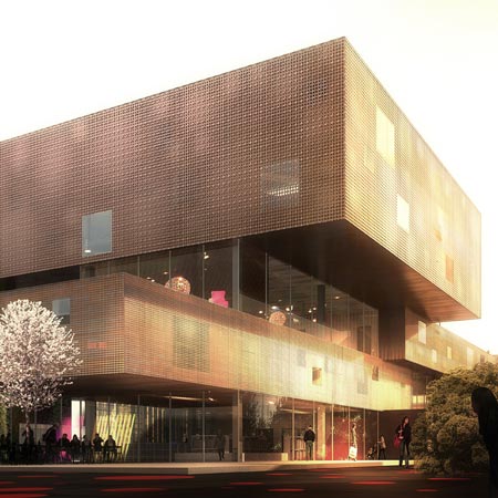
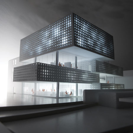
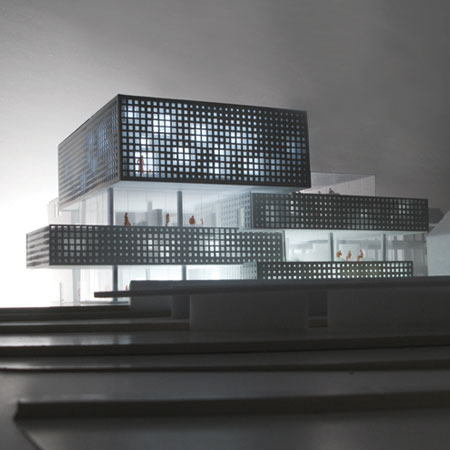
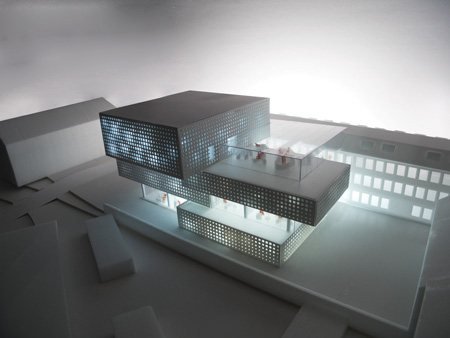
The top
As a main gesture, the culture and concert hall is placed at the top of the building. A powerful object that seems to defy the laws of gravity, the position of the hall encourage people to move across the building towards the magnificent view over Copenhagen. The placement of the hall will leave a strong, dynamic impression on those passing by. The experience of a new initiative, opening up for a dialogue between the new and the old, the young and the elderly. A much needed institution for arts and culture.
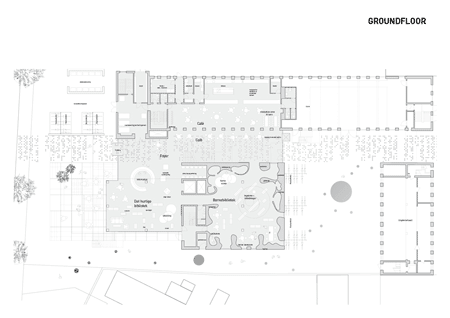
Above: ground floor plan
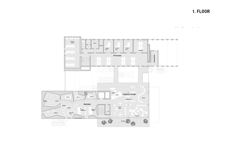
Above: first floor plan
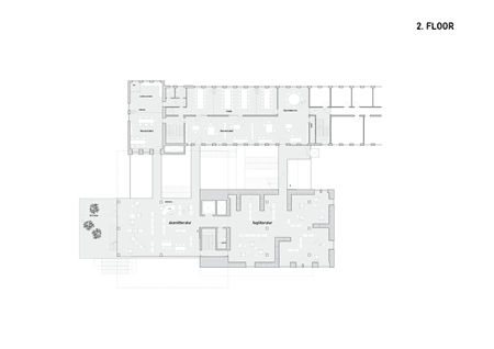
Above: second floor plan
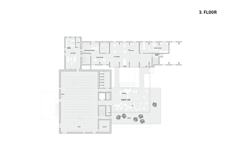
Above: third floor plan
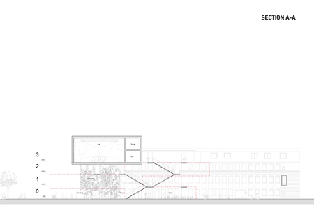
Above: section
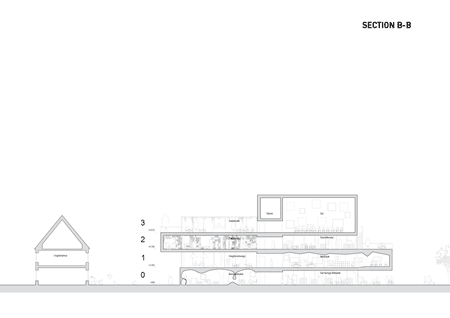
Above: section
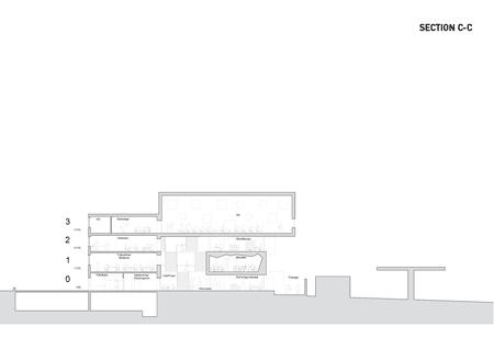
Above: section
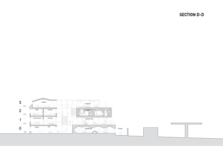
Above: section