
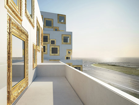
Stockholm architects Wilhelmson Arkitekter have designed a housing project with windows that look like gilded picture frames.

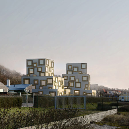
Designed by professor Anders Wilhelmson, the project is to be built overlooking the sea in Helsingborg, Sweden.

Pictures are by Peter Thuvander and Danyal Taylan.

More about Wilhelmson Arkitekter on Dezeen: Peepoo bag by Anders Wilhelmson

Update: Wilhelmson Arkitekter have sent us a bit more text and some drawings:
–
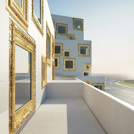
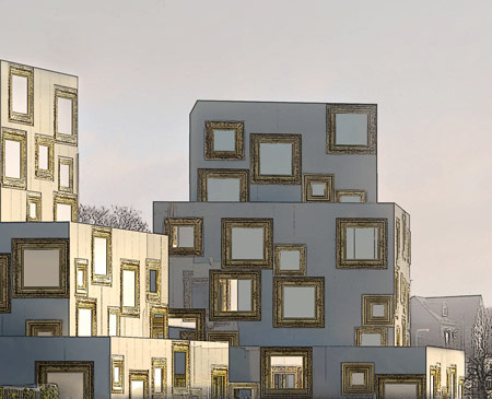
Upper end housing proposed for a site just north of Helsingborg, Sweden. Generous apartments with clear views onto Öresund (the sound between Sweden and Denmark). Denmark is on the horizon.

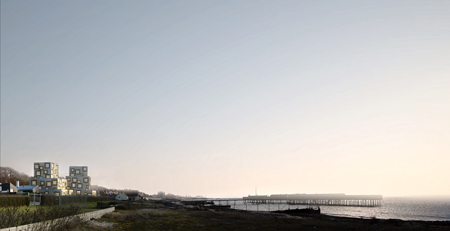
2 houses, both with 6 stories. In total 14 apartments (9 of them duplex apartments), 100-170 sqm.
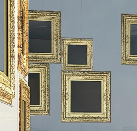
Enameled façade panels, glossy white. Cast aluminium window frames, gold leaf-plated.
Date of design: 2008-2009. Scheduled for planning decision September-October 2009.
Architect: professor Anders Wilhelmson
Collaborators: Danyal Taylan, Elin Rosenberg, Joanna Zawieja, Peter Kinnmark
Client: HSB Nordvästra Skåne


August 25th, 2009 at 2:16 pm
cool & funny! jaja!
August 25th, 2009 at 2:24 pm
this is so strange – it is just cool!
Great project – like to see more…
August 25th, 2009 at 2:37 pm
I never really liked those kind of frames around paintings… ewwww. It is creative though, I suppose.
August 25th, 2009 at 2:38 pm
it burns!!! yikes!
it’s like a bad installation of art that one can see at your local Z gallery.
August 25th, 2009 at 2:53 pm
I really like Zaha’s work
August 25th, 2009 at 3:22 pm
Ouuuu I did not know that there are some architects out there that are making things that can work like this one .. Congrats !!!!!!!
August 25th, 2009 at 3:23 pm
HI why dont you put some Antlers on top, then you have all the cleshays……………..Boring
August 25th, 2009 at 3:40 pm
I absolutely love it.
August 25th, 2009 at 3:45 pm
i don’t think that the purpose of architecture is to have a catch
August 25th, 2009 at 4:01 pm
could we get an evening shot with the inhabitants as live paintings?
August 25th, 2009 at 4:02 pm
Funny, why not!
Francois Beydoun
August 25th, 2009 at 4:07 pm
ahah nice
August 25th, 2009 at 4:08 pm
so gimmicky.
August 25th, 2009 at 4:20 pm
Genius!
didnt know swedish architects had the balls to do something like this.
I like it.
Love the gold!
August 25th, 2009 at 4:39 pm
why would you do this? just because you can doesn’t mean you should. i sincerely hope this never gets built, it’s such a ridiculous gimmick it’s making my extremities curl.
and out of interest here’s something i came across that is equally as unpleasant
http://www.yardandgardenstructures.com/mine/fakewindows.html
now that’s art!
August 25th, 2009 at 4:45 pm
I think the design is unique, creative but hideous. The aesthetic of this project is just distasteful. A perfect example of something we would see in 20 years from now and say “what in the hell were we thinking?”
August 25th, 2009 at 4:56 pm
My wildest dream came through…awesome !!
August 25th, 2009 at 6:13 pm
details are good,but the whole thing could be better.
August 25th, 2009 at 6:16 pm
Yuck. Ewww.
August 25th, 2009 at 6:42 pm
Ridiculously bold in a good way. But is it worth it?
August 25th, 2009 at 6:51 pm
One of the best projects i’ve seen recently. Absolutely gorgeous!
August 25th, 2009 at 7:54 pm
There’s a REASON this hasn’t been done before.
A good reason.
It is fluent in the language of bad taste.
August 25th, 2009 at 7:59 pm
Funny, unique, fresh
like it!!!
August 25th, 2009 at 8:16 pm
I always found that houses along the sea lacked curtains in the evenings so their dwellers could look out. Curiously everyone walking along the beach or boardwalk could see into the house and see the scene inside. I like this, and cannot wait to see photography of the different views framed of the activities inside.
From a distance the building looks like it is covered in square barnacles. I actually think this is one of the few places this concept would work well. Lets see some interiors, details and plans!
August 25th, 2009 at 8:20 pm
A nightmare! I’m sweating…
August 26th, 2009 at 12:11 am
LoL. You modernists. I bet if they replaced the gilded frames with flat frames made of natural wood you’d think it was a winner.
August 26th, 2009 at 1:22 am
well, as long as it doesn’t involve parametric, over-sustainability or basically any pointless intellectual concept, why should we get upset?
stupidity is sometimes a compliment, and this deserves it.
August 26th, 2009 at 10:42 am
does your professor likes this? then put him on the balcony!
don’t tell him about the inside space!
August 26th, 2009 at 12:19 pm
it turns the classic modern archtiecture inside out… you dont catch views anymore you catch the happening in the inside for the passengers? even if it feels creative and inspiring the first few moments i look at it… in the end it isnt good architecture imho!
August 26th, 2009 at 12:30 pm
i see one potentially interesting idea ctrl+C/ctrl+V over and over again until you get nausea!
August 26th, 2009 at 12:50 pm
Well willem, you obviously judge the inside from what you see on the outside. This says more about you than about the project.
I can´t see any plans or details in drawings here, but I am an architect , and so with enough spatial understanding to at least admit the fact that the potential of a welldesigned inside is without a doubt there.
I agree with Tom. This is a beautiful way of exposing any quasimodernists conservatism.
I´ts intresting to see how everything different from the expected is quoted as a “gimmick”
I also have to comment Charlie Chan who swings with paradoxes in need of adjustments.
You say: …A perfect example of something we would see in 20 years from now and say “what in the hell were we thinking?”
If you think about it, this case should be the opposite.
If it gets build people will say “what the hell were we thinking” but not in 20 years. They will say it NOW. In twenty years a project like this cannot be other than enjoyed. It has to much directness and heart.
I must say, I haven´t been this positivly surprised by modern architecture in many many years.
Amazing!
August 26th, 2009 at 3:56 pm
Tom at 12:11 hit it right on the head!
August 26th, 2009 at 7:06 pm
if they only used the patterned wall paper then it would have been perfect!
August 26th, 2009 at 7:34 pm
I like the “gimmick,” it brings something of interest to the area.
However, the gold and white becomes monotonous and cheap when viewed as a whole. It would be nice to see a tasteful variety of stains mixed in with perhaps blue or orange tinted windows.
August 26th, 2009 at 10:22 pm
Very humorous and clever, but it will be tired and dated in no time. I wonder if the frames could be changed out for another style.
Looks like the glass is reflective, which is nice, but it would be even funnier if the window shades have a painting printed on it — now that would be very campy!
August 27th, 2009 at 5:57 am
Wow….what a brilliant piece of art…….yuk…..
August 27th, 2009 at 9:33 am
You conservative poor people, stuck in ideas that are 100years old.
Poor people, hesitating over the the genius and proclaiming the obvious!
Poor people
August 27th, 2009 at 10:56 am
This is fresh – I actually love it or possibly love the idea of it.
Just think theres maybe too many scattered about – a little too obvious.
But awesome thinking…
August 27th, 2009 at 12:56 pm
I think this looks great, not sure about the position. I think it would be better suited in a town or a lower level part of a city. In the position proposed in the images it screams above the low level beach houses and is an eye sore. I think the amount of gilded windows could be reduced.
August 27th, 2009 at 1:39 pm
So fantastic! Here we have ART!
August 27th, 2009 at 1:52 pm
Fake glass could prove painful…
http://failblog.org/2009/08/17/understanding-automatic-door-fail/
August 27th, 2009 at 2:12 pm
I like the idea very much, INCLUDING the proximity to the sea (it wouldn’t work without it – not for me).
I’d rather have no frames and just mirrors. Wow, i’d love that!
But it’s cool!!
August 27th, 2009 at 2:30 pm
The more distant the picture, the better it looks…
August 27th, 2009 at 3:08 pm
interesting for like 2 seconds. maybe that’s enough? wonder why there are no plans, sections or diagrams… ? did Wilhelmson play with the idea of the picture enough to go beyond the one-liner?
August 27th, 2009 at 3:44 pm
those windows shouldn’t work… BUT… they DO !
cheeky.
nice one.
;o)
August 27th, 2009 at 4:09 pm
It should have some more glitter. And a rainbow. And unicorns. Otherwise, I don’t get it. Who puts their money into this?
August 27th, 2009 at 4:33 pm
Brilliant! I love this. Best part is the contrast between the heavy gilded frame of the window and the crisp lightness of the parapet and wall edges. Can’t wait to see images at dusk with the rooms animated from within- a cabinet of curiosities!
August 27th, 2009 at 11:17 pm
a perfect mix of kitsch and modernism. i wouldn’t want to be its neighbor though, but it would be a perfect setting for a photoshoot.
August 28th, 2009 at 11:10 am
Etienne
Why wouldn´t you want to be it´s neighbour?
Why?
August 28th, 2009 at 11:23 am
This is a torn in the eye for architects, not for people.
Since modern architects in general are desperat and think they can change the world with their overestimated points of wiew, lack of talent and most of all conservative ideas provided as a manipulation groomed in architectschool by halfdead professors , this stands out fresher than anything.
This is also a torn in the eye towards architects generally described as playfull. When you see a project like this, playfulness gets a meaning.
I´m so happy, this changed me completly
August 29th, 2009 at 6:36 pm
It is that kind of work that looks good for a minute, you blink, clear your eyes, then you hate
August 30th, 2009 at 6:04 pm
looks like a building with a bad skin disease.. horrible.. my eyes are burning..
August 31st, 2009 at 6:08 pm
This is just Beautiful!
August 31st, 2009 at 7:26 pm
Obviously, the interiors, or at least, the terrace detailing, could be influenced by the very successful mix of Corbusier & Bestegui:
http://4.bp.blogspot.com/_6cxcqUeoKk4/R3-c6koEGbI/AAAAAAAAAGA/3vLNFUvI7DA/s1600-h/beistegui.jpg
But, hopefully NOT where Bodkin advises:
http://www.yardandgardenstructures.com/mine/fakewindows.html
September 1st, 2009 at 8:57 pm
Since the frame is the extension of architecture of each period, this concept is perhaps the most adroit use of the idiom, although the frames are a little close together, the concept still moves us to react in a way never seen before. We see the frame here as an anacronistic device to view the inside habitants in their spaces, looking out at the viewer looking in at the viewee…..is this reverse vouyerism?
…….or just another way to sell a condo to an art collector?
September 9th, 2009 at 4:58 am
blurgh!!!
its so disgusting and tasteless that I’m glad I don’t live near that thing!
and that’s why I LIKE it >;D
December 30th, 2009 at 6:44 pm
Wow! Stunning architecture.