Vitality by fuseproject for Sabi
San Francisco designer Yves Behar of fuseproject has designed a range of pill containers for new brand Sabi, launched today.

Called Vitality, the range of holders for medicines and vitamins aims to move away from the stigma and low-quality of medical products normally associated with hospitals and nursing homes.

It includes a water carafe with a chamber in the top to hold pills and a slide-out pill calendar for dividing up daily doses, plus a cutter, crusher and bottle that dispenses one pill at a time.

A range of products called Agility to help with lifting, reaching and carrying is due for launch later in the year, as is a line of travel gadgets called Mobility.

See our story about medicines labelled with symptoms rather than ingredients here.

Here's some more information from Yves Behar of fuseproject:
As a designer and entrepreneur, I have long had a simple question no one has been able to answer: why is there no functional brand that speaks to the boomers while taking care of their everyday needs? With such a large demographic of people in their 60’s and older, it is not only a missed business opportunity, but also an insult that products with low quality and lesser design are still the norm. Often I have thought about my own future when I might need a cane or a pill diary, and what it means to have needs that are not addressed thoughtfully by designers and entrepreneurs. So when Assaf Wand, a serial entrepreneur himself, visited Fuseproject 15 months ago, his vision was a perfect match for what had been brewing for years in the studio.
Sabi and Fuseproject became venture partners in keeping with our successful model of long-term engagements such as those with Jawbone and Herman Miller. Business and brand strategy questions had to be answered at the onset: How would Sabi establish credibility in a space offering beige, low-quality goods? How does the brand respond to the ergonomic and functional needs of boomers while appealing to a vast spectrum of users? How do we build visibility for the products and company in a faceless category? Our approach has been to base the brand and design work on universal design, meaning the actual executions needed to assess all users needs throughout the design process, especially populations that have special needs. The other unique strategy was to focus on a single problem, but in a holistic manner. The first Sabi line is functionally focused on medicine storage and organization.
We designed 9 products to cover the needs of a variety of users, multiple situations (from daily use, weekly planning or travel), and location specific solutions (bedside, bathroom or in purse or bag). The line of products – from weeklong pill storage to convenient on the go solutions – cover wide ranging needs, instead of just a singular solutions.
Another differentiating decision was to have each solution seamlessly fit within an active lifestyle. While Sabi helps keep people mindful of their daily rituals, such as taking pills and vitamins, it does not make these the focal point of their day.
Because the products are not reminiscent of hospitals or nursing homes, the stigma around such needs is reduced. Finally the designs combine improved functionality with expressive forms that are ergonomic features: the fluting permits easier grip or palming, while the nature inspired texture brings additional tactility. The aqua accent color visually outlines areas of interactions by indicating how to use the product and where to apply pressure or grip. The result is that while being highly functional, the Sabi products are more reminiscent of a lifestyle than one born from need. The innovation and aesthetic beauty infused in each design makes Sabi products stand out among others of its kind. These products are not designed to be hidden in bathroom drawers or bedside tables, but used and displayed proudly.
At retail, the brand and packaging experience is driven by the desire to deliver a lot of information and value, but with minimal materials. The eco-friendly consists of folded printed papers, with consistent iconic shapes that create continuity on the shelf. The clarity and simplicity of the packaging complements the high-quality manufacturing, BPA free, and elegant materials of the products they encase. The combination of these elements makes the Sabi line very different from the pharmaceutical or medical looks of what has remained to date a faceless category. The Sabi products are one’s life accessories to live with everyday.
CHOP
Easy pill cutter
$9.99
Split pills of all shapes, sizes, and textures, with or without a seam mark, cleanly, accurately and safely
CRUSH
Easy pill smasher
$9.99
Crush tablets of all shapes, sizes and textures into a fine powder, with minimal effort and twisting
FOLIO
Easy pill traveler
$19.99
Folio is an all-in-one load-and-lock weekly pill book that includes two chambers for each day of the week
GRANDE CARAFE
Handy pills + water
$14.99
Drinking bottle with built-in three-chamber vitamin and pill storage cap for on-the-go use
GRANDE FOLIO
Easy pill organizer
$29.99
Magnetic weekly pill book with removable four-chamber containers for each day of the week
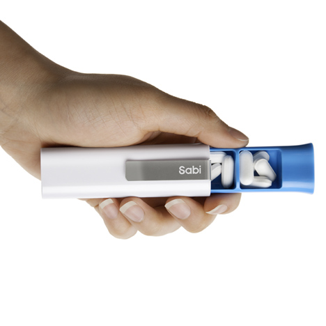
HOLSTER
Daily pill clip
$5.99
Easy to carry, slide-open three-chamber clip-on travel pill case
HOLSTER FOLIO
Weekly pill carrier
$29.99
Load-and-carry weekly pill wallet with removable slide-open three-chamber clips for each day of the week
SHAKE
Easy pill dispenser
$14.99
Germ-free, no-turn-top bottle that dispenses one pill at a time