Whiting Architects adds utilitarian extension to Melbourne residence
Recycled bricks, corrugated cladding and oak flooring were used to build this barn-inspired extension to a house in Melbourne by Australian studio Whiting Architects.
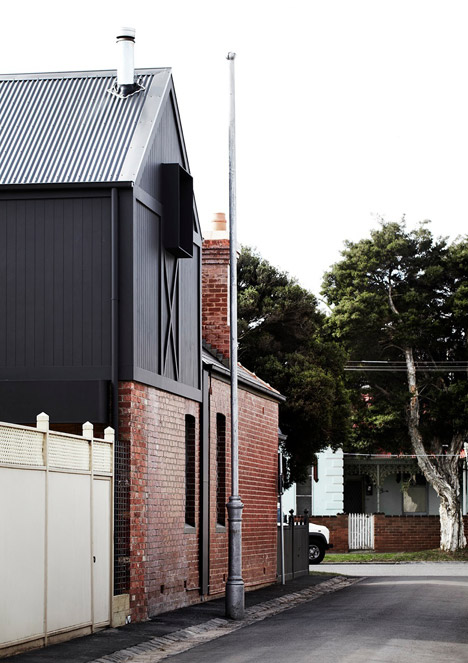
Rather than mimic the traditional features of the single-storey period property at Kerferd Place, Whiting Architects chose to create a contemporary two-storey gabled addition that looks more like a converted warehouse.
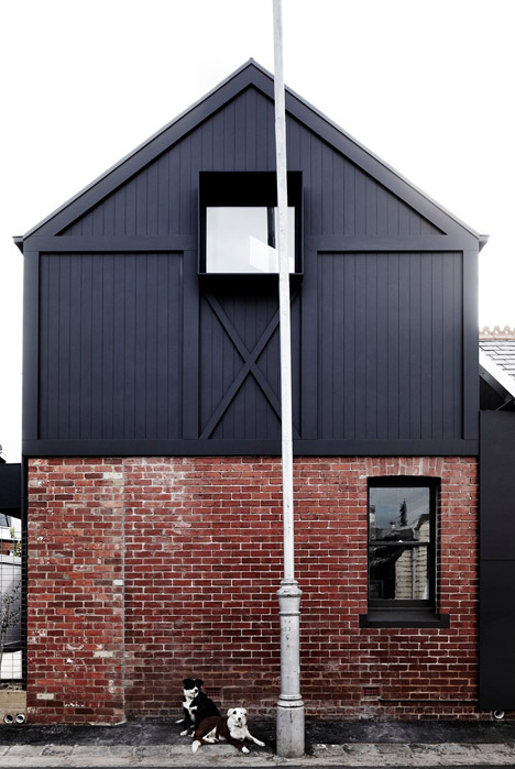
"It is a utilitarian building like a workshop or a barn, conceived out of need rather than design," said studio founders Steven and Carole Whiting. "We wanted to avoided the cliched, heroic-modernist box, or worse still the one-liner gimmick piece."
An existing brick wall provided a starting point for one of the two exposed walls of the structure. Above and beside this, the architects added cement cladding with aluminium-framed windows, creating a facade with solid base and a lightweight upper section.
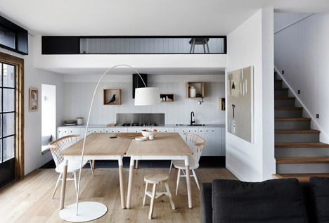
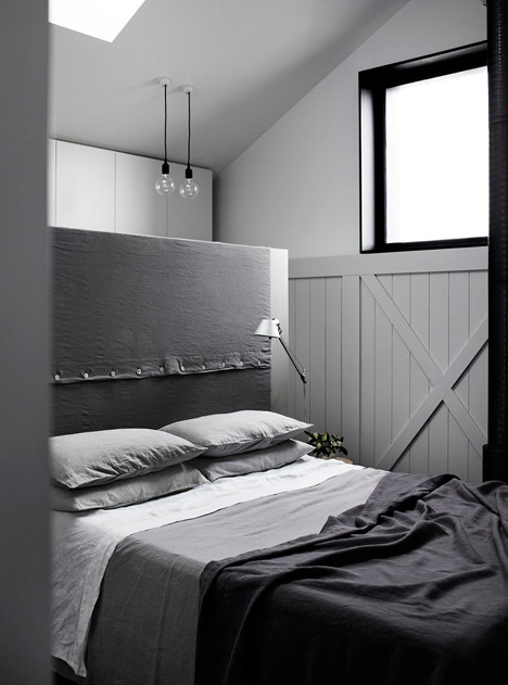
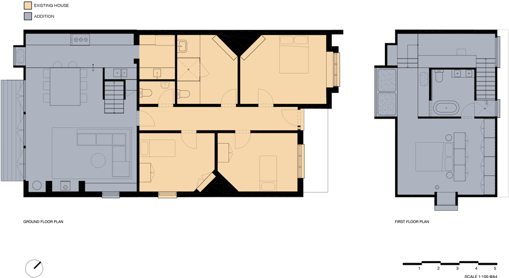
The extension was designed to become the new living quarters of the clients, while the original house now houses their children and any guests. The ground floor accommodates a large living room, dining area and kitchen, while the floor above contains a master bedroom and study.
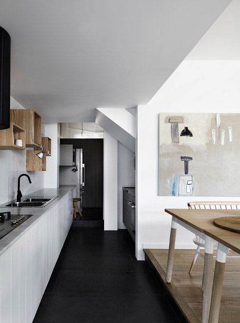
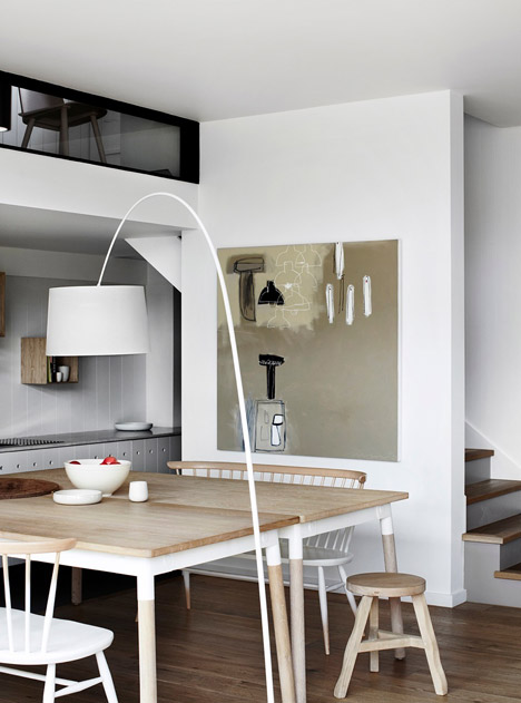
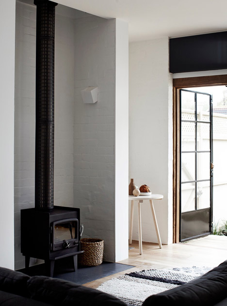
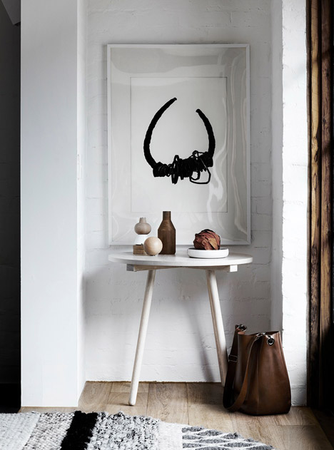
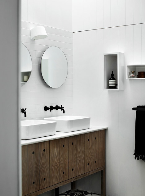
Several interior walls have been lined with plywood and finished in white, matching the newly white-painted brickwork. These are accompanied by oak floors, wooden joinery and a wood-burning stove.
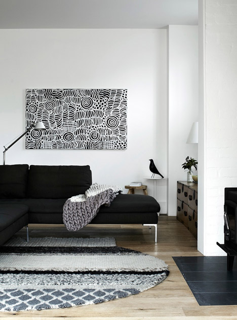
"We liked the idea of capturing the informality of a holiday place. Nothing precious, all simple and practical," said the designers.
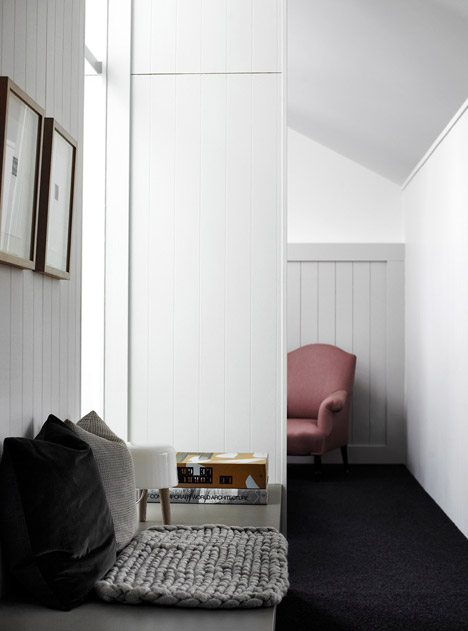
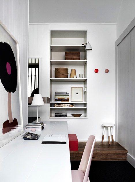
A staircase with wooden treads connects the two floors. A key design concept was to avoid wasting space with unnecessary corridors, so the two intermediate spaces between flights function as a study and window seat.
"This type of single-storey period home was never intended to have a stair, so we kept it simple and secondary," said Steven and Carole.
An en suite bathroom features the only door in the extension. Inside, a free-standing bath tub sits alongside a stable door, allowing bathers to see who's coming up the stairs, and the floor is covered with decorative monochrome tiles.
Photography is by Sharyn Cairns.
Here's a longer project description from Whiting Architects:
Kerferd Place
Rear extension to a double fronted Edwardian Redbrick, slate roof, four principle rooms with a central corridor. The new is essentially a self-contained home for parents. Children and guests are housed in the existing building with their own large bathroom.
A complimentary-opposite; relating through height, scale and proportion. Belonging without replicating. Avoiding the typical flat-roof response at odds with site and surroundings. The new should contribute to a "sense-of-place" transcend fashion; remain contemporary and robust.
In getting back to architectonic basics we wanted to avoided the cliched, heroic-modernist box, or worse still the one-liner gimmick-piece in which the fabric of architecture is reinvented with each lean-to addition. Like a punch line, ok at first, a sugar hit, but by the second visit the novelty has worn thin, more saccharine than sweet.
Separate new from old with a clear delineation space to provide a physical break between the two buildings.
We created an infill building to complete the existing rooftop topography. Our site was the missing "tooth". There is also a strong language of laneway pitch roof, attic garage extensions in the area.

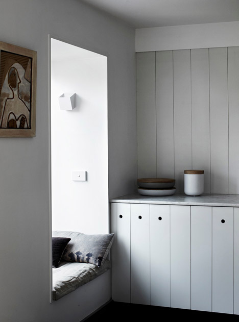
Interior planning is resolved and minimal, no doors or corridors, thus no wasted space = less m2 but maintaining maximum amenity. This type of single-storey period home was never intended to have a stair, so we kept it simple and secondary. One minimal flight up to a low mezzanine study space.
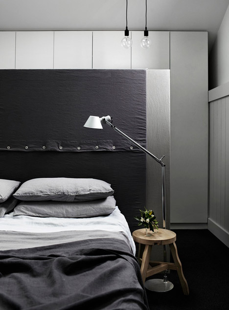
What could have been corridor became the study with an under desk internal glazed visual link to the living area below. Then up a couple of steps to a window box daybed seating area. Again, a no corridor area, instead it's a private sitting area adjacent to the master bedroom.
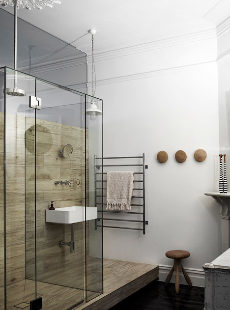
Arrival to the main bedroom is via these "transition spaces", no bedroom door required. The robe is concealed behind bedhead box. The en suite is accessed behind an operable wall panel, a view out from the bath tub is available by sliding back a "barn-door" to reveal more internal glazing, giving the user the ability to personalises the level of privacy they want.
It is a utilitarian building like a workshop or a barn, conceived out of need rather than design. And as with these sorts of buildings, necessity drives the aesthetic.
The walls are panelled and robust, the spaces are just what they need to be and no more. We also liked the idea of capturing the informality of a holiday place. Nothing precious, all simple and practical. Not a high gloss show home, a base from which to explore. Visit the Albert Park village, the beach, St Vincent's gardens, the Albert Park Lake, Aquatic Centre or jump on any one of a number of trams to the city of market.
An open kitchen eating area in the centre of it all with large wide table to spread out, simple efficient combustion fireplace, doors opening out to the back yard.

Adaptation
We didn't start with "design" then turn it into building, we started with "building" and turned it into design. We already had (or sourced) elements and materials. Vintage 1930s steel framed doors, commercial aluminium double glazed windows, timber "scissor trusses", sheet cladding, grilles, fixtures, fittings, tiles, furniture and art.
We then set about crafting a home in a more vernacular, traditional way, to producing something that just "feels-right" through a subliminal, intuitive interpretation of subconsciously familiar architectural elements; corrugated-iron roof, gable-ended pitched roof, square high window, primary geometry: triangle, rectangle, square, extrapolated into 3D objects stacked about the house like giant crates.
Our concept sketch looked like a child's drawing of a house. Reading as an archetype, a prototype; the first in a run. This leads us to that recognisable "dignity-of-style" you get through familiar forms and archetypal elements.
A steep pitched-roof over a rectangular footprint. A single window, too high to look through. Primary-forms and simple-geometry. These aren't features belonging to any single local vernacular; they are common where almost everyone lives.
Despite this ubiquity, we wanted to bring these elements together in an unusually refined and beautiful composition.The house should be a lesson in pride. It helps us to recognise the dignity of a style of building which is regarded as humble only because it has not until now been attended to properly. We point to some of what there is to be proud of in suburbs, in a realistic and practical way. We hope for something more in our work, an engagement with the building that transcends the obvious, something that bathes the subconscious and just feels right "intuitively".
And therein lies the challenge, feels right intuitively – to remain an unspoken joy.