GrandArmy rebrands United States Postal Service with "Americana" graphics
Graphic design studio GrandArmy has overhauled the signage and packaging for the United States Postal Service in the "largest retail rebrand project in American history" (+ slideshow).
The United States Postal Service (USPS) wanted to revamp its 31,000 locations around the country. GrandArmy's aim was to simplify and modernise the in-store graphics used to present customer information to make the experience better for users.
"The USPS knew their retail locations needed help," GrandArmy cofounder Eric Collins told Dezeen. "Things had been cluttered, disorganised and visually messy for years."
"So their brief was a total re-thinking of the in-store experience through signage, language and way finding, and to create a unified system that would hold everything together," he explained. "The goal was to make the experience easier, faster and simpler through design."
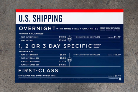
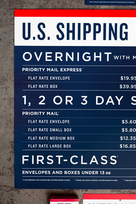
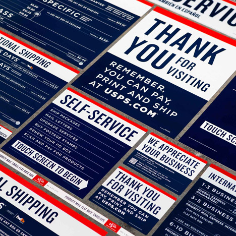
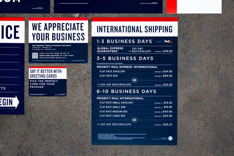
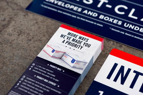
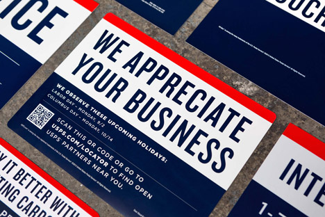
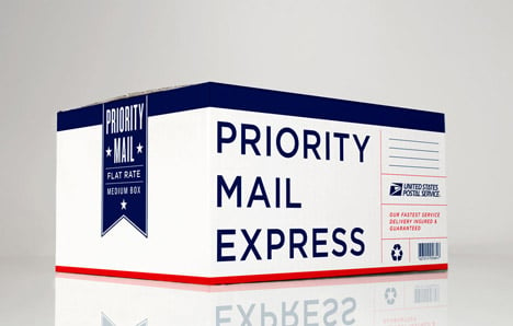
The rebrand encompasses all materials used in the retail outlets, including tags, signage, kiosks, menu boards, welcome signs and window stickers.
"The USPS has something like 31,000 locations," said Collins. "I believe that makes it the largest retailer in the US, making this the largest retail rebrand project in American history, in terms of modified physical locations."
None of the buildings could be physically altered, so the designers had to implement a "paper and paint" solution to transform the interiors.
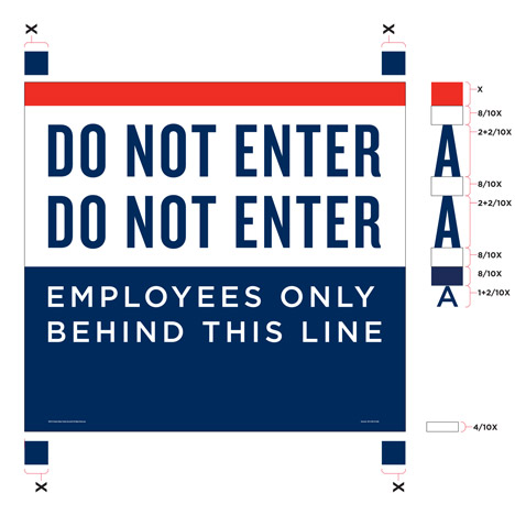
"We developed a very stripped down grid and typographic system," Collins explained. "The whole project really boils down to three colour fields, three typefaces and a simple ratio that determines the size of elements between them."
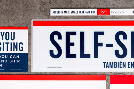
Signage and menu boards are unified into a standard format, using a patriotic colour palette. A red strip runs along the top, headers are written in navy blue on white and supplementary information is presented inversely.
Thin lines break up sections of information to make them easier to read and dotted lines further separate text.
Two typefaces were chosen for text, both designed by New York type foundry Hoefler & Co. Knockout is used in two weights for headers and Gotham medium forms secondary headers and body copy.
"Aesthetically, Knockout hints toward the Americana angle," Collins explained. "[Gotham medium] pairs well with Knockout and is very hard working at smaller sizes."
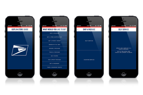
The project also includes the design of a mobile app to act as an in-store guide, which uses the same graphic language.
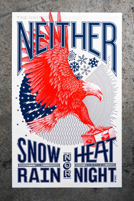
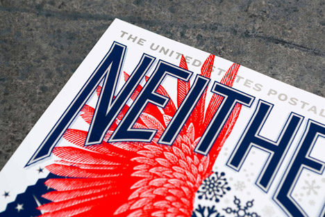
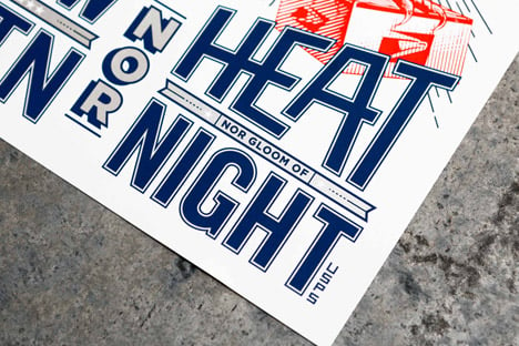
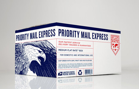
Promotional posters feature an American eagle and typographic art depicting the phrase "Neither snow nor rain nor heat nor gloom of night", which is inscribed across the front of the James Farley Post Office in New York.
"The USPS has a rich history that interweaves with the history of this country going back to its inception," said Collins. "We wanted to nod to that heritage."
"We wanted to make people proud of the USPS," he added. "Politically it often seems like a target, or that we are constantly hearing about what is wrong with the USPS. Rarely do we ever stop to think about what an amazing technical marvel the entire institution is."
GrandArmy's shipping boxes designs were later modified by an external team.