Tokyo unveils 2020 Olympics logo by Kenjiro Sano
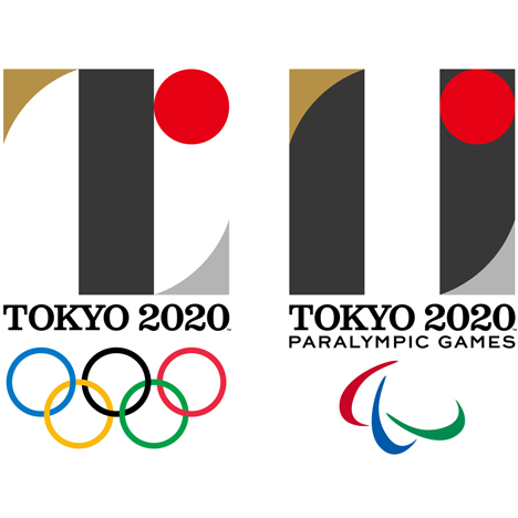
The logos for the Tokyo 2020 Olympic and Paralympic Games by Japanese graphic designer Kenjiro Sano have been unveiled by the event organisers.
The official emblems for the games were presented at an event in the Japanese capital earlier today.
The ceremony was held just a week after the country's prime minister scrapped Zaha Hadid's design for the stadium set to host track and field events, as well as the opening and closing ceremonies, during the sporting competitions.
Sano, founder of Tokyo studio MR_DESIGN, designed both logos to incorporate the red circle found in the centre of the Japanese flag. For Tokyo's Olympics, the graphic designer used blocks of grey and gold to create the shape of a T, which is used to stand for Tokyo, Tomorrow and Team.
"Tokyo 2020 Games emblems are a wonderful work of art that represent the aspirations and the ultimate goal that athletes around the world aim to achieve – taking part in the Olympic and Paralympic Games," said Tokyo 2020 president Yoshiro Mori.
The Tokyo 2020 Paralympic emblem is based on the equals sign, but with two thick lines arranged vertically rather than horizontally.
These bands are formed from the negative space around the stem of the T in the Olympics logo. It features the silver and gold corners, and the red dot, in identical locations.
"This emblem, whilst paying testament to Japan's rich heritage, will represent that brighter future and will become globally synonymous with sporting excellence and the incredible achievements of Paralympians," said Andrew Parsons, vice president of the International Paralympic Committee.
Related content: see all our stories about the Tokyo 2020 Olympics »
"The Tokyo 2020 Olympic Games emblem is a powerful symbol of Tokyo's Games vision," said IOC coordination commission chair John Coates. "By embracing the concept of unity in diversity, it shows the unique ability of the Olympic Games to bring together people from all over the world in peace and harmony."
Earlier this month, the torch for the Rio 2016 Olympics was revealed as an expanding design that reveals coloured resin sections when ignited.
The logo for London's Olympic Games in 2012 designed by Wolff Olins proved controversial from its unveiling in 2007 right up to the event.