Google rebrands with new sans-serif logo
Google has revealed a simplified new logo, a month after the tech giant announced a company-wide restructure with the launch of umbrella brand Alphabet.
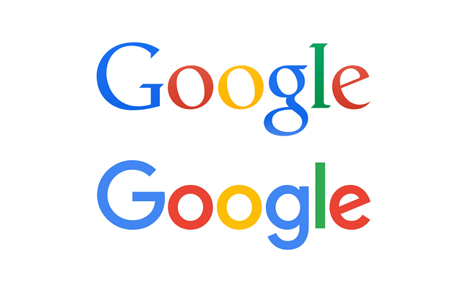
Unveiled today, the design retains that distinctive colour order of the previous Google logo, but the serif typeface has been replaced with a sans-serif alternative that many news outlets have welcomed as "friendlier".

The logo's distinctive and playfully tilted "e" remains, and the colours appear to have been softened somewhat.
The blue "G" icon – which appears on browser tabs – will also be updated to a four-colour emblem, reflecting the colours of the new wordmark.
According to a blog post written by Tamar Yehoshua, vice president of product management, and Bobby Nath, director of user experience, the logo has been designed to be more in-line with people's multi-platform experience of the search engine.
"Once upon a time, Google was one destination that you reached from one device: a desktop PC," the blog post states. "These days people interact with Google products across many different platforms, apps and devices – sometimes all in a single day."
"Today we're introducing a new logo and identity family that reflects this reality and shows you when the Google magic is working for you, even on the tiniest screens."
"We think we've taken the best of Google (simple, uncluttered, colorful, friendly), and recast it not just for the Google of today, but for the Google of the future," they added.

It's the first logo update introduced by the brand since 2013, when it abandoned drop shadows in favour of a new flat logo.
However it is the fifth incarnation of Google's logo in its 17-year history. The original logo, designed in Baskerville Bold, was used for just a month in 1998.
Later that year an exclamation point was added, and Google's five colour order of blue-red-yellow-blue-green-red was instated.
The introduction of the new sans-serif logo echoes the Alphabet wordmark – also in a sans-serif face – introduced by Google earlier this year as part of its restructuring announcement.
Google will sit as one of many companies under the parent Alphabet brand, which was created by CEO Larry Page to help expansion into different fields.
A video posted by Google documents the search engine's visual history and evolution, as well as showing how the new graphic language will be deployed across Google's various digital services.
The new design has already been added to the Google homepage, with an animation that shows a hand wiping out the old logo and writing the new one in chalk. The new identity will be rolled out to other Google services in the following weeks.