Adrian Frutiger, type designer and creator of London's street-sign font, dies aged 87
Swiss typographer Adrian Frutiger, designer of typefaces including Univers, Avenir and the eponymous Frutiger, has died.
Graphic designers have paid tribute to his life and his legacy. Erik Spiekermann called him "the best type designer of the 20th century" while London-based studio Sawdust said that his "brilliance and influence knew no bounds".
Frutiger, whose letterforms graced signage from Westminster in London to Disney World, died last Thursday aged 87.
Born in 1928 in Unterseen, Frutiger had an early fascination with scripts and symbols and wanted to become a sculptor, but his father didn't approve of his artistic ambitions.
Instead he took an apprenticeship with a local printer before enrolling at the Kunstwerbeschule (School of Applied Arts) in Zurich, where he studied under Walter Käch amongst others.
Käch encouraged his students to make rubbings of Roman inscriptions and Frutiger would later look back on these exercises as playing a very formative part in developing his understanding of – and love for – letterforms.
In 1952 he went to Paris to join the Deberny & Peignot type foundry, designing his own typefaces and adapting classic fonts for the new phototypesetting machines. As a typeface designer, Frutiger's main passion was clarity.
"I first experienced the power of type to make the whole intellectual world readable with the same letters in the days of metal," he wrote in the foreword to his book Typefaces: The Complete Works.
"On my career path I learned to understand that beauty and readability – and up to a certain point, banality – are close bedfellows: the best typeface is the one that impinges least on the reader's consciousness, becoming the sole tool that communicates the meaning of the writer to the understanding of the reader."
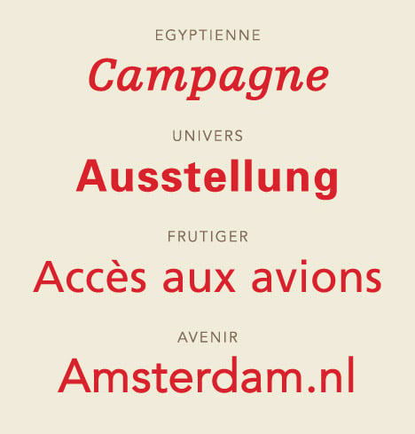
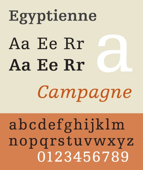
Although Frutiger produced more than 30 typefaces, including serif typefaces like Méridien and Didot, he is most famous for his sans-serif creations.
Univers came about after he was asked to adapt Futura and suggested instead he might work on something new. He produced the font system in just 10 days, drawing on scrap card and sticking together the results.
"I was completely immersed in this stage of inventing, the way only a young man can be," he told Eye magazine in 1999.
The typeface was revolutionary in that Frutiger designed a large, coherent font family of 21 variations, explained by his own numbering system whereby the first digit signals the weight of the characters and the second the width.
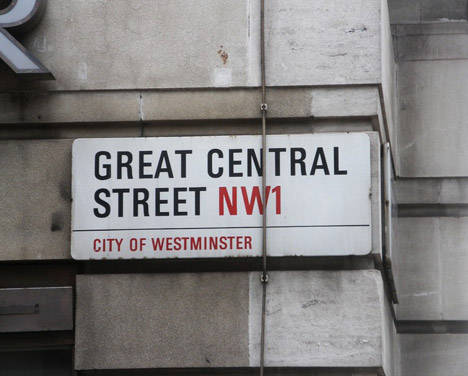
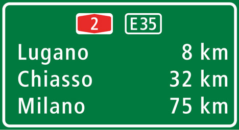
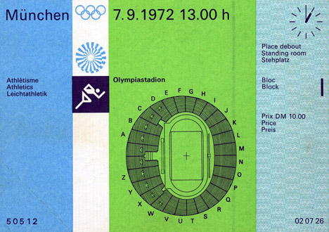
Univers was hugely popular during the 1960s and 1970s, embraced by brands like Deutsche Bank, General Electric and Apple. Its clarity made it perfect for signage – it could be found in Frankfurt International Airport and on London street signs, in Disney World and across the wayfinding at the 1972 Olympics in Munich. It endures today thanks to its suitability for digital screens – the likes of CNN and eBay have regularly used Univers.
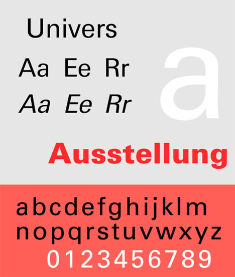
The design writer Yvonne Schwemer-Scheddin called it "a masterpiece of structured diversity," but Frutiger himself was modest about his most famous creation.
"I don't want to claim the glory," he told Eye. "It was simply the time, the surroundings, the country, the invention, the post-war period and my studies during the war. Everything led towards it."
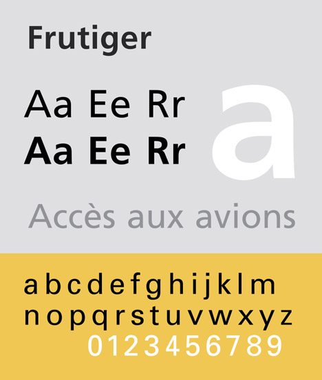
He repeated the success with Frutiger, released in 1975, which also became a firm favourite with an eclectic range of organisations, from universities and brands to airports and armies. Erik Spiekermann called it "the best typeface in the world for the Latin alphabet" and thinks his mentor's brilliance lay in marrying the technical and emotive aspects of type design.
"I know of no other typeface designer who can put so much feeling into a systematic approach," he says. "Frutiger's typefaces are always carefully planned, but they never look it."

Roger Black, the designer, art director and founder of Font Bureau type foundry, agrees. "With Univers, Serifa, Frutiger and Avenir, the left and right brains are working together," Black told Dezeen. "I expect when our successors look at them in 50 years, they'll still be great designs."
"He combined great design talent with a very modern theory of the way type should work, so the type is beautiful, and also enormously useful."
Black believes Frutiger will also be remembered for redefining the role of a type designer. "The 20th century had already produced type designers who had great original style. Frutiger took this kind of individuality to the next level. He amplified his personal aesthetic for typefaces into large families. This work inspired younger type designers to think on their own."
Alongside designing type, Frutiger set up a design studio with Andre Gürtler and Bruno Pfäffli in the early 1960s, working on branding projects for the like of Air France and IBM. He wrote several books and taught design for many years, most notably at the Ecole Estienne and Ecole Nationale Supérieure des Arts Décoratifs in Paris.
He received the Chevalier de l'Order des Arts et Lettres and the New York Type Directors Club Type Medal. After both of his daughters committed suicide at a young age, he and his wife established the Fondation Adrian et Simone Frutiger which helps fund mental health research.
He moved back to Switzerland in 1994 and continued to work on updated versions of his typefaces. He died in Bremgarten bei Bern on 10 September.