Studio Egret West reveals designs for future London Underground stations
Studio Egret West has unveiled a "revolutionary new design vision" for London Underground stations of the future (+ slideshow).
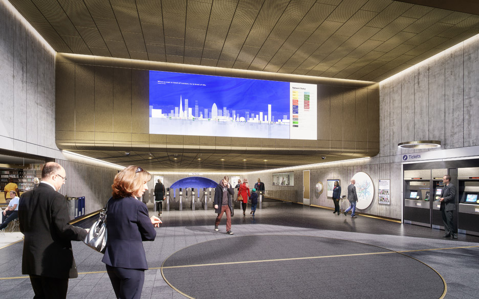
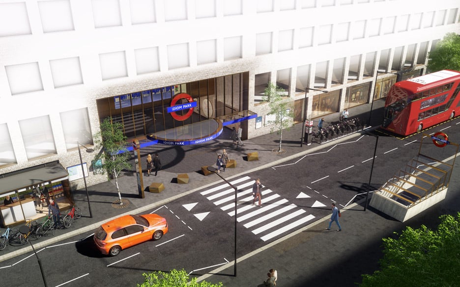
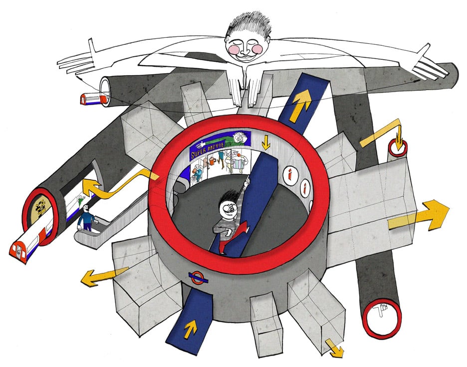
The design manifesto developed by the London studio prescribes design details "from pavement to platform", including more eye-catching tube station entrances, subdued lighting and blue tiling.
Developed with Transport for London (TfL), the Station Design Idiom offers guidelines for repairs of existing stations, as well as large-scale new builds. The aim is to create a uniform appearance across the network.
The present branding – including the Underground's iconic circle and bar roundel symbol, and its sans-serif typeface – was designed by typographer Edward Johnston in the early 20th century under the direction of TfL's publicity manager Frank Pick.
During the same period architects Harry Ford and Charles Holden developed stations along the District and Piccadilly Lines, while draftsman Harry Beck developed the tube map in 1931.
But TfL said there has been a "lack of confidence" in the Underground's brand identity since the end of world war two, and these new plans are an attempt to change that.
"Not since the days of Frank Pick has there been such an opportunity to holistically rethink the network's design approach," said David West of Studio Egret West. "We are delighted to be involved in the London Underground Station Design Idiom project at such a pivotal point in the network's evolution and to receive recognition for it already."
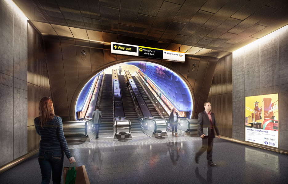
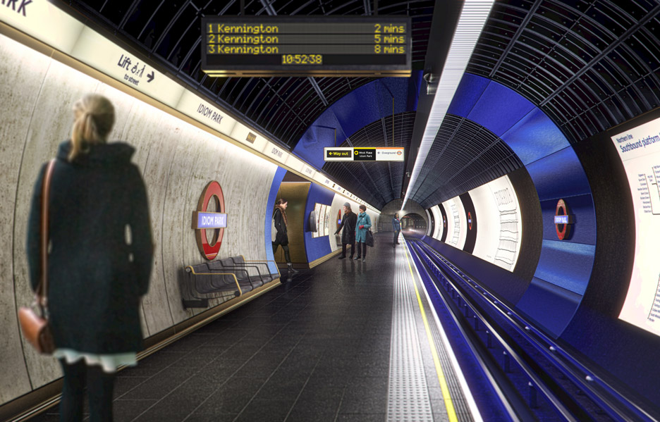
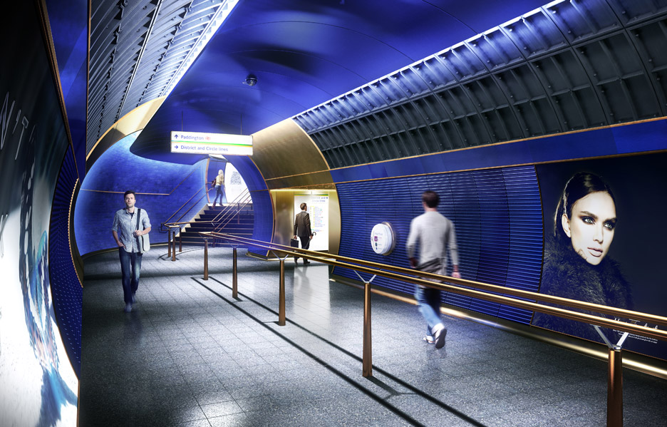
The corporate blue from the roundel signage features heavily in the new designs, alongside bronze and grey finishes. This so-called 2015 palette will be applied to new stations and used to update older stations in need of repair, using the contrasting colours to help improve navigation and appearance.
Platforms will feature darker grey ceilings, to conceal dirt and wires, while trackside cabling will be covered with removable cladding.
One visual shows a loop of blue tiling that accentuates the circumference of the tube tunnel, while in another the same coloured ceramics line a passageway between platforms.
Previous renovations and cumulative patch repairs had been "insensitive or blind" to the overall station design and had caused a "decline" in quality, said TfL.
"Successive initiatives have compromised [the Underground's traditional brand identity] under the guise of 'progress' and 'freshness'," it continued. "We aim to reclaim and improve this legacy."
The strategy calls for heritage features to be preserved where they exist and for new artworks to be integrated.
"This Design Idiom is about ensuring we put great design at the heart of what we do for now and the future," said London Underground's strategy director Gareth Powell.
The project was awarded the Design Champion Award in the 2015 London Design Awards and the plans are currently on show at Platform project space near Southwark Underground station.
It forms part of a series of improvements to the network. Last year, London firm PriestmanGoode unveiled designs for driverless trains, which are set to be rolled out on four network lines by 2020.
Studio Egret West has previously worked with Hawkins\Brown on the overhaul of the brutalist Park Hill housing estate in Sheffield, and designed a library in south London that looks like a row of books.