Wolff Olins' logo for Oi morphs in response to sounds
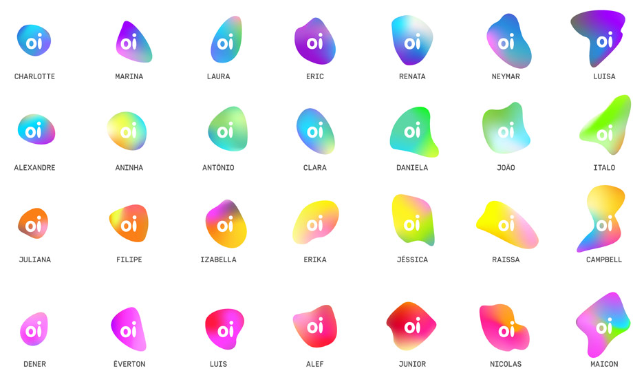
British-American branding firm Wolff Olins has created a shapeshifting logo for Brazilian telecoms company Oi that changes colour and form in response to people's voices (+ movie).
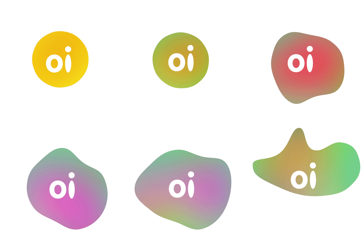
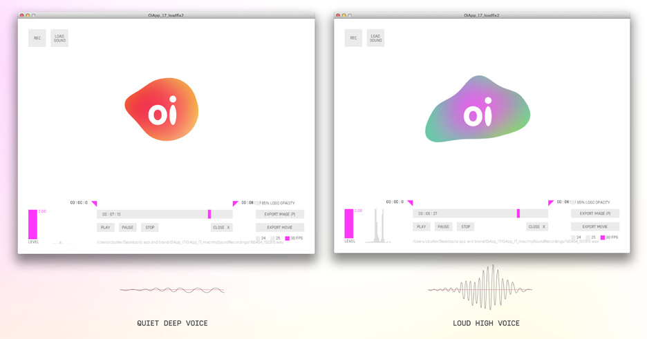
Volume increases the size of the logo, whereas changing pitches vary the colours and shape. Quiet, low voices create "calm" blue versions, whereas louder more high-pitched voices result in "a more wild and fluorescent symbol".
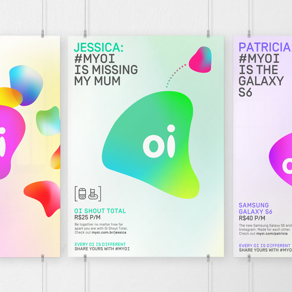
The new logo replaces the company's previous static "orange speech bobble", although features the same white cut-out lettering.
"We worked really hard to define the exact movement, shape and colours of the logo in response to sound," the firm's design director Campbell Butler told Dezeen. "We wanted it to feel really organic and beautifully responsive to human voices."
The consultancy collaborated with design studio Onformative to develop custom software, which allows anyone to use sound to transform the digital logo on-screen via a microphone. It also lets users save their own iterations.
Moving, responsive versions of the symbol will also be used in live-action environments, whereas unique versions of the logo will be generated for print.
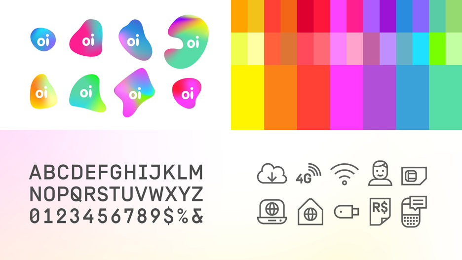
The firm has also created a modified version of the Simplon typeface, originally designed by foundry Swiss Typefaces, and a set of icons.
Subscribe to Dezeen's YouTube channel for the latest architecture and design movies
"People are at the heart of this brand," said Butler. "An important part of the brief was to develop icons and typography that could be easily 'read' by anyone, on any device."
Wolff Olins was also responsible for the much-debated new logo for The Metropolitan Museum of Art – referred to as a "graphic misfire" by New York Magazine's architecture critic Justin Davidson.
Taxi app Uber also recently found itself at the centre of criticism for its new identity, which included a widely derided "asshole" logo.