Paul Eis uses Instagram to give German architecture a colourful makeover
Photo essay: keen to embark on career in architecture, young German student Paul Eis has been documenting the buildings of Berlin and Hamburg, but adapting them with bright colours (+ slideshow).
Eis, 18, uses the Instagram account the_architecture_photographer, to present his images, which have all been stripped of their context, updated with a new colour palette and superimposed over a vibrant blue backdrop.
He hopes the series will help show there is more to these cities than white and grey facades, and believes the addition of colour can help to highlight the interesting and unique qualities of buildings ranging from Walter Gropius' Bauhaus Archive to Frank Gehry's DZ Bank.
In a text written exclusively for Dezeen, he explains the purpose of the project.
I started my Instagram project in the summer of 2015, but I have been interested in architecture and buildings since before I can remember. When I finish school this year – the same school Bauhaus founder Walter Gropius went to – I want to study architecture.
With my photographs, I initially wanted to focus more on the buildings than on the technique of picturing them in the most spectacular way. But in a city like Berlin, sites that are both interesting and offer a pure view are very rare.
After photographing a few famous backyards and underground stations, I started to get bored. There is also distinct lack of colour in Berlin's modern architecture. So I started giving the buildings new colours.
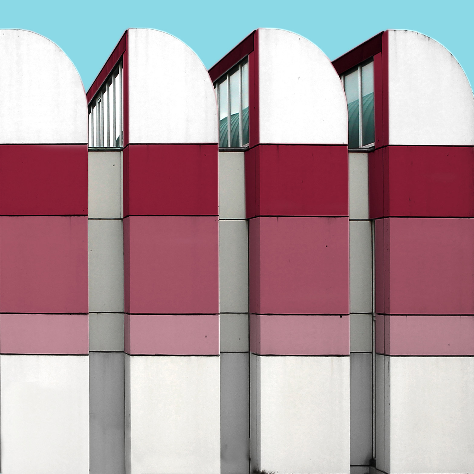
The first objects I did this to were some of the typical socialist housing estates in east Berlin – buildings with very strong rectangular shapes and clean geometries. Fascinated by these minimal designs, I thought some colour could make these monotonous white or grey structures more interesting.
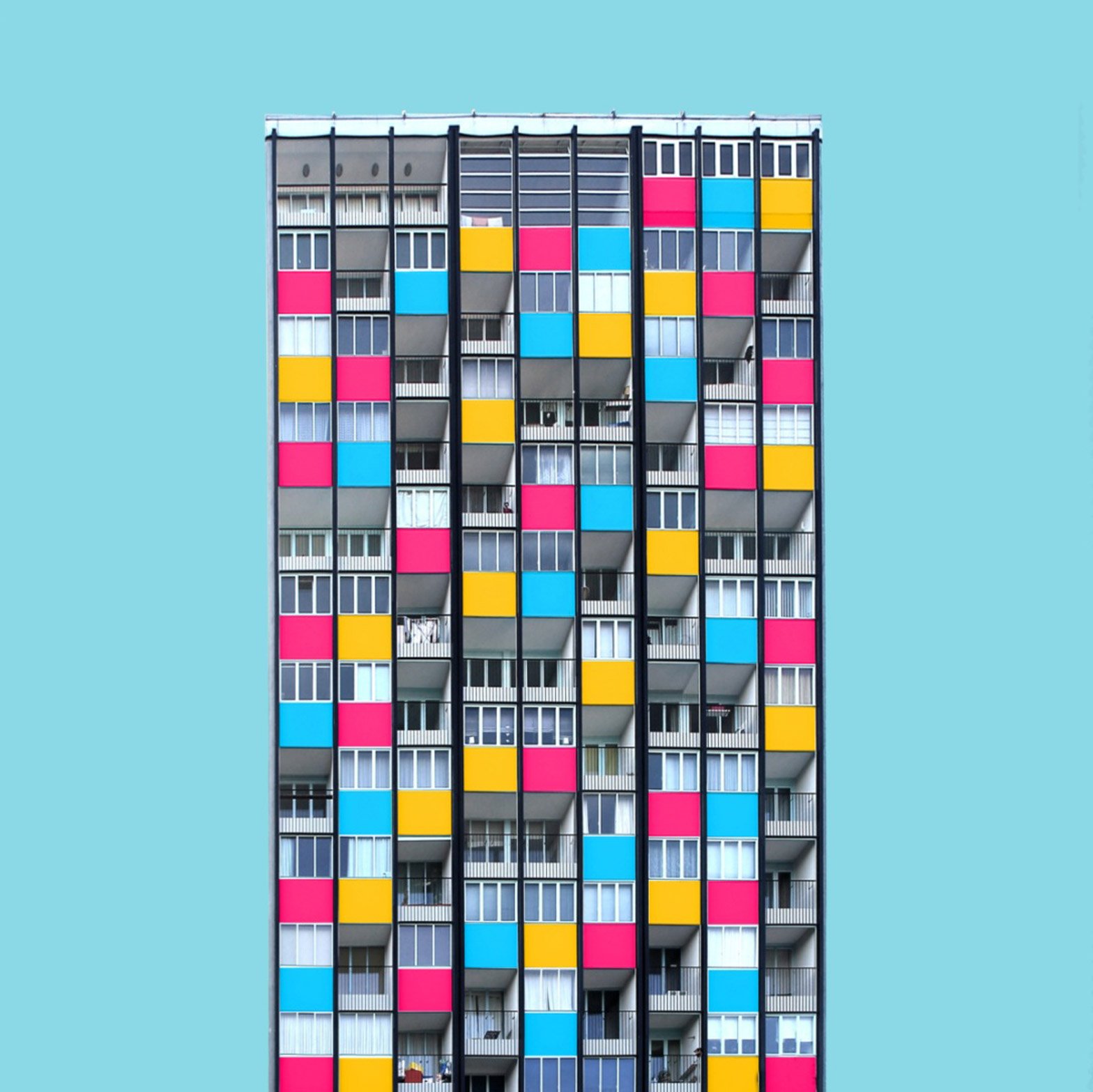
In the beginning I just coloured in pictures of straight facades, transforming them into vibrant, geometric structures. Later I started adding whole buildings to the series, and starting including contemporary buildings from Berlin and Hamburg. I also added social housing estates in west Berlin. Although the design of these homes is not that spectacular, buildings by architects like Gropius fascinate me with their clean lines and gigantic proportions.
All my images, except the full-sized facades, have a uniformly blue background. The blue acts as a characterising property and it focuses the viewer's eyes on the building itself, creating contrast between the colours I apply and the white areas I leave. I like to think this is comparable with the gold backgrounds that paintings from the Middle Ages often have.
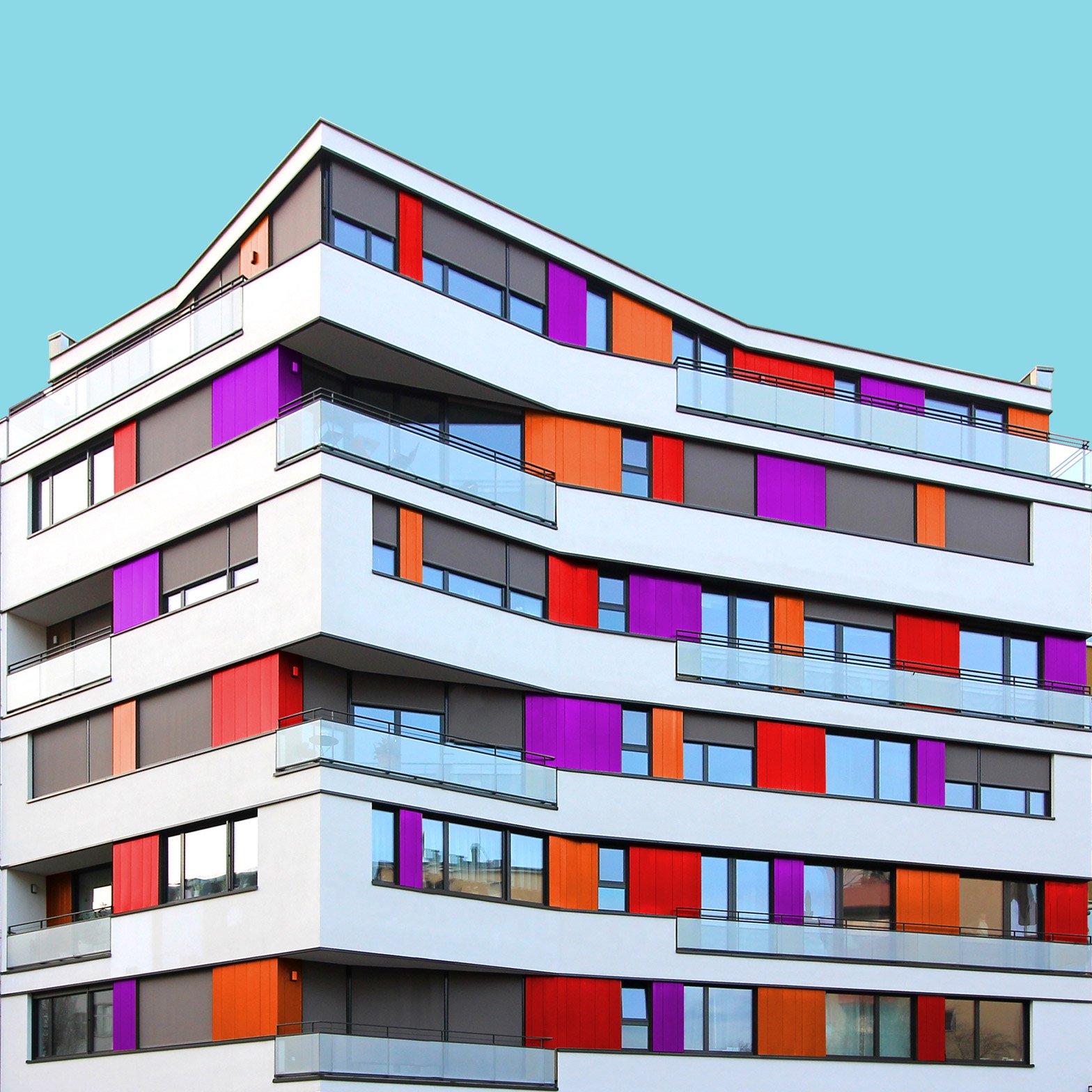
When colouring buildings, I orientate mainly towards characteristic elements like balconies or windows. Sometimes, when the buildings already have some colours, I include them in my images. The colour palette is intended to be either purely complementary, rich in contrast, or to define a colour gradient. But I always use at least one colour that suits the background. Also, the order of the colours in each image depends on the building's structure. When the building has a clean geometry, I order the colours in a somehow repeating way. But when it has a random structure, I usually choose a more random order of colours.
The method of photographing is also very important for me. Shooting with a wide angle lens gives the image a sense of depth, but keeping the vertical lines straight allows it to be appear very stoic. I do this by applying perspective correction in the post-production stage. Cutting the building out of its environment makes it appear more monumental, standing alone in an undefined landscape with no other object in correspondence.
The project could be seen as a way of showing how much of Berlin and Hamburg's architecture can be understood as artwork. Buildings should not be defined by shape only – but it is hard when so much of the architecture in Germany is grey. Adding colours helps to highlight how interesting and unique these buildings are.
For example, the Uhl64 building by Raumpool Architekten – a modern white corner house – is by no means ugly in reality, but it is also not really special. Adding colour to the window dividers gives it a completely new lively look.
Meanwhile, the Marcopolo Tower in HafenCity Hamburg is a good example of when white facades were the wrong solution. After just a few years, the former white facade of the Marcopolo Tower has grey areas that make it look dirty.
My project is not meant to be a critique on modern architecture, but maybe instead on the rise of boring housing estates. Because of the housing market in Berlin, it is hard to understand why companies take so little care in creating good architecture. Maybe it is the mentality of the buyers or just a lack of interest in architecture. I do not know. But it hurts me every time I see new buildings that seem so dull and I know will look ugly in just a few years, especially when their white facades start to get dirty.
Some of my coloured buildings feel utopian as well. In reality the colours would probably become just as dull as the white, but in my opinion they are a way of making the cityscape more interesting.