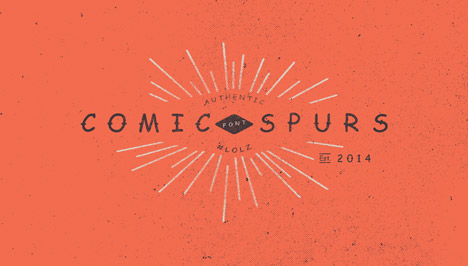
Comic Spurs typeface is Comic Sans with added irony
Two designers from different sides of the globe have used a fictional design company to launch a new version of Comic Sans, with added spurs to lend it a "vintage, Mid-Western American aesthetic".
Sydney-based design director Michael Kleinman and New York art director Declan Byrnes-Enoch have published Comic Spurs under the name James H Goldberg.
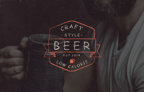
Comic Spurs is based on Comic Sans, the comic book-style typeface designers love to hate. Each letter has added barbs, some running through the middle and some sticking out from only one side. These are the spurs referred to in the title – a reference to the spikes worn by horse riders and cowboys on their boots.
The typeface is available from a bespoke website, which introduces Comic Spurs as a way to "fight back against the anti-establishment establishment".
"These days it is getting harder and harder to be ironic," it says. "Comic Sans used to be funny to designers, but it's been corrupted by 'The Man'."
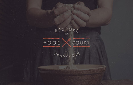
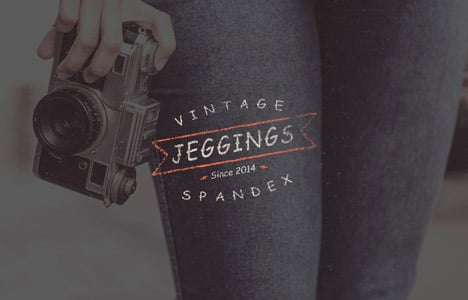
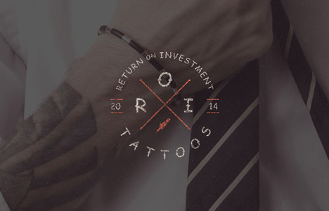
The designers said they created the typeface as a response to a growing trend for typography and branding "with a vintage, Mid-Western American aesthetic".
"It's usually accompanied by smaller words and slogans like 'Artisanal' or 'Finest Quality'," the designers told Dezeen. "Since those words require very little substantiation, it's easy to perceive them as fake, almost ironic. How could something so weathered have been founded last Tuesday?"
"So the challenge was to authentically reproduce this style with the world's most ironic font."
Comic Spurs can be downloaded from the specially created website, and is available to use for free.
It is part of a wider collaboration under the name James H Goldberg, through which the designers work on "absurd" projects that poke fun at the design world.
"As creative professionals we usually work on more sincere projects and have both at times seen the absurdity in what we do, and how seriously people can take it," they said. "James H Goldberg provides the perfect opportunity to reflect that absurdity, with the same techniques we use to create sincerity on a daily basis."
Past projects have included Creative Promises, a range of 3D-printed promise rings – jewellery used to demonstrate commitment to a partner before or instead of marriage – designed to show the "special bond" between art director and copywriter.
"From that, we realised one of the most enjoyable aspects was reading people's interpretations of our work, good or bad, it's fascinating," they said. "So we wanted to make something that people would react to. Cue Comic Sans. And the fact that it's probably the most overused joke in the design world only adds fuel to the fire."
Kleinman and Byrnes-Enoch said that they hoped Comic Spurs would provoke a strong reaction but also show how design can be used to "manipulate people's perception".
"If a middle-class office worker with a neck tattoo looks like a badass, maybe Comic Sans with spurs can too," they said.
Based on hand lettering found in comic books, Comic Sans was first distributed as a part of Microsoft's standard font package in 1995.
Its availability on millions of desktop computers rapidly made it one of the most popular typefaces in the world, but designers who felt it was being used "inappropriately" began to campaign against it in 2000.
It is now described by the V&A Museum as "one of the most popular and despised typefaces in existence".
Last month, creator Vincent Connare – who once said the typeface was "the best joke I ever told" – defended the typeface in an exclusive interview with Dezeen.
"I think people who don't like Comic Sans don't know anything about design," Connare told Dezeen. "They don't understand that in design you have a brief."
"The timing couldn't have been better because to us it kind of signified the very end of the Comic Sans joke," said Kleinman and Byrnes-Enoch.
"You could say that one of the fundamental differences between art and design is a brief. Connare had a brief and he answered it so well that to use it for anything other than its original purpose is utterly ridiculous."
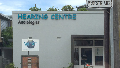
"Like using Papyrus for a futuristic action sci-fi film; its misuse is the joke, not the font itself. Talking cartoon dog? Definitely. Extruded signage for an audiology clinic? Maybe not."