Neville Brody and Nike design "modular and slightly industrial" typography for England women's kits
Graphic designer Neville Brody has collaborated with Nike to create a typography for the England women's football kit that references the original Wembley Stadium's art deco origins.
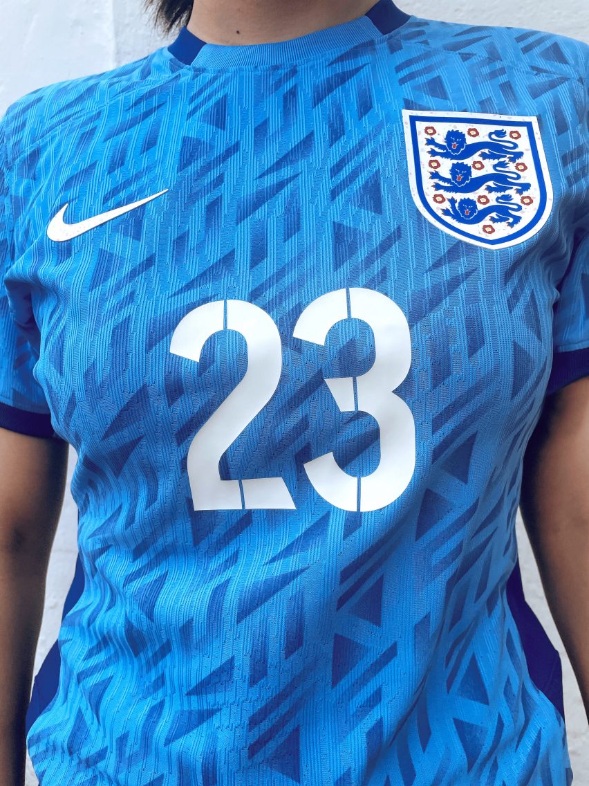
The lettering and numbers are an updated version of the typeface that Brody created prior to the 2014 World Cup for the England men's team football kits.
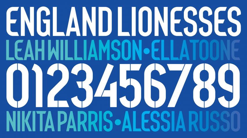
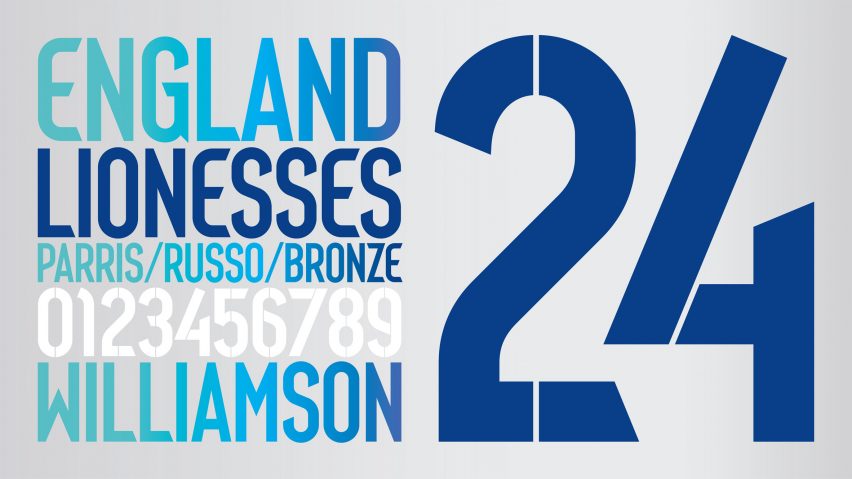
This typeface is taller and lighter to accommodate reduced sizing and features more angled elements with stencil-like lines "to bring more of an inventive and creative narrative," according to Brody.
"It evolved from the same core spine and approach [as the 2014 typeface] but was reconfigured according to the different form and proportions of the kit," the designer told Dezeen.
The blue and white characters take cues from the recently released kit on which it is emblazoned, designed by Nike to pay homage to 100 years of Wembley Stadium, which first opened in 1923.
Art deco-style patterns and a chalk-coloured hue modelled on the original stadium's brick facade characterise the kit's blue and white shirts respectively.
"We incorporated many architectural and stylistic elements, which were also featured as a central part of the pattern Nike's team had created for the textile print," explained Brody.
"These included angled cuts, strokes and use of negative space and a geometric approach to how curves joined straight lines."
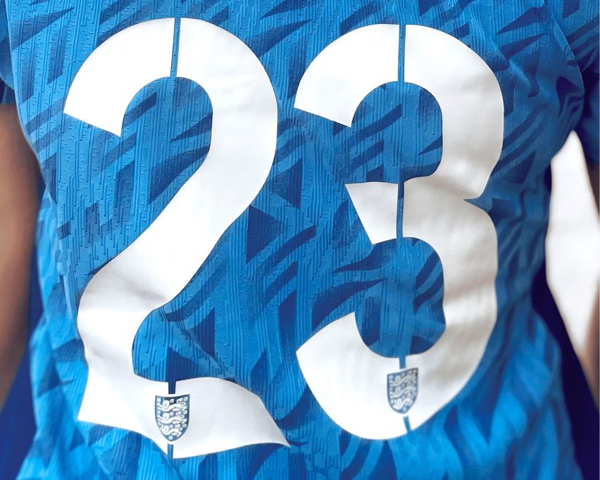
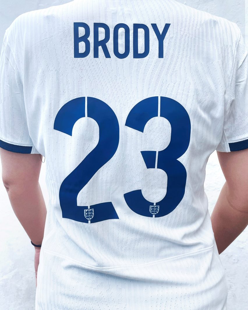
The typeface's stencil-like design also featured in its 2014 iteration and cuts through the large numbers displayed on each player's shirt.
"The stencil feel functions as a means to create lettering that feels modular and slightly industrial, emphasising team dynamics and efficient organisation," added the designer.
Brody said that while some of the original ideas for the typeface were more "adventurous", the designer and his team worked with Nike to ensure that the typeface remained legible – especially on-screen during a fast-paced match.
"Exploring the boundary between legibility and abstraction was a major part of our development process, seeking the sweet spot between expression and function," explained Brody.
The England team – also known as the Lionesses – debuted the kits during the first-ever Women's Finalissma, in which the winners of the UEFA Women's Euro cup meet the winners of the CONMEBOL Copa América Femenina, which the team won against Brazil last week.
On Tuesday, the Lionesses wore the kit to play Australia in an international friendly game, but one in three players' names were removed from their shirts to highlight the statistic of people born in the UK today who are expected to develop dementia.
The kit also features period-conscious blue shorts that are fitted with an ultrathin absorbent liner so that players can bleed more comfortably and discreetly during a match.
Known for his typography design, Brody previously created Coca Cola's first own-brand typeface.
The images are courtesy of Brody Associates.