Thonik updates Dutch Design Week's graphic identity for 20th anniversary
Amsterdam studio Thonik took cues from the typography of graphic design legend Wim Crouwel to create a fresh identity for Dutch Design Week, marking two decades since the inception of northern Europe's largest design festival in Eindhoven.
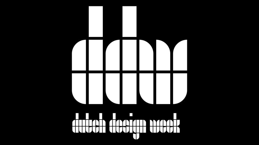
The branding takes cues from a seminal poster designed by Crouwel for an exhibition on Dutch painter Edgar Fernhout, which was held at the city's Van Abbemuseum in 1963.
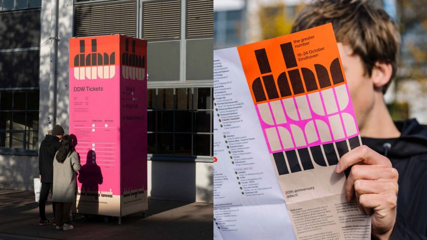
The poster features Crouwel's specially designed Fernhout typeface – a collection of 13 chunky grid-based letters formed using quarter circles.
Thonik updated the identity for Dutch Design Week (DDW) using the characters featured on the poster and worked with London-based type foundry The Foundary Types to design the remaining 13 letters and complete the alphabet.
"The new identity goes back to the first identity of the festival, where DDW was written in a similarly constructed font," Thonik told Dezeen.
"In that way, it is a celebration of 20 years of Dutch Design Week."
When written in the Fernhout typeface, the letter W in the DDW logo also resembles a tulip – Dutch Design Week's longstanding logo and the national flower of the Netherlands.
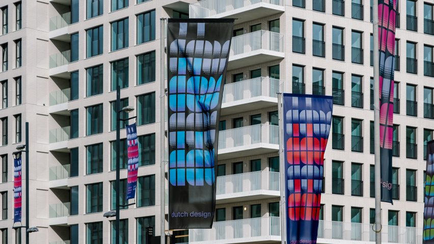
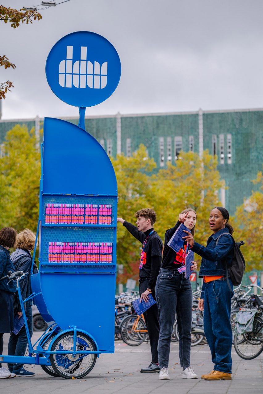
The distinctive graphic identity was featured on a range of signage and wayfinding during the design festival, which ended last Sunday.
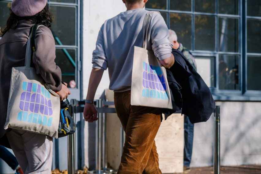
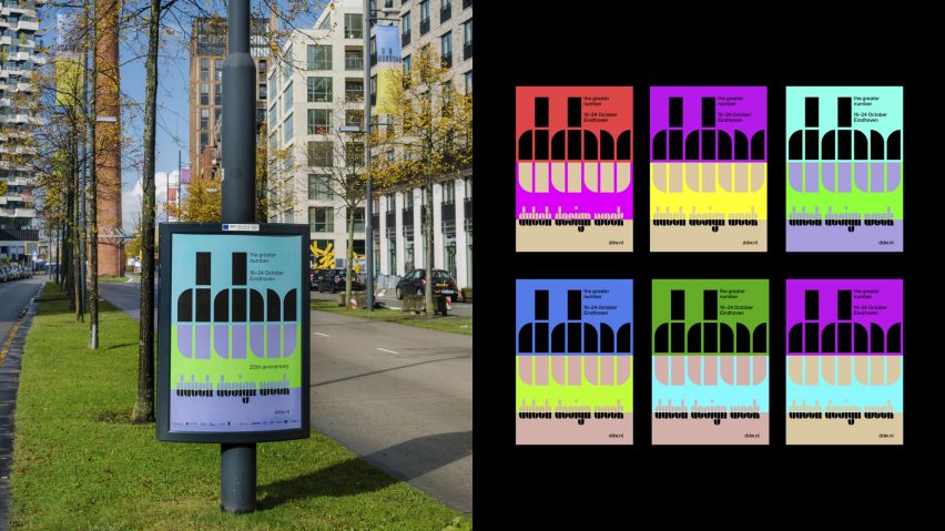
"DDW and its full name Dutch Design Week are written in the Fernhout typeface, as are short words like map, crew, press and TV," said Thonik.
"We use grids throughout the online and print communication. A wide mix of colours also brings liveliness to the identity."
Thonik created various animations to promote the festival based on the branding, which has been shortlisted in the graphic design category of the 2022 Dezeen Awards.
Other projects in the running for the award include a series of typefaces designed to protect Indigenous languages and OlssønBarbieri's rebrand for Château Picoron, which plays with the restrictive winemaking regulations of Bordeaux.
Although this year's edition of Dutch Design Week recently drew to a close, Dezeen has created a highlight reel of the event and explored various projects presented as part of the festival, including biodegradable soap packaging made from artichoke leaves and peapods.
Other designs investigated the potential of off-grid lighting systems created to showcase the benefits of solar power and minimalist furniture made from folded sheets of steel.
The images are courtesy of Thonik.
Dutch Design Week 2022 took place from 22 to 30 October. See Dezeen Events Guide for an up-to-date list of architecture and design events taking place around the world.