
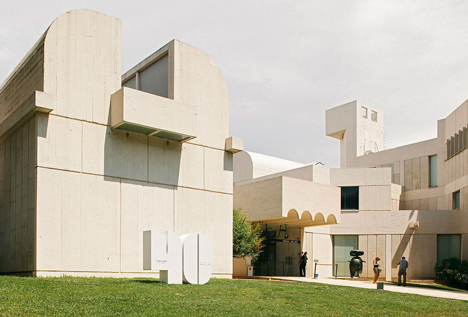
The distinctive shapes of Catalan architect Josep Lluís Sert's Joan Miró Foundation building in Barcelona are interpreted as a set of graphic symbols in celebration of the organisation's four decades of operation (+ slideshow).

The anniversary identity and communications were created by design studio Mucho, which has offices in Barcelona, Newark, Paris, San Francisco and New York.

Tasked with creating "a very recognisable and iconic symbol", the studio purposefully avoided using visual elements that would repeat the Miró Foundation's existing corporate identity.
"We were asked for a campaign capable of relating the centre to the people of Barcelona, through relevant dates of the last 40 years," the studio explained in a statement.

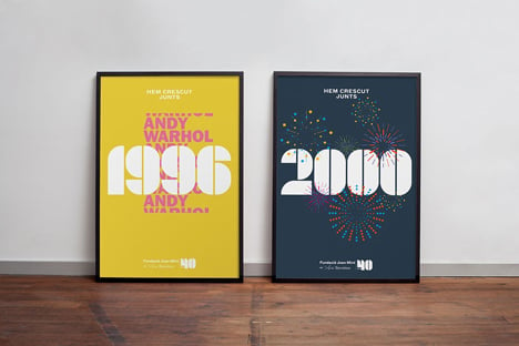
The foundation, which opened in 1975, showcases local artist Joan Miró's work alongside that of other contemporary practitioners. It has hosted exhibitions from artists including Jackson Pollock, Olafur Eliasson and Mark Rothko.

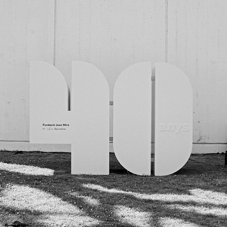
Mucho used the cultural centre's Sert-designed Modernist building as a visual reference. The curved skylights that allow light to filter into the gallery's architectural shapes are echoed in the forms of the letters and numbers.

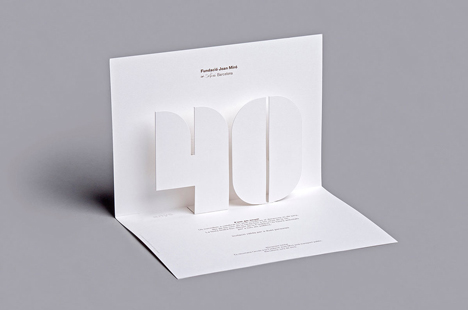
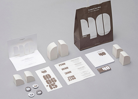
"Its characteristic skylights are the perfect base to generate a typographical modular system," Mucho explained. "This finding was important not only as a solution to the logo, but also to compose the key dates of the campaign."
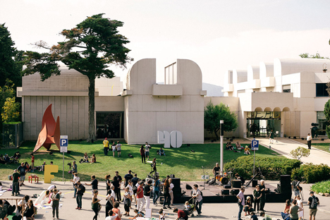
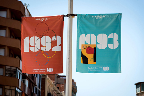
Oversized three-dimensional representations of the number 40 appear outside the centre, as well as across various printed materials including a pop-up invitation.
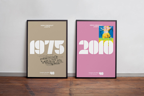
Posters mark the foundation's 40th anniversary by highlighting some of the centre's standout exhibitions, again using the modular type that reflects Sert's architecture.
"When a piece of design taps into our emotions it is because it conveys the magical, hidden truths of a message," said Anna Noëlle, the centre's head of communication.
In 2007, Lisa Rienermann used the shapes of buildings to form an alphabet of photos – and more recently, Polish studio Zieta experimented with the possibilities of three-dimensional type by using inflated sheet metal to create letters.