
Sebastian Wrong's Font Clock "wakes people up with a real crack" at midnight
Most Loved: London designer Sebastian Wrong reflects on living with the distinctive sound made by his 2007 Font Clock for Established & Sons in the latest movie in our exclusive video series.
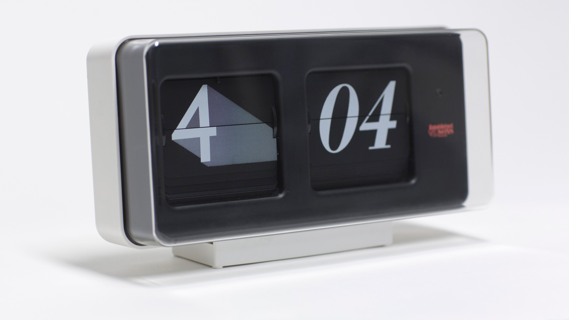
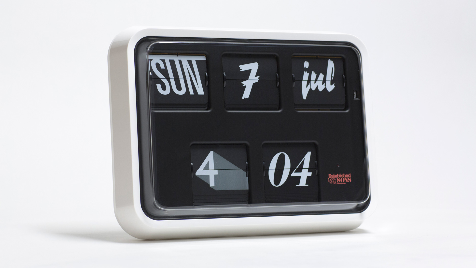
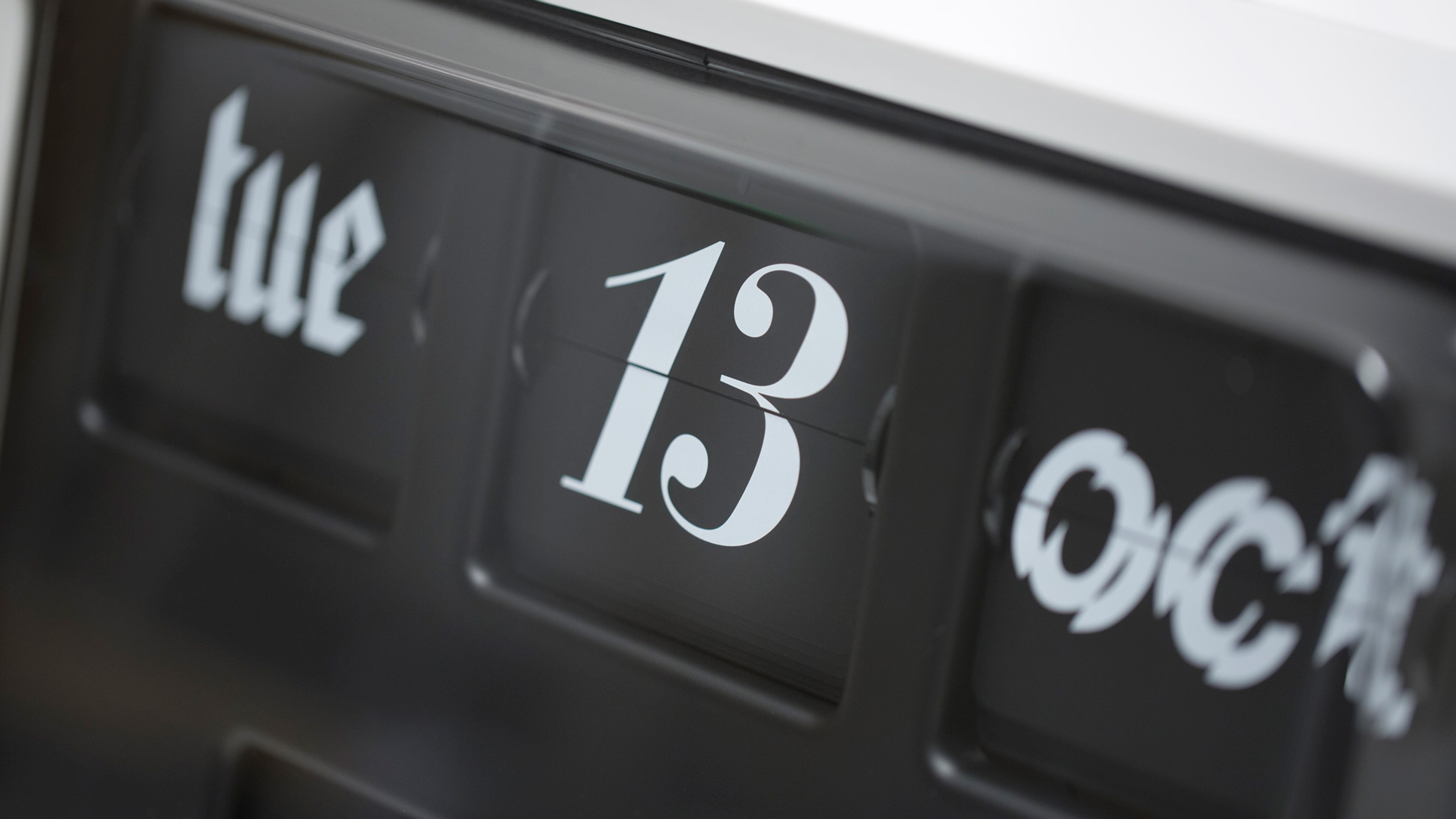
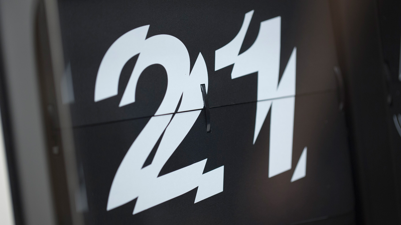
Font Clock features a flip mechanism and displays the date and time using a combination of 12 different fonts.
Wrong, who has a Font Clock on the wall in his kitchen, says the regular clicking sound it makes as it cycles through time is something "you really miss" when you get used to living with it.
"It's an important object for us as a family," he explains in the movie, which Dezeen filmed in London. "There's something very reassuring about the repetition of the sound."
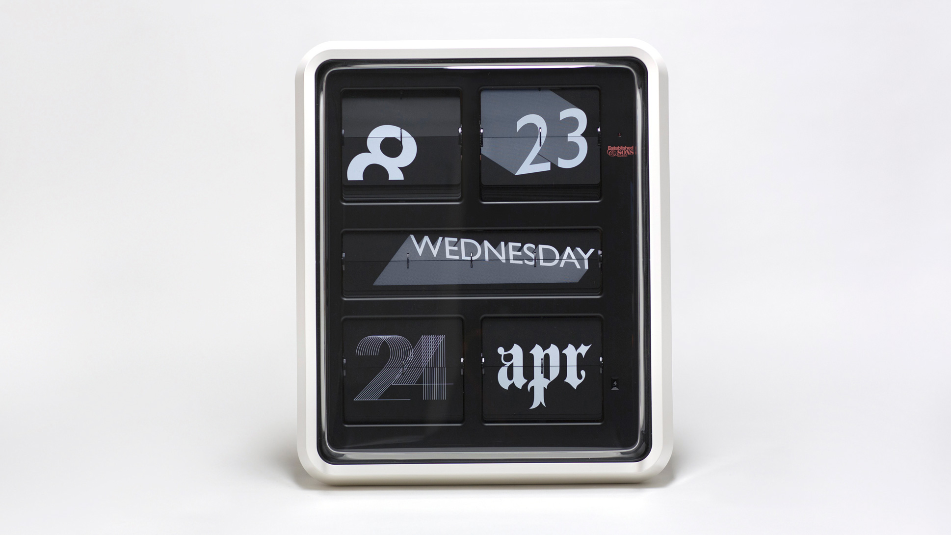
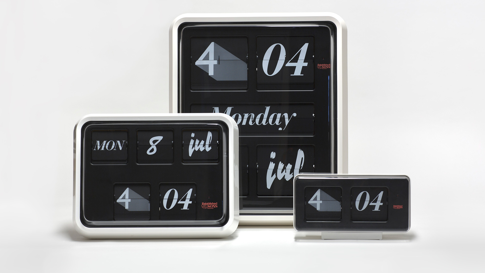
The clock comes in three sizes. A tabletop version, which just displays the time, and two larger wall-mounted versions, which also display the date and day of the week.
Wrong says the sound made by the biggest clock at midnight, when all the five flip displays change at once, can be a bit startling for people who are not used to it.
"It wakes people up with a real crack," he says. "People think something has fallen down!"
Wrong based his Font Clock on Grayson calendar clocks, which were often found on the walls in public buildings before digital clocks became commonplace.
"The initial inspiration behind the idea was the classic Grayson flip clocks that you found in post offices and doctor's surgeries and stations," Wrong says. "It was a nice object that was mounted on the wall and had a sound to it. I was always drawn to this."
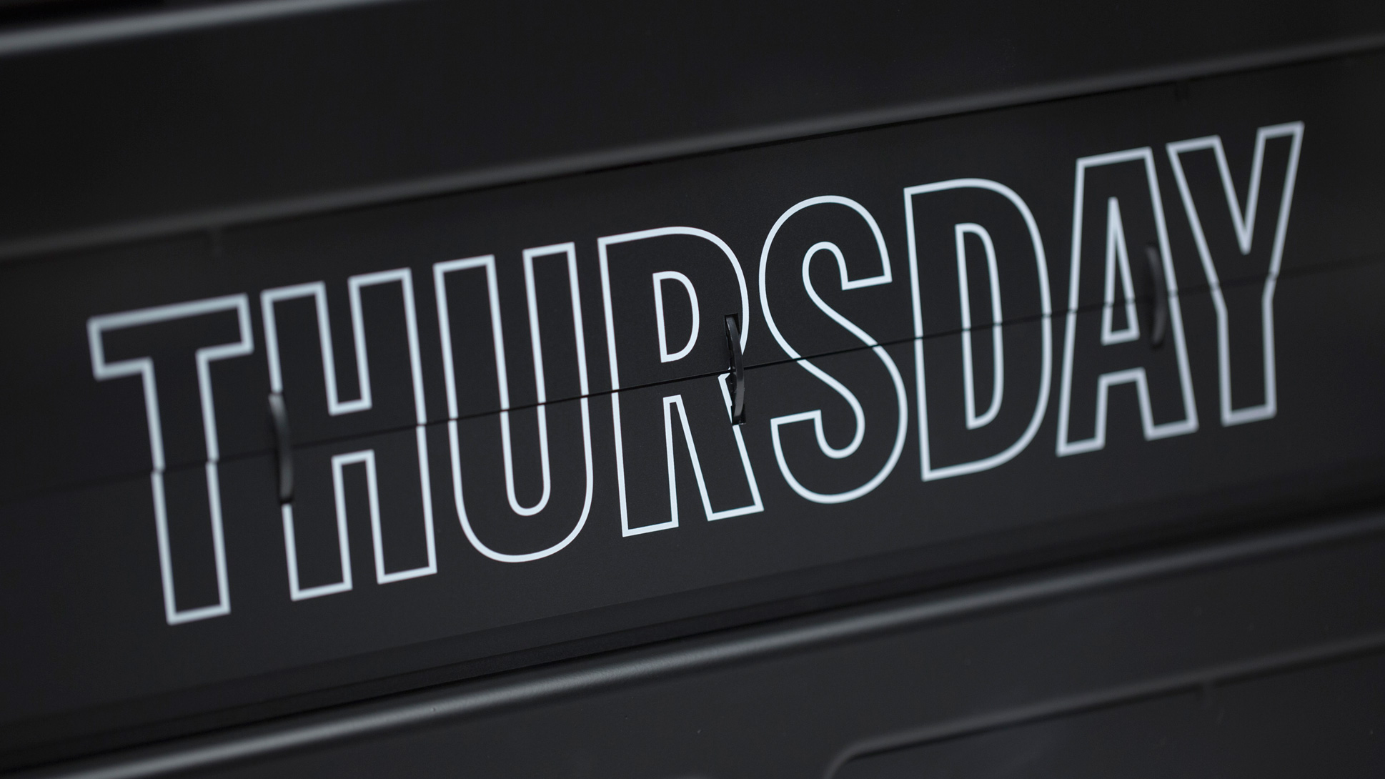
Working together with graphic designer Stefan Kraus, Wrong chose an eclectic mixture of 11 different pre-existing fonts to identify the time and date, with a focus on 20th-century type families such as Franklin Gothic and Helvetica.
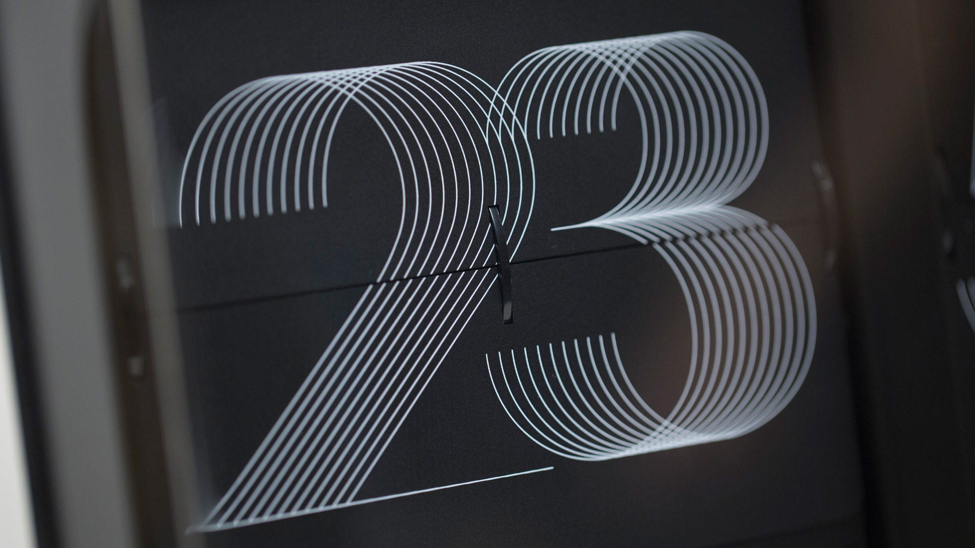
The 12th font, Neon Kraus (above), was designed by Kraus especially for the clock.
"I thought about how [the classic Grayson clock] could be adapted into something that was a little bit more of a study on fonts, on type, on time, and actually a collision or a combination of all of these ideas," Wrong says.
Very occasionally, the clock displays the time and date in a uniform font. But most of the time it shows a combination of different styles.
"It's just an ongoing random thing, which is never the same," Wrong says. "There's always something different every minute. I think that's nice."
Subscribe to Dezeen's YouTube channel for the latest architecture and design movies
He adds: "There is apparently a moment when the different fonts are all synchronised. But I'm not sure exactly when that is!"
Wrong designed the Font Clock for British design brand Established & Sons, which he co-founded in 2005. He resigned as design director of the company in 2012.
This movie was filmed by Dezeen in London. All photography is by Dezeen.
Most Loved is a collaboration between Dezeen and car brand MINI celebrating design objects that have found a special place in people's hearts. Over the coming months, we will be interviewing some of the world's leading designers about their most popular and enduring designs.
You can watch all the movies as we publish them on our special Most Loved microsite: www.dezeen.com/mostloved