Ward Roberts' photographs capture the colours of sports courts around the world
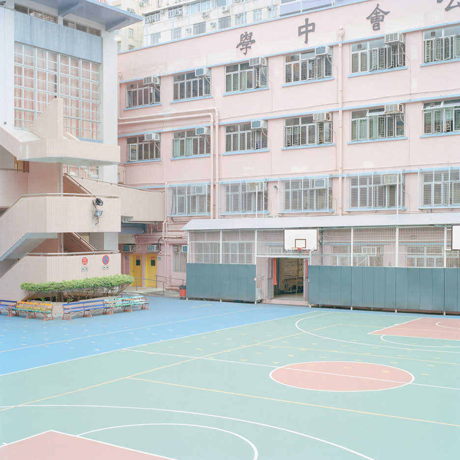
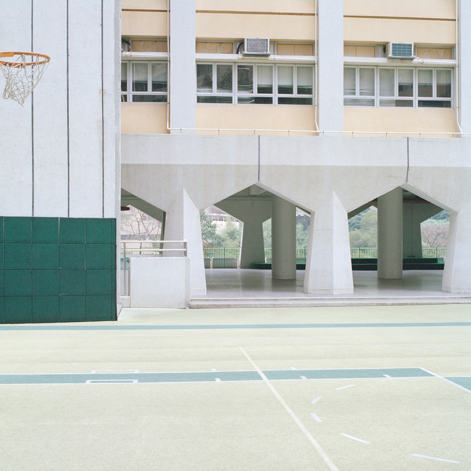
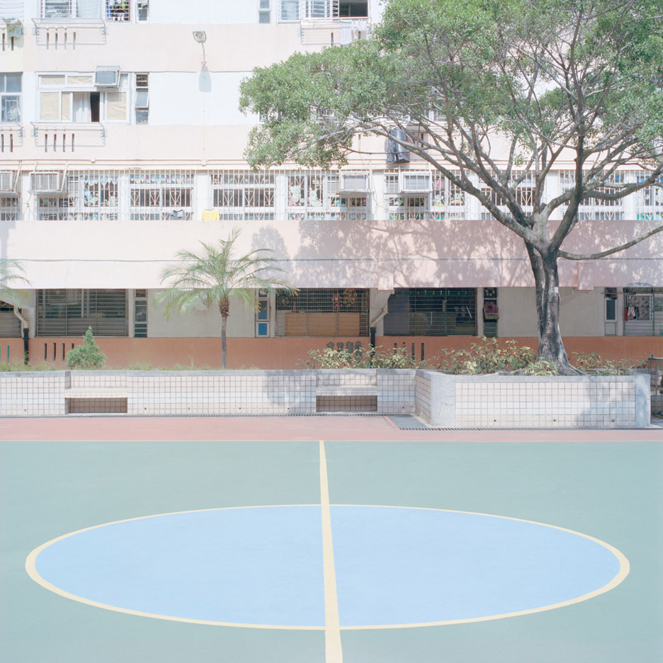
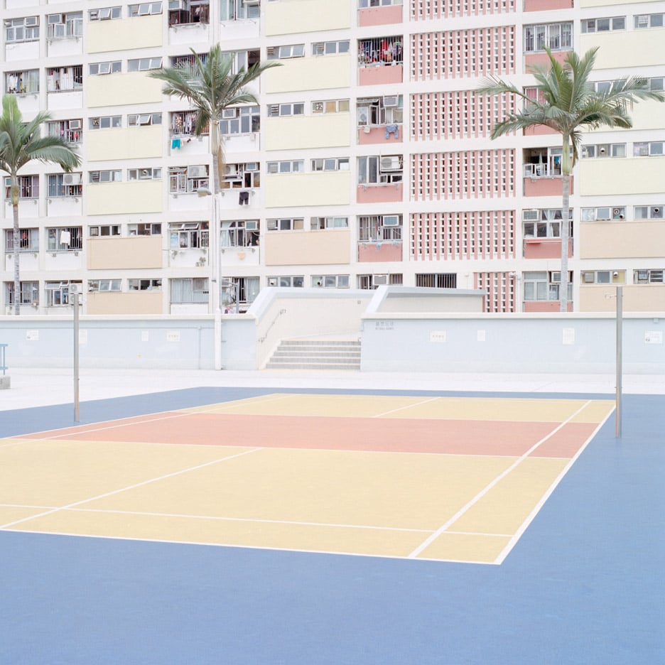
Photo essay: drawn to the bright hues painted on basketball, tennis and volleyball courts in low-income neighbourhoods, New York-based photographer Ward Roberts has scoured the globe to capture these pastel-toned pockets of urban space (+ slideshow).
Initially aiming to document Hong Kong's car parks, Roberts found a deeper connection with the city's basketball courts and switched his focus to these colourful spaces instead.
He noticed that many of the most multicoloured courts were located beside low-income apartment buildings, and used these as landmarks to track down the hidden spaces.
After publishing a first set as Courts 01, Roberts continued his search while on travels to Bermuda, Hawaii, New York and Melbourne. In these locations, he also snuck into the sports grounds to photograph the empty spaces and built up a comprehensive series of images – explained in the essay below.
The photos are compiled into a new book called Courts 02, published by Éditions, and three are available as limited-edition prints.
The first court picture was taken in 2007. At the time, I was shooting a series of empty parking lots, trying to recreate a series by the German photographer Carsten Meier, just trying figure out how he did it and if I could do it too. It was a really good experience, learning through imitation.
While doing that, I also photographed an empty basketball court in Hong Kong, and I felt a stronger connection to it than to the parking lots because I played a lot of sports growing up.
I remember looking back at that image again and again, and thinking "I feel an innate energy in this space. I don't know what it is, I don't know why I'm drawn to it, but I know that I have to do something with this".

Maybe it's because I used to play basketball and tennis a lot when I was younger and then I stopped. Maybe it was a yearning for that time in my life. After that, everywhere I travelled, I would want to go out and photograph courts.
In a sense, I wanted the series to bring up a certain nostalgia for childhood and for playing sports with your friends. I felt so much excitement in these locations; I wanted other people to feel that too.
In Hong Kong, I would use Google Maps, find a few courts in the same area, plan an itinerary, and then walk down to each individual court. After a while, I noticed that a lot of the most visually interesting courts were near low-income apartment buildings, so I started looking for those buildings specifically.
If, a mile up the road, I saw some beautifully colourful residential towers, I'd go there, walk around and try to find a court. Most of those buildings have a court on the playground or on the rooftop, and you can go right in, there's no security.
I think the courts near the low-income housing buildings are really colourful because there's a lot of poverty and depression in those areas. The bright colours seem to be there to make the spaces look less barren, at least that's the impression I got. The wealthier parts of the city aren't as colourful.
There were also some amazing courts in schoolyards, but they were hard to get into because the schools are really high-security. No one is allowed to go in unless they have a child. I snuck into one or two of those, but I missed around 10 amazing-looking courts because I just couldn't get in.

I wanted the first Courts series to be almost like an index of Hong Kong's coloured courts: a blue one, a green one, a pink one, a brown one, a yellow one, an orange one, a red one... I only spent two weeks shooting in Hong Kong, so it was a bit rushed. I didn't really have an opportunity to explore as much as I would have liked to.
For the second series, I had two months in Hong Kong, so I wanted to make it more comprehensive. I really took the time to explore different parts of the city, to do research online, to talk to local people.
I did everything I could to try to expand the series as much as possible. I was looking for diversity. Different colours, interesting architecture or landscaping. Something distinctive. Something fascinating to look at.
The first Courts series was more about architecture. The second one has a bit more vegetation in it. But I'd always shoot in Hong Kong in the winter because there's pollution in the sky at that time of the year. It looks like fog and it adds a kind of softness to the images. It gives them a painterly quality.

I'm very visually driven. I'm drawn to colours. I like my work to have a conceptual dimension to it, but I really want it to be visually interesting as well. I want to make images that are beautiful to look at, so I try to be mindful of everything, to consider how the different aspects of the image communicate with each other.
I shot the Courts series in a square format because I wanted every element of the composition to be connected. It's about how the lines of the courts and the shapes and colours of the buildings around it divide the square and play off of each other. It's like a puzzle.
Melbourne's courts are really eclectic. They've got that basic rectangular design with the lines but other than that, it's all over the place. Melbourne doesn't really have a vernacular architecture. There's a bit of everything and the courts reflect that.
In New York, the courts weren't as visually arresting, they were a lot more gritty and dirty so I went with the seasons to try to incorporate an element of colour into each image.
I shot one court in the fall, when the leaves on the trees were red and vibrant, and another one in the winter when the ground was covered in snow, hiding all the trash and making it look a bit more clean and minimal.

At the very beginning of the series, I shot a few images with someone playing on the field and it just didn't feel right. It didn't work. It broke up the composition and it felt visually distracting. In my work, I hate what I call "the full-stop", which is when you look at an image and there's one element that attracts all of your attention. It becomes the only thing that you can focus on.
I really try to avoid that. I want to make it all connect so that you can look at the image as a whole, as a complete statement. It's about creating a sense of visual flow within each image and throughout the series.