Peter Saville designs packaging for Tate Modern pale ale
British design legend Peter Saville has adapted his graphic identity for the Tate Modern into a new Switch House beer can.
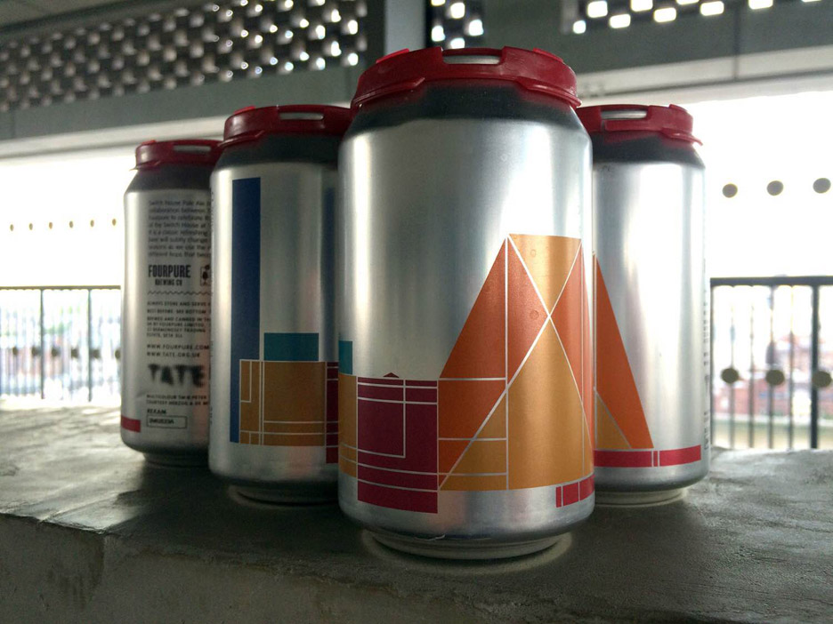
Saville worked with Tate Design Studio on the packaging design, which is silver with brightly coloured geometric artwork.
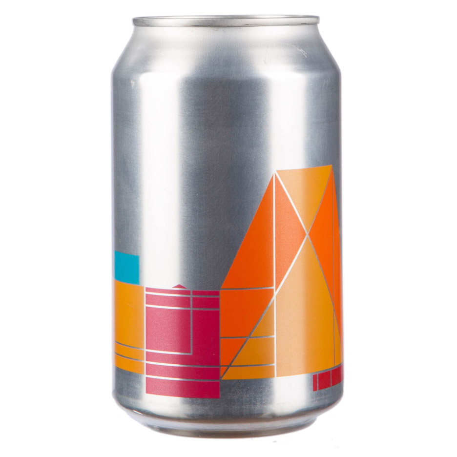
As with Saville's graphic identity for the gallery, the design represents the shape of the Tate Modern – complete with its newly finished extension by Herzog and De Meuron – with each section or department designated its own hue.
Tate wanted to create a modern pale ale to fit with the aesthetic of the Tate Modern bar, but the beer will also be available Tate's other galleries – Tate Liverpool, Tate St Ives and Tate Britain.
"We wanted to celebrate the simple materiality of the can and make a gesture that alludes to how the architecture of Switch House meets the raw brick of the original power station," Tate Design Studio's graphic designer Mathew Whittington told It's Nice That.
The institution collaborated with nearby Bermondsey-based brewery Fourpure Brewing to create the 4.8 per cent pale ale.
Peter Saville rose to fame while creating artwork for Factory Records in Manchester during the 1970s. After moving to London, his clients included department store Selfridges, record label EMI and fashion houses like Jil Sander, John Galliano, Christian Dior and Stella McCartney.
He was awarded the London Design Medal in 2013, and was once reported to be working on a logo for Kanye West.
Other recent work includes collaborations with fashion brands Lacoste and Y-3.