Lion crest on Dutch national football kits undergoes sex change for women's team
Wieden+Kennedy Amsterdam has transformed the Royal Dutch Football Association's lion logo into a roaring lioness, to represents the national women's squad.
The advertising agency worked in partnership with Nike to create the new crest for the female team, ahead of the UEFA Women's European Championship, which is being hosted in the Netherlands.
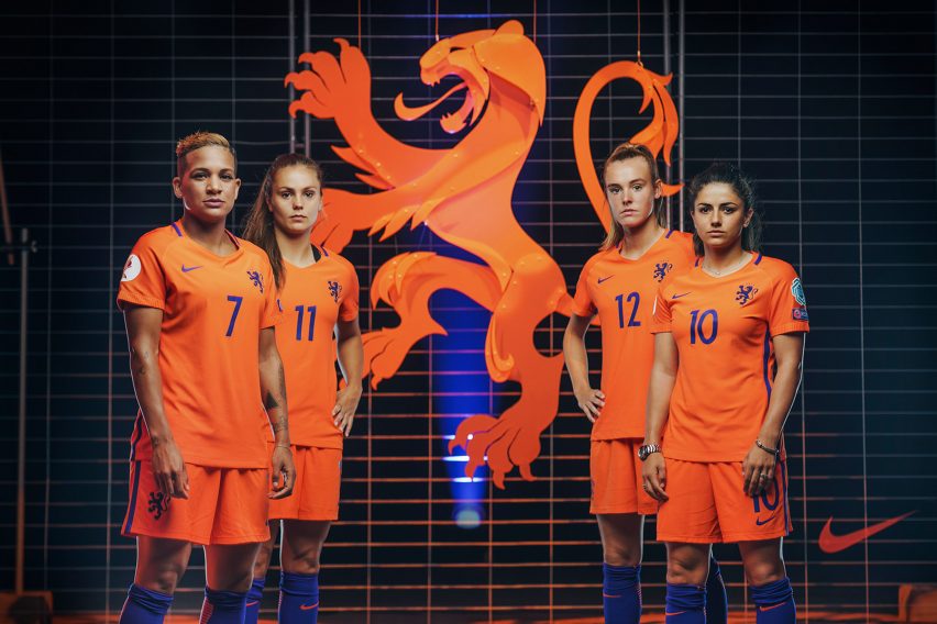
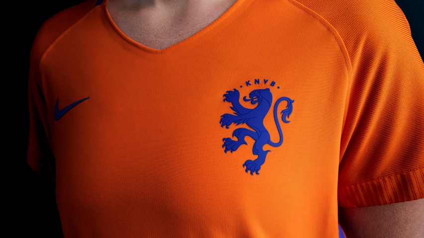
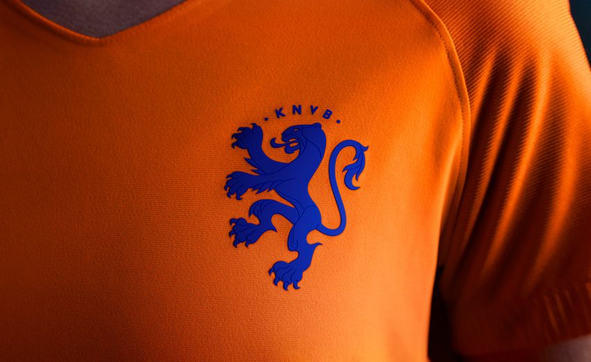
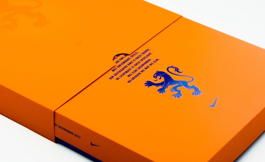
The design echoes the team's nickname Oranje Leeuwinnen, which translates as Orange Lionesses. It is similar in shape to the Royal Dutch Football Association (KNVB) crest, but the mane and shaggy tail are replaced with sleeker fur.
It is intended to become a symbol to encourage women in the Netherlands, and around the world, to take up football.
"They have been called lionesses for the past 46 years, so it was a natural fit to give them a crest that was born out of who they are, and how they play," said W+K Amsterdam creative director Craig Williams.
"When redesigning the logo, we simply removed some elements which made it elegant yet still recognisable as the KNVB emblem and remained unmistakably Dutch," he added.
"A lioness is a symbol of power, strength, elegance and agility. It's a tribute to how they play and celebrates the history of the team as well as the future."
Wieden+Kennedy originates from Portland, Oregon. Co-founder Dan Wieden is responsible for Nike's infamous Just Do It slogan – a tagline he based on the last words of a convict facing a firing squad.
Founded in 1992, the Wieden+Kennedy Amsterdam office has previously created ad campaigns for brands including Nike, Instagram, Facebook and Corona. It worked on the new KNVB crest for six months, before it was unveiled during an event at Nike's store in Kalverstraat, Amsterdam, on 5 July.
The emblem made its official debut at the first game of the European championship, and will remain a permanent fixture on the women's kit.
"This is an idea that is so much bigger than just a campaign or logo update," added W+K Amsterdam art director Hannah Smit. "It's an idea that will endure and a strong statement that will help to continue to accelerate the growing momentum around women's football."
"It's a message that gives female players something of their own to rally behind and to help drive sports participation amongst women in the Netherlands and beyond."
Other football clubs that have revamped their crests recently include Italian team Juventus, which unveiled a minimal crest that became the subject of widespread criticism. Similarly, England's premier league updated its own lion logo last year with a significantly simplified version.